
This One Hidden Trigger Explodes Clicks on Instagram
The stop-the-scroll opener that hooks thumbs in one second
Make the first second do the heavy lifting: a bold visual, a tiny surprise, and a micro promise. When the feed scrolls, your opener should slap the thumb into a pause - not whisper for attention. Think of it as a cinematic hook with a tiny tagline, not an ad blurb.
Start with contrast: bright subject on a dark background, a diagonal crop, or an unexpected close up, then land a three word punchline that reframes what the viewer expects. Examples that work fast are bold verbs and a curiosity tilt such as Stop. Read this., Wait until you see this., and Fix this now. Use punctuation as rhythm: a period makes the thumb stall, a question makes it linger.
Pair that line with a clear tiny promise - a concrete benefit the viewer gains in seven seconds. Avoid vague hype; swap "follow for tips" for "learn one reel trick in 7s" or "fix your caption in 10s". Anchor benefits to feelings: save time, avoid embarrassment, get a micro win. Captions should finish the thought in one more sentence and invite one simple action.
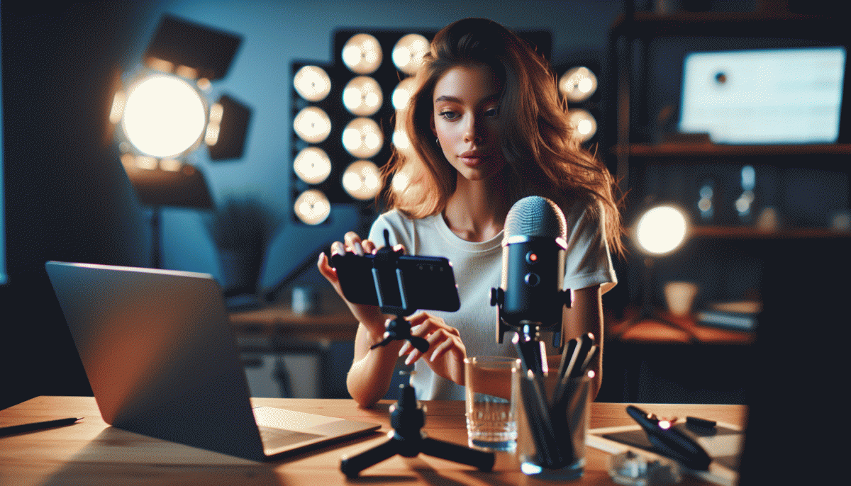
If testing sounds like effort, steal what works: swipeable formulas, tested hooks, and asset ready openers live in one place. See a collection that scales with creative assets at boost Twitter and copy the structures that increase real attention and clicks.
Turn captions into cliffhangers that beg for a tap
Think of your caption as a tiny movie trailer. Open with a line that creates a tension gap, not a summary. Drop a surprising fact or a small mystery in the first 125 characters so the preview stops and fingers tap. Keep language conversational and visuals vivid so readers feel compelled to continue.
Use three simple moves: Hook: lead with one odd detail; Tease: promise a payoff without giving it; Reward: deliver the reveal in the next slide or swipe. Simple templates work: "I tried X and the result was..."; "What happened next surprised me"; "Here is the quick trick that changed Y."
Make the mechanic obvious. One short hook line, one two-line tease that builds the gap, then a CTA that begs a tap — ellipses, a redacted word, or "tap to see" do the trick. If you want to scale tests faster, get Instagram likes today to see which cliffhanger earns the most taps.
Track taps, profile views, and saves to know what actually hooks. Rotate wording, swap emoji for plain text, and test where the reveal goes — comments, carousel, or story. Turn curiosity into a system and watch the tap rate climb; that is how small mysteries become big growth.
Cover images that whisper click me without yelling
Think of cover images as polite pickpockets: they steal attention with a smile, not a megaphone. A whispering cover uses a single focal point, a sliver of motion, and one saturated accent to hint at feeling. It invites a tap rather than demanding one.
Trim the clutter: crop in tight, back off from noisy backgrounds, and make the subject the brightest item. Use short, punchy text if you must, but keep it to two words max. Small, confident choices read as premium and curiosity-inducing on a fast scroll.
Try this mini checklist every time:
- Focus: One clear subject — remove competing elements.
- Contrast: Push one color or value to pop against a muted backdrop.
- Context: Add a tiny motion cue or prop so the image implies a story.
If you want templates that already whisper instead of shout, swipe a few pro-ready layouts and tweak colors to match your feed. Grab a starter pack at YouTube boost and swap in your imagery.
Run small A/B tests: three cover variants, 24 hours each, compare clicks and watchtime. Photos with eye contact and a tiny directional cue (a hand, a streak) often win. Measure lift, then scale the subtle element that moves the needle.
Bottom line: whispering covers feel intentional, not desperate. Start with one tidy modification per post, keep a swipe file of winners, and let data tell you which quiet nudge explodes clicks. Your thumb will thank you.
Carousel slide one: the curiosity gap made visual
Open with a visual tease that has one job: make people itch to swipe. Crop to half a face, half an interface, or a zoomed-in detail so the brain wants to complete the picture. Pair that crop with a punchy micro-headline and a dramatic contrast bar or spotlight; the trick is to promise value without giving the whole formula away. A tiny hint of a wow moment and a strong focal point will create a curiosity gap that feels urgent rather than annoying.
- Tease: Reveal only the outcome, not the how.
- Contrast: Use color and negative space to guide the eye to the unresolved element.
- Promise: Lead with a clear payoff or number that begs a follow up.
Match that imagery with microcopy that amplifies the mystery. Short beats long here: a line like How this doubled my reach in one week creates a question the brain will not ignore. For plug-and-play ideas and first-slide templates that work on Instagram, see Instagram visibility boost — they include headline formulas, crop examples, and contrast combos you can steal and test.
Finally, treat the first slide as an experiment. Swap headlines, tweak the crop, move the highlight, then measure swipe-through and completion. Tiny changes to that curiosity gap compound: the right tease turns scrolls into swipes, and swipes into clicks. Be bold, keep it short, and design your first slide to tease a secret the rest of the carousel is begging to reveal.
CTA lines that feel like a nudge not a nag
Treat CTAs like gentle taps on the shoulder, not megaphones. A nudge wins when it respects feed flow, points to a tiny benefit, and feels reversible. Use words that lower friction: small verbs, optional language, tiny deadlines. That tone is the hidden trigger that turns casual scrollers into curious clickers without tripping irritation.
Swap blunt commands for friendly invitations: instead of Buy now, try See how it looks or Tap to save for later. Add light social proof like join 2k+ creators or warm scarcity such as limited run rather than alarm bells. Keep CTA copy to two to four words, pair it with an on-brand emoji when appropriate, and match the ask to where the viewer is in the funnel — story viewers need different nudges than first-time post visitors.
- Microcopy: Keep it tiny and benefit-led. Convenience is persuasive.
- Timing: Ask right after a helpful tip or reveal when engagement spikes.
- Placement: Put the nudge where eyes rest: caption start, first story slide, or as an on-screen sticker.
Measure impact with small experiments: test three micro-variants per post and track clicks over 48 hours. Small tonal shifts often deliver outsized lifts, so treat the CTA as living copy — refine weekly, copy what proves reliable, and always aim to nudge, never nag.
Read also
You’ve Been Doing Instagram Live Wrong—Do This Before You Hit ‘Start’

This One Tiny Tweak Skyrockets Clicks on YouTube

Post at This Exact Hour to Blow Up on Instagram (We Tested It)

Are Instagram paid ads still worth it? Read this before you spend another dollar

Stories vs Reels vs Shorts on Instagram: The One Move That Explodes Reach