You Won't Believe What's Going Viral on Social Platforms in 2025: Visual Trends Marketers Can't Ignore
Hook in 1 Second: The thumb-stopper formula for scroll-stopping visuals
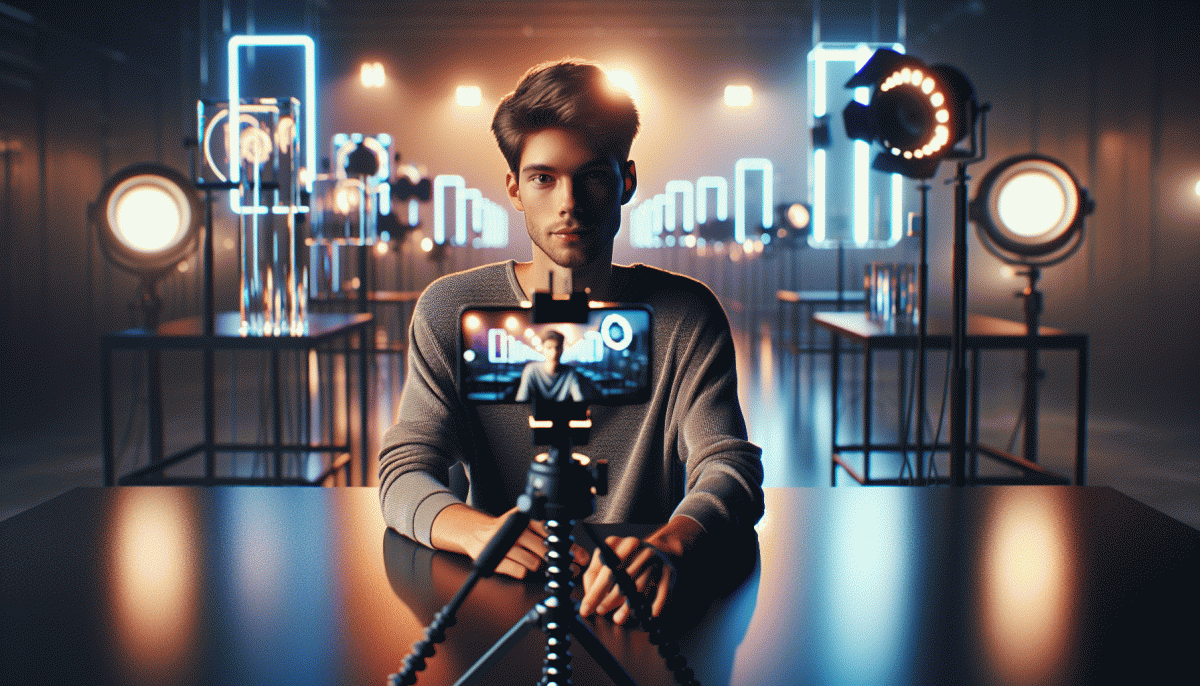
One second is all you have to be unforgettable. The eye locks on contrast, motion and faces faster than a caption can load; your job is to roll those three into a single frame that feels like an invitation, not an ad. That first glance is the headline; everything else is supporting copy.
Use the thumb-stopper formula: bold color + instant context + a tiny story. Lead with a visual that answers one question — what is happening now — then add a three-word caption that amplifies the result. Typography should read at a glance; scale it huge, keep opacity low, and animate a single word for maximum focus.
Production shortcuts make this repeatable. Shoot vertical at high shutter speed, lock the first frame for 0.8–1.2 seconds, then cut to consequence. Use a single motion ramp or a quick zoom instead of complex edits; swap music stems across variants and use natural light or a single soft key for consistent skin tones. Add a consistent color accent to anchor brand recall.
Fast feedback beats perfect design. Small paid tests reveal which opener wins in hours, not weeks. If you want a place to learn quickly, try a targeted experiment via a platform boost — for example check the Pinterest boost service to gather directional data at scale and inform your next creative iteration.
Measure first-frame retention, swipe-away rate and share velocity before vanity metrics. If all three move, scale; if not, alter the opening 300 milliseconds and rerun. Iterate relentlessly — small wins compound. Boldness beats blandness; make the first frame the promise, not the tease, and your visual will do the heavy lifting in one unforgettable second.
Lo-fi wins: Why raw UGC beats polished ads (and how to make it convert)
Glossy hero shots lost their viral mojo. Audiences crave proof people like them actually used something, not a polished studio moment. Raw UGC signals trust: imperfect lighting, candid reactions, and on-the-spot praise feel believable and relatable, which lowers skepticism and speeds decision making. For marketers that means swapping storyboard perfection for genuine moments that map to real customer journeys.
To make low-fi convert, focus on three things: a thumb-stopping hook, a clear value moment, and an obvious next step. Keep clips short, sound natural, and let on-camera fans speak in their own words. Repurpose the same 10-20 second clip across feed, stories, and ads with small edits instead of recreating a new campaign every time.
Quick tactical swaps that move the needle:
- Hook: Lead with a surprising result in the first 2 seconds to reduce scroll loss.
- Edit: Trim to a single reaction or demo, add captions, and keep audio raw unless it is distracting.
- CTA: Use a low-friction next step like swipe up, DM to learn, or a one-click landing page tailored to the clip.
Track micro conversions — view-through rate, short-form lift, and message volume — then iterate fast. If clips raise curiosity but not clicks, swap the CTA or surface a different moment from the same creator. Low-fi is inexpensive to scale, so run many small bets, double down on winners, and let authenticity be the growth lever that outperforms polish in 2025.
AI-enhanced aesthetics: Prompts, styles, and ethics that drive shares
AI is no longer just a background filter; it is the new stylist. Marketers who win in 2025 treat prompts like recipes and styles like wardrobes: mix a dash of "cinematic neon" with a pinch of "analog grain" and iterate until the image vibrates with personality. Small tweaks to wording and reference images change emotional tone, so test three prompt variants before committing a campaign.
Start with tight, repeatable frameworks that speed creativity and improve consistency:
- Prompt: Use role, mood, and artifact: e.g., "fashion editor, hopeful, handheld polaroid."
- Style: Lock a style token like "surreal pastel" across assets to create a recognizable visual signature.
- Ethics: Embed provenance tags and ask permission when using real faces to avoid backlash.
Guardrails are not optional. Label synthetic content, run bias and likeness checks, and keep a human in the loop for final edits. Also plan distribution while you refine aesthetics: different platforms prefer different crops, motion, and pacing, so convert a hero image into a short loop or a still with kinetic caption for cross-platform reach.
Ready to scale the visuals you craft? Run microtests to learn which prompts earn shares, then amplify winning posts with targeted boosts like get TT views today to jumpstart social proof and landing page engagement.
The new color playbook: Gradients, duotones, and cozy contrast palettes
Colors are the new attention currency on social feeds. Think of gradients as motion without a frame, duotones as instant mood setters, and cozy contrast palettes as the warm sweater your grid wears when everyone is scrolling in low attention. These approaches make content scannable, memorable, and shareable because they speak fast and feel familiar.
When building a gradient, keep it purposeful: choose a dominant hue, a supporting hue, and a neutral buffer to protect text legibility. Angle and length matter more than you think — diagonal sweeps read as dynamic, radial blooms draw the eye inward. For motion, animate a micro shift or a subtle noise layer to avoid flatness. Export testing at mobile sizes will show if the effect scales without muddying key details.
Duotones simplify emotion mapping. Pair a warm midtone with a cool accent for contemporary contrast, or choose two warm shades for cozy appeal. Use duotone on portraits, product shots, or headline blocks to create a consistent signature across platforms. Cozy contrast palettes rely on muted base tones with one modestly saturated pop; this preserves readability while delivering personality. Always check contrast for accessibility and tweak saturation before publishing.
Put this playbook into motion with a simple recipe: design three reusable templates, apply a gradient family and a duotone variant, then run quick A B tests on thumbnails and first three seconds of video. Make one element a brand signature color so your content registers even when users scroll fast. Small, repeatable rules win virality more often than unpredictable sparks.
Vertical-first storytelling: Carousels, captions, and subtitles that boost watch time
Treat vertical-first storytelling like serialized TV for a tiny screen: each card or clip is an episode that must earn a swipe or a second more. Smart creators stop thinking single-shot and design a sequence where curiosity compounds across frames, leading to longer session times and better ranking.
Hook in the first two seconds with a bold caption and a readable thumbnail-as-title. Use large, simple text on the first frame that promises a payoff, and mirror that promise in the closed-caption opener so viewers do not need sound to know why they must keep watching.
Subtitles are not optional—they are watch-time insurance. Time line breaks to natural speech, limit lines to two, and pace them for 160 to 180 words per minute reading speed. Contrast and drop shadow matter more than font choice; test colors on real device screens.
Structure carousels as a three-act mini-journey: setup, value, reveal. Keep 3–7 cards for clarity, use visual anchors to help memory, and place micro-CTAs one card before the end so the final swipe feels like completion, not interruption.
Measure what matters: average watch time, retention curve, and rewatch spikes. A/B thumbnails and caption styles, then iterate on the version that sustains minutes, not clicks. Cross-post but tailor chapter markers and caption cadence per platform algorithm.
If you want a fast way to validate hooks in-market, try a quick engagement test like get instant real TT likes. Use the data as a creative lab: double down on the sequences that hold and rework the rest.
Read also

Visual Trends in 2026: Viral Visual Hacks Social Platforms Cannot Resist

Visual Trends in 2026: The Shockingly Simple Secrets Behind What Goes Viral on Social Platforms

Visual Trends in 2026: What Actually Goes Viral on Social Platforms (and How to Ride the Wave)

Visual Trends in 2026: What Goes Viral on Social Platforms (and How to Hijack It)

Visual Trends 2026: What Actually Goes Viral on Social Platforms
