Visual Trends 2025: Steal the Viral Playbook Before Your Competitors Do
Short Form Video 2.0: Win Attention in the First 3 Seconds
Attention is a tiny currency and the feed is a slot machine. Open with a visual impulse that stops the thumb: a rapid close up, an unexpected color hit, or a tiny motion that implies a bigger payoff. If sound is allowed, start with a single sharp cue or whispered hook that sets mood in under a beat.
Craft the first frames like a micro trailer. Lead with a clear promise and show the payoff before the halfway mark of that three second window. Use bold on-screen text to reinforce the value proposition for viewers watching muted. Trim anything that slows the tempo and replace long builds with jump cuts and instant contrast.
Design for loops and repeat views: end with a visual that invites rewinding and a framing that works in a mute preview. Caption every video, size for vertical crops, and test two thumbnail frames. For growth experiments and platform specific tips check best TT boosting service for inspiration on what early retention moves actually scale.
Measure retention at 0.5, 1.5 and 3 seconds and treat those metrics as creative briefs. Iterate rapidly: kill anything that leaks attention, double down on small surprises that buy a second view, and build templates so novelty can be produced like a repeatable trick. The result will be short videos that feel effortless and repeatedly irresistible.
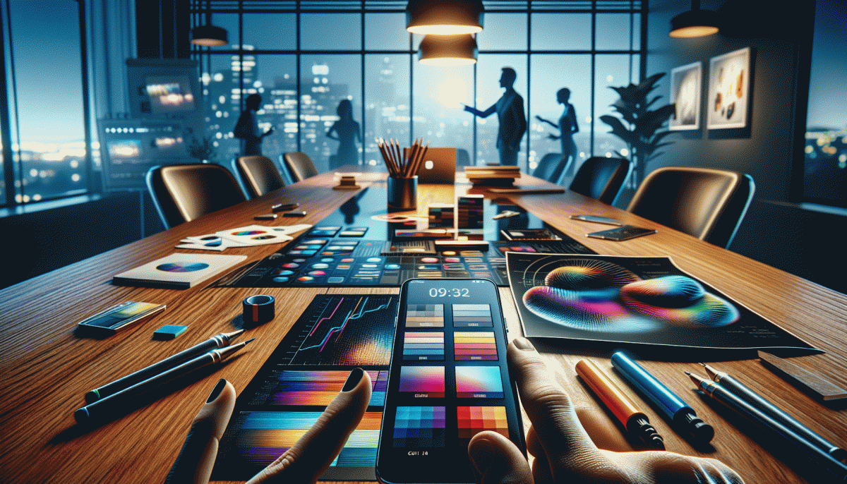
Bold Type, Bolder Colors: Maximalism That Stops the Scroll
Turn the feed into a stop-sign: oversized type paired with unapologetic color grabs attention before sound or motion ever load. Think headline as hero — not as caption. Keep copy surgical: one strong verb, one bold noun, and a visual that amplifies meaning instead of whispering.
Start with scale: punch titles to 28–48% of the image area on vertical content, compress body text, and exploit negative space. Layer type over big color blocks, use heavy weights and tight letterspacing for impact, add a subtle outline or drop shadow for legibility on busy backgrounds, and reserve minimal sans for fine print.
Color should do the heavy lifting. Combine a saturated base with a clashing accent to create tension, try duotone overlays for mood, or use a neon accent to guide the eye to action. Check contrast ratios so bold never becomes unreadable; accessibility protects virality by keeping everyone in the loop.
Ship quickly with templates: three headline-first layouts and two CTA positions, then iterate with A/B thumbnails. Add micro-motion to reinforce hierarchy rather than distract. Measure CTR, view time, and comments; double down on combinations that lift all three. Use platform-specific safe zones so type never gets cropped. Maximalism wins when it is designed, tested, and mercilessly repeated.
AI Generated Visuals With Soul: Make Synthetic Look Human
AI imagery that truly connects behaves like a good actor: small tells, a touch of imbalance, and micro decisions that reveal context. Think posture, gaze, and camera distance as emotional tools, not just composition. Start prompts with mood, not mechanics — "quiet kitchen light, distracted smile, warm cup in hand" produces frames that suggest a life beyond the shot.
Texture and analogue artifacts sell authenticity: film grain, subtle chromatic aberration, lens flare, and uneven shadows make pixels feel tactile. Introduce asymmetric imperfections deliberately and avoid perfect symmetries. Apply selective dirt, slight color shifts, and gentle dodge and burn to anchor subjects to environments; the goal is relatability, not realism for realism sake.
Pipeline matters. Generate multiple variants, lock seeds for continuity, then composite real-photo patches for skin subtleties and fabric detail. Upscale intelligently and hand-retouch only the areas that give personality. If you want a fast traffic lever while you refine craft, check authentic Instagram boost — but never boost hollow assets alone.
Measure reaction, not vanity numbers. A/B test one soulful image against a sterile render and watch watch time, comments, and qualitative feedback. Train editors to nudge AI output instead of replacing instincts. The winners will be teams that treat synthetic visuals as drafts to be humanized, then scaled.
UGC That Does Not Look Like Ads: Plug and Play Formats
Forget glossy ads and staged smiles. The formats that drive shares and conversions feel like someone next door showed a tiny hack. Design plug and play templates that mimic organic posts: short vertical clips, raw sound, jump cuts that match speech, and on screen captions that tell the story without audio. Those are the signals audiences read as authentic.
Recipe templates you can roll out today: a 25 to 35 second before and after with a hands on reveal and a stamped timecode; a 15 second micro tutorial that opens with a 3 second problem hook, three quick steps, and a satisfying final shot; a reaction POV where the creator records their first-time reaction and overlays candid captions. Keep each template modular so footage, caption, and thumbnail swap in and out like building blocks.
Production shortcuts matter. Use natural window light, pocket microphones, and imperfect cuts to keep human texture. Place product in context rather than center stage, let branding be a background detail, and let the creator voice lead. Avoid full script reads; give creators a one line prompt and let them riff. Include a tiny disclosure line in captions and do not interrupt authenticity with hard sell language.
Measure fast and iterate. Launch three templates per campaign, watch retention at 3 and 15 seconds, then double down on the winner with a small paid boost. Repurpose top performing verticals to stories, shorts, and community posts. Keep a swipe file of creator lines and hooks, then treat the file as your reusable plug and play playbook for 2025.
Carousel Comeback: Turn One Idea into 10 Swipes on Instagram
Carousels are not decorative anymore; they are the lean, mean storytelling machine for brands that want viral reach without shouting. Pick one compact idea and treat each slide as a tiny chapter: open with a question that stops the thumb, follow with escalating value, and close with an easy action. The goal is to turn passive scrollers into committed swipers by owning attention in micro bites.
Break your idea into a simple narrative arc and format each frame for fast comprehension. Use this three move toolbox to design the deck:
- Hook: Lead with a surprising stat or image that creates a felt gap in two seconds.
- Proof: Show results, screenshots, or a one line case study to build trust.
- CTA: End with a friction free action: save, DM for the template, or swipe up to learn more.
Make the visuals sing: one accent color, bold type for the headline, and consistent framing so users fluidly scan. Map slides like this: 1 headline, 2 to 4 problem, 5 to 7 solution steps, 8 social proof, 9 quick win, 10 micro CTA. If you want a quick traffic boost or to test distribution tactics, try order Twitter boosting as an experiment to see which opener drives retention.
Final quick checklist before you publish: test the first two slides as a thumbnail, caption a single value prop, A/B the CTA phrasing, repurpose key frames as short video clips, and measure swipe-through rate. Treat each carousel as 10 small experiments that teach you what people actually want to see.
Read also

Visual Trends in 2026: Steal the Viral Formula Social Feeds Crave

Visual Trends in 2026: Viral Visual Hacks Social Platforms Cannot Resist

Visual Trends in 2026: The Viral Secrets Dominating Your Feed

Email Marketing Isn't Dead—You're Just Doing It Wrong (Steal the Playbook Your Competitors Hope You Never Find)

Steal These Powerhouse Tools to Dominate Social Media in 2026 (Before Your Competitors Do)