The One Thing That Drives Clicks on YouTube (It's Not What You Think)
Stop the Scroll: The Thumbnail Trick That Gets Instant Attention
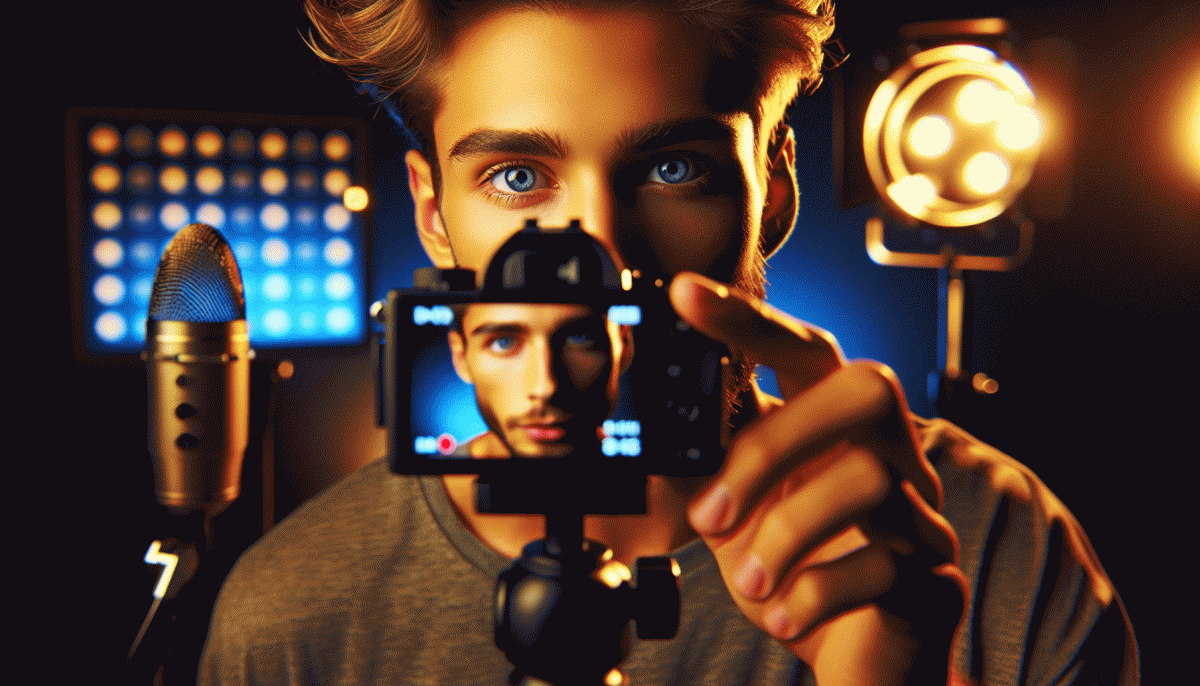
Thumbnails win attention in a tenth of a second, so think like a blink-and-decide customer. Stop trying to explain the whole video in the tiny square; instead, deliver a single, loud visual promise. A clear focal point, a face or object, and one strong color pop will trigger curiosity and make viewers pause mid-scroll.
Break the thumbnail into three visual layers: subject, context, and signal. The subject is a close-up or silhouette that reads at small sizes. The context is a simple prop or setting that hints at the story. The signal is a bold accent—outline, border, or a short two-word label—that tells the brain why to care. Keep text to two words max, use high contrast, and avoid clutter so the thumbnail still reads at a glance on mobile.
Make thumbnails for phones first. Shrink your canvas to a phone preview and ask whether the main element still pops. Export as a sharp JPEG with small file size and test on different devices. Batch-produce three quick variations: one emotional (face), one instructional (tool/prop), and one curiosity-driven (mystery crop). Then run simple A/B checks with YouTube analytics or a pinned community poll to see which style lifts CTR.
- Contrast: Use complementary colors and a dark/light border to separate subject from background.
- Expression: Show exaggerated emotion or action to convey stakes immediately.
- Test: Launch two small variants, let the algorithm pick a winner, and double down on the winnering style.
Final rule: be honest but provocative. Thumbnails should create a curiosity gap, not break trust—clicks matter today, subscribers tomorrow. Build a repeatable template, keep a swipe file of thumbnails that worked, and treat each thumbnail like a tiny poster with one clear call to attention.
Curiosity Gaps That Beg for a Click—Without Clickbait Regret
Curiosity gaps are the gentle tug that makes a viewer click — not a loud promise of miracles. Do it right and you're inviting someone into a story; do it wrong and you're swatting them away. Tease a specific oddity — a tiny contradiction, an impossibly small number, an unexpected object in frame — so the brain can't resist checking the payoff.
Language matters: use precise verbs, sensory clues, and a tight timeframe. Replace vague hooks like 'you won't believe' with 'how I fixed X in 72 hours' or 'the one thing restaurants hide from customers.' That kind of specificity fuels curiosity because it creates a clear gap — the viewer sees the endpoint and wants the path.
Don't forget delivery. Promise a real reveal in the first 10–20 seconds and your retention will reward you; tease forever and you'll lose trust. If you want an easy place to experiment with curiosity-driven titles and thumbnails, run controlled tests on a platform that shows results fast: YouTube boost website.
A simple checklist to try right now: frame the title as a narrowed question; make the thumbnail imply a clear consequence; open the video by addressing the gap immediately. Do that consistently and you'll earn clicks that convert into watch time instead of regret.
Colors, Faces, and Contrast: Your 3-Second Click Magnet
You get one impression in three seconds; make it pop. Bright color, a human face, and a clear contrast are your ticket to a reflexive click. Think of thumbnails as tiny billboards that must shout your promise before the viewer blinks. Be bold, choose one visual hero, and eliminate the rest.
Use saturated hues that contrast with YouTube UI — cyan, orange, magenta — and avoid mid-tone greys. Limit palette to two dominant colors plus neutral; pair warm+cool for instant depth. Test saturation: bump it until the thumbnail reads on a phone, then back off 10% so it still feels real. Pro tip: use complementary edges to guide the eye.
Faces convert because we're wired for social signals. Close-ups with strong eye contact and slightly exaggerated expressions outperform neutral looks. Keep the face large (rough rule: 25–45% of frame), light the eyes, and remove busy hats or sunglasses. If you want tactical help building consistent visuals, check out top Instagram marketing service for templates and A/B frameworks.
Contrast beats cleverness: bold text with a thin outline, high-contrast subject vs. background, and negative space to breathe. Use a short 2–3 word punchline in heavy type, then test thumbnails as 50px thumbnails to ensure legibility. Iterate fast: small thumbnail wins compound into big view gains.
A/B Test Thumbnails Fast: The Zero-Design, High-CTR Method
Think like a scientist rather than an artist. The zero design, high CTR method strips thumbnails down to three variables you can test in minutes: headline text, face versus no face, and background color or contrast. Make two simple images, keep everything else identical, and treat them like lab samples. The goal is speed and signal, not perfection. Fast tests give clear answers; slow overthinking gives vague comfort.
How to run one quick experiment: pick a recent video that is getting steady impressions, duplicate its thumbnail layout in two variants using any basic editor, and swap between them on a fixed schedule. Option A might be a bold 3 word text block on a bright background. Option B might be a close up face shot with the same words. Change the thumbnail at a consistent interval so traffic patterns are comparable, then log impressions and clicks from YouTube Analytics after each interval.
Decide with simple rules. Wait until each variant has at least 500 impressions and 100 clicks or until you have been running the test for 48 to 96 hours, whichever comes later. If one thumbnail shows a relative CTR lift of 20 percent or an absolute improvement of 0.5 percentage points, call it a winner and roll it out. If the numbers are too close, iterate immediately with one new tweak only. Small changes, repeated often, beat occasional masterpiece thumbnails.
Takeaway: build a tiny thumbnail playbook of proven winners, automate the swap routine, and treat clicks like data not taste. This is how you scale a consistent CTR advantage without hiring a designer. Try one rapid A B test on your next upload and let the numbers decide which style to repeat.
Hook First, Title Second: Phrases That Punch Above Their Weight
Think of the hook as the tiny trailer that appears before a movie poster: it primes emotion, promises a payoff, and makes the title look irresistible. Swap the order most creators default to — lead with a short, punchy phrase (3–6 words) that teases a problem, a surprise, or a benefit, then follow with the clear, searchable title. That micro-commitment is what makes viewers click.
Use small, repeatable phrases that punch above their weight. Test language that sparks curiosity, speed, or scarcity; keep each hook crisp and unambiguous so it reads instantly on phones. Try these starter flavors to mix and match with your titles:
- Curiosity: tease an unexpected payoff without giving it away
- Speed: promise a fast result or shortcut the viewer can get now
- Shock: flip a common belief or reveal a surprising stat
When you are ready to scale tests, run 2–3 hooks per thumbnail variation and measure CTR, watch time, and subscriber lift. If you want a quick way to loop in targeted promotion after you optimize hooks, check guaranteed YouTube boost for options that align with ethical growth. Bottom line: hook first, title second, test like a lab — the clicks will follow.
Read also

The One Thing That Drives Clicks on YouTube (Spoiler: It's Not Your Video)

The One Thing That Drives Clicks on YouTube (You're Probably Ignoring It)

The One Thing That Drives Clicks on YouTube (No, Not the Algorithm)

The One Thing That Drives Clicks on YouTube (Hint: Your Thumbnail Rules the Game)

The One Thing That Drives Clicks on LinkedIn (You're Probably Ignoring It)
