The One Thing That Drives Clicks on YouTube (Hint: It’s Not Your Title)
Why Thumbnails Beat Titles Every Time
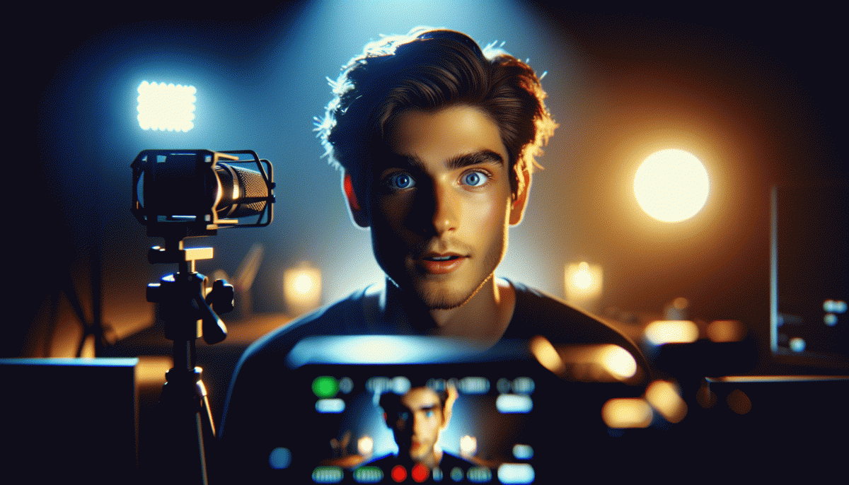
Think of your thumbnail as a handshake for the video: five pixels into a scroll people decide whether to stop. A bold image anchors attention far faster than a title. The brain sees faces, color and motion cues instantly, so a thumbnail that telegraphs emotion or clear action becomes the click magnet while the title plays second fiddle.
That happens because images require almost no conscious work. A single face with strong eye contact and an expressive mouth communicates intent in a fraction of a second. Action shots, contrasting color and a tiny dose of readable overlay text together create a promise. If the thumbnail clearly answers What will I get? viewers are far more likely to tap.
Design for the smallest screen first. On mobile a thumbnail is tiny, so avoid small fonts and busy backgrounds. Use high contrast, tight crops and one focal subject. Keep overlay text to one to three words set in a bold, legible font. Review your thumbnail at thumb size before you upload to avoid surprises.
Do not rely on clickbait. A glossy lie may raise initial clicks but will crush watch time and audience trust. Match the thumbnail to the actual moment in the video and trade mystery for clarity where possible. Create a simple template for brand consistency, then iterate. Templates speed production and help viewers spot your content in a feed.
Quick action checklist: lead with a close up, use a pop color to separate subject from background, add one short overlay word for context, keep expressions exaggerated and honest, and A/B test two variants in the wild. Track CTR and average view duration together; when both move up you have a winner worth repeating.
The 3-Second Rule: Stop the Scroll, Steal the Click
Three seconds on a phone is a lifetime. In that microwindow the brain decides if a viewer will linger or fling your video into the void. The practical takeaway: design for an instant hit of curiosity. Think bold contrast, a clear face or object, a suggestion of motion, and a readable one-line overlay that answers Why should I care? Faster beats and a visual promise win every time.
Start by engineering a thumbnail-to-first-frame handshake: the thumbnail must accurately preview the first second, and that first second must contain an immediate hook — a question, a motion spike, or a tiny reveal. If you want to outsource tests or scale campaigns, try the best Twitter SMM panel for promotion experiments, then iterate on winners. Use strong color contrast, a visible eye line, and avoid clutter; a single focal point converts better than a busy scene.
Tactics you can apply in the editor right now: trim any pre-roll dead air, punch up the first frame with a fast zoom or sound cue, and overlay a two-word tease that promises payoff. Faces with exaggerated expressions catch attention; so do action silhouettes and bright accent colors. Keep text legible at tiny sizes and test how the thumbnail reads at 10% scale.
Finally, measure ruthlessly. Run 3–5 second view rate A/Bs, watch audience retention at the 0–10 second mark, and kill what does not grab. Repeat the winnerʼs visual formula and refine. The 3-second rule is not magic, it is mechanics: design the first moments to be impossible to ignore.
Color + Face + Contrast: The CTR-Boosting Trio
Thumbnails are tiny billboards and the eye moves fast. Use color to shout, faces to whisper a story, and contrast to slap a giant neon "CLICK ME" on the curb. Treat each frame like a micro-ad: bold hue choices get attention, expressive faces build trust, and contrast makes the whole composition legible at thumb size.
Break it down into practical moves you can test next upload: choose a dominant color that contrasts the YouTube UI, frame a face with negative space so the expression reads at 160px, and bump edge contrast so details do not merge into the background. Small tweaks here translate into big CTR swings because viewers decide in a split second.
Quick checklist to try on your next thumbnail:
- Color: Pick one dominant color and a complementary accent to cut through the feed.
- Face: Use a close-up with a readable expression and slightly off-center composition.
- Contrast: Increase edge contrast and shadow separation so silhouettes pop on mobile.
Want a fast way to prototype dozens of combos? See options like the YouTube boosting service for split-test ideas and inspiration. Then iterate: change one variable at a time and track CTR — the pattern will tell you which color+face+contrast mix your audience cannot resist.
Before You Upload: A/B Test That Thumbnail
Think of your thumbnail as a billboard on a crowded highway: it either yanks eyeballs or gets passed. Don't guess which design wins—A/B testing turns gut feelings into hard numbers. Start small: pick one variable (facial expression, color pop, or headline text), make two clean versions, and let them compete. Focus composition, contrast, and a single focal point so viewers can read the image at a glance.
Run your experiment where you can get reliable, repeatable data: use a testing tool like TubeBuddy or VidIQ, run a short micro-ad campaign to your target audience, or post variants in the community tab and compare engagement. Keep titles, tags and description identical during the test to isolate the thumbnail. If you want a ready shortcut for distribution and real exposure try YouTube boosting service to seed early views and accelerate learning—just set a strict budget and identical targeting for each variant.
- Hypothesis: Test one change at a time so results are actionable
- Audience: Match the test group to your channel’s viewers, not random traffic
- Metric: Prioritize watch time and retention over click-only signals
Run each variant for a meaningful window (typically 48–96 hours or a few hundred representative views), watch the trends, then double down on the winner and iterate. Small thumbnail wins compound: a 3–5% lift in CTR with better retention can mean outsized growth. Treat thumbnails like experiments—not art projects—and you'll start harvesting the clicks that actually turn into watch time and subscribers.
Steal These Thumbnail Formulas (No Designer Needed)
Thumbnails are a visual headline. They tell a microstory in a glance and do the heavy lifting when someone scrolls past a hundred videos. Use bold composition, a readable face, and a clear emotion to create a stop-me-in-my-tracks moment. Think of them as mini-billboards: simple, high contrast, and impossible to ignore.
Face & Emotion: close up, mouth or eyes conveying reaction, large enough to read on a phone.
Before/After: split frame that promises transformation or payoff.
Curiosity Gap: a bold object or number plus a question implied by layout. These three formulas cover most niches and can be mixed fast without design software.
Quick recipe: pick a single dominant color, add a thin contrasting border, place a face on one third, and drop 2 to 4 words max in heavy type. Use arrows or a circled detail to guide the eye. Export at 1280x720 and check legibility at 20 percent scale. Execute this template five times and A B test the winners for a week.
Want a fast boost while your thumbnails do the long term work? get Instagram views today to seed the algorithm and push your best thumbnails into real viewership. Small visual wins plus a little traffic can make a single thumbnail pull double the clicks.
Read also

The One Thing That Drives Clicks on YouTube (Hint: Your Thumbnail Rules the Game)

The One Thing That Drives Clicks on YouTube (Spoiler: It's Not Your Video)

The One Thing That Drives Clicks on YouTube (You're Probably Ignoring It)

The One Thing That Drives Clicks on YouTube (No, Not the Algorithm)

The One Thing That Drives Clicks on LinkedIn (You're Probably Ignoring It)
