Stop the Scroll: Visual Trends in 2025 — What's Actually Going Viral on Social Platforms
Thumb-Stopping Colors: Bold Pops, Electric Neons, and the New Neutrals
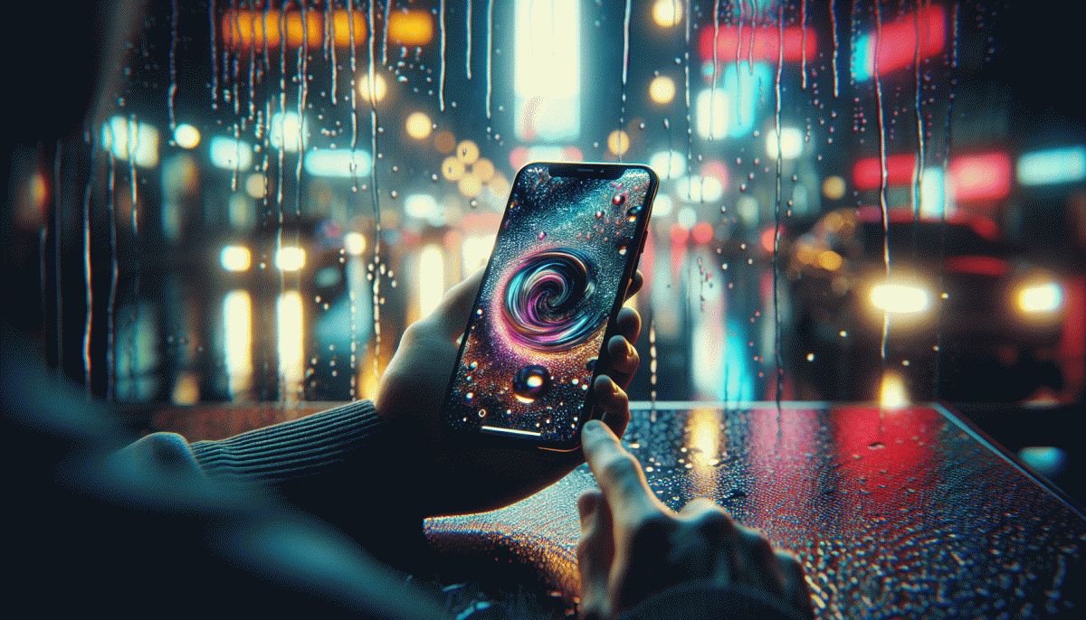
Color isn't a decoration anymore; it's a fast lane to attention. Swap safe gradients for purpose-driven palettes: a single saturated pop will read as a button, a neon streak turns motion into a headline, and a thoughtful neutral keeps the eye on the subject while giving the whole frame a premium calm. Mix them like seasoning—too much neon becomes noise, but a sliver of electric contrast can double your click-through.
Try these quick visual recipes to stop the scroll:
- Bold: Use one intense hue for CTAs or facial highlights — think punchy crimson or sunflower yellow to pull the viewer into the action.
- Neon: Accent motion and tech scenes with cyan/magenta glows or duotone overlays for a modern-retro shock that plays well in short-form video.
- Neutral: Frame your subject with warm clay, greige, or softened black to make colors pop and give luxury-oriented feeds breathing room.
Practical rules: test contrast at thumbnail size, work in HSL to tweak saturation without losing luminance, and use soft vignette or shadow to anchor bright elements. Platform context matters—neon thrives on Instagram and ArtStation, while refined neutrals win on LinkedIn. Ship three variants per post (saturated, neon, neutral) and A/B the winner; over time you'll learn which pop maps to which audience. Small color shifts, big engagement lift.
Lo-Fi, High Impact: Why Imperfect Video Beats Perfectly Polished
Forget cinematic perfection for a second. Raw clips that show a real person, a real mistake, or a real laugh are the quick path to stopping the scroll. Imperfect frames read as honest, relatable, and snackable — which is exactly what modern feeds reward when users are scrolling with divided attention.
Lo fi does three clever things at once: it lowers the barrier to publish, it increases authenticity signals, and it speeds up iteration. Brands and creators who favor speed over polish can test dozens of concepts in the time it takes to finish one glossy edit. That volume creates more chances for a hit and keeps content aligned with real-time trends.
Platform mechanics also favor the messy. When viewers rewatch a clip to catch a cut, react in comments, or stitch a candid moment, that behavior sends strong engagement signals. In practice this means a shaky handheld shot with a clear hook often outperforms a polished piece that feels rehearsed and distant.
Ready to make lo fi that lands? Aim for tight opening hooks, vertical framing, readable captions, and honest sound levels. Embrace jump cuts, quick POV shifts, and one authentic emotion per clip. Reuse longer livestream moments as bite sized edits and prioritize story clarity over perfect lighting.
Want an easy way to amplify organic momentum while you experiment? Check options like buy Instagram saves cheap to give test posts a little boost and gather real feedback faster.
Text-on-Video That Converts: Fonts, Motion, and Read-Time Sweet Spots
Stop thinking of on-screen words as captions and start treating them like billboards with timing. Text-on-video that converts does three things at once: it reads fast, lands emotionally, and signals what to do next. Pick a clear family (sans-serif for speed, a humanist for warmth), set a readable size for mobile (think large enough to scan at arm's length), and always check contrast against moving backgrounds so words stay king even when the frame is busy.
Timing is where most creators blow it. Too fast and viewers skip, too slow and attention wanders. Try these read-time sweet spots as starting points:
- Short: 1–2 seconds per line — great for quick hooks and bite-sized CTAs.
- Medium: 2.5–3.5 seconds per line — ideal for one-line ideas or punchlines that need a beat.
- Long: 4–6 seconds per line — use sparingly for complex points or emotional payoff.
Motion and hierarchy are your friends: animate the most important word first, keep entrances snappy with ease-out timing, and avoid simultaneous full-line movements that feel chaotic. Limit yourself to two typefaces, use weight changes instead of additional fonts for emphasis, and reserve ALL CAPS for single-word emphasis only. If you want help getting consistent, measurable wins, try boost your Instagram account for free to test creatives at scale and learn what text treatments actually move numbers.
Quick checklist before export: lock text inside safe margins, run with captions on to catch mute viewers, and A/B a serif vs sans for voice tone. Measure watch-through and CTA clicks, then iterate — small timing tweaks (±0.5s) often yield the biggest lift. Treat words like motion design: purposeful, rhythmic, and designed to stop the scroll.
UGC 2.0: Studio Vibes Without the Studio (and Without the Budget)
Think like a director, shoot like a roommate. You don't need a stage: a phone, a lamp, and a little intention recreate studio polish. Start with one simple rule: control your frame. Use a three-shot storytelling pattern (establish, close reaction, product/reveal), pick a clean background, and lock your camera on a tripod or a stack of books. Small choices equal big production value.
Light like a pro with household gear: a selfie ring for soft fill, a desk lamp as a cheap key, and a white poster board to bounce highlights. For sound, clip-on mics under $30 or a noise-removal app in post will outshine a noisy room. Costume tip: pick contrast over pattern; clothes that don't fight the camera make you look sharper instantly. Practice one look and one move per clip. Lock exposure and white balance; use gridlines for rule-of-thirds.
Edit fast and intentionally: trim to rhythm, punch with jump cuts, and use one branded LUT and two font styles for consistency. Add captions and a one-sentence hook at the start - mobile viewers decide in three seconds. Repurpose: export vertical, square and landscape crops from the same edit to keep your content working across feeds without extra shoots. Normalize levels and keep music under dialogue.
Distribution is the secret sauce. Schedule micro-drops, seed to a small engaged group, then amplify winners. Use stories and small groups to test creatives. If you want a low-friction boost to get that initial traction, try free YouTube engagement with real users to validate which takes deserve paid push. Studio vibes don't come from gear alone - they come from repeatable systems.
Hook in 3 Seconds: Share-Worthy Story Arcs and Save-Bait Structures
Three seconds is both tiny and decisive. Lead with a thumbnail aligned to your first frame and promise a clear payoff fast: an outcome, a face, or a motion that answers why the viewer should keep watching. Replace slow builds with an immediate visual signal of benefit so the thumb stops. Treat frame one like the headline for a moving image.
Build micro story arcs that live inside that window: Setup, Twist, Payoff. Setup names the problem; Twist adds an unexpected visual pivot; Payoff shows the result and hands over value. Try the reverse reveal: open with the result, rewind two quick frames, then show the key action. That rewind bait invites replays, which drives algorithmic lift and organic shares.
Design save bait as compact utility. Think carousel checklists, a single frame cheat sheet, or a templated before and after that is worth bookmarking. Use bold typographic hierarchy, consistent color blocks, and numbered steps so saving feels like collecting a resource. Place a small micro CTA that says Save for later or Pin this tip so the intent is explicit.
Mechanics make hooks work: high contrast and tight face close ups catch attention, while a quick motion or sound cue signals importance. Start with the payoff visual, add a brief on screen caption that amplifies rather than repeats, then cut rapidly at the twist. Optimize for replays and saves by testing opening frames, crop ratios, and caption length, and measure what truly holds attention.
Adopt a repeatable 3 shot recipe: Promise the outcome, Tease the mechanics, Deliver the quick win plus a saveable asset. Track save rate, completion rate, and replay lifts, iterate weekly, and scale what becomes reliably bookmarkable. Make people stop, feel something, and press save — that is the engine of share worthiness in short form visual content.
Read also

Visual Trends in 2026: What Actually Goes Viral on Social Platforms (and How to Ride the Wave)

Visual Trends 2026: What Actually Goes Viral on Social Platforms

Visual Trends in 2026: Viral Visual Hacks Social Platforms Cannot Resist

Visual Trends in 2026: The Shockingly Simple Secrets Behind What Goes Viral on Social Platforms

Visual Trends in 2026: What Goes Viral on Social Platforms (and How to Hijack It)
