We Tested Raw, Flashy, and Weird—Here's the Style That Crushes the Rest
Raw: The unfiltered charm that sells without the gloss
Think of raw as the friendly neighbor of advertising: breezy, a little messy, and impossible to ignore. When a product shows the real scratch on the case or the founder laughs at a missed take, that honesty builds trust faster than slick polish. Use candid audio, offbeat lighting, and short takes to invite viewers inside the process rather than selling from behind a glass wall.
Start small with three simple plays that scale: make permission to be imperfect your creative brief; hand a camera to a customer and let them talk; stitch together brief mistakes into a highlight reel. Try these three experiments right away:
- Free: Post a behind the scenes cut showing how a product is made, no edits, 15 to 30 seconds.
- Bold: Share a customer clip that lists what did not work and how the brand fixed it.
- Fast: Run a 48 hour test where one ad is rough cut and another is polished, then compare initial clicks.
Measure what matters: watch retention at 3, 6, and 15 seconds, track comment sentiment, and follow conversion lift over a week. If a raw asset gains engagement, repurpose it across short form, story ads, and product pages. The invitation is simple: pick one rough idea, publish it, and learn faster than any perfect rehearsal could teach you.
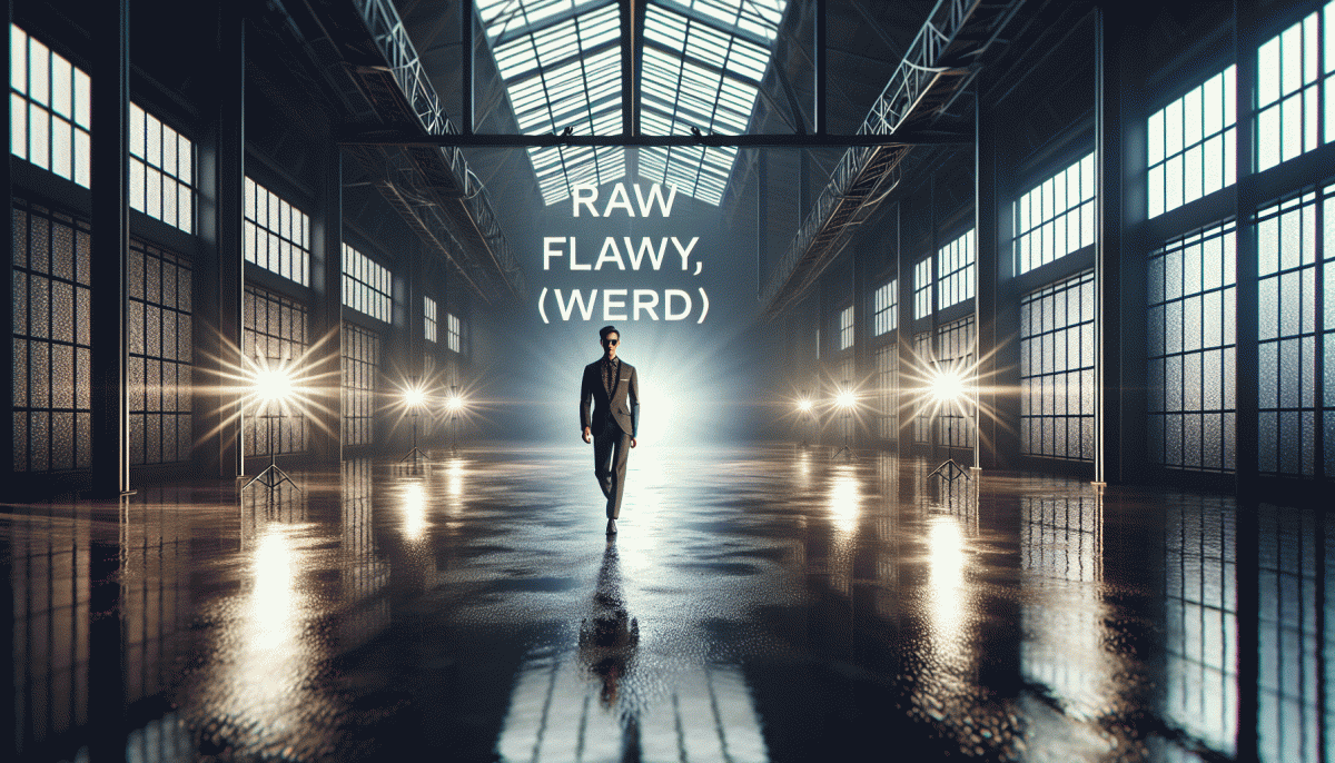
Flashy: High-shine visuals that stop the scroll (but do they stick?)
Flashy visuals are the digital peacocks of feeds: chrome gradients, kinetic type, lens flares, motion, sound and reflective textures. They force a double-take — on first contact they win eyes, taps and the scroll halt, but familiarity dulls fast.
Use that power like a scalpel: front-load contrast and motion so your asset reads in one glance. Aim for a 1–2 second comprehension window — large type, one focal point, a legible hook and a tiny promise of what happens next.
Attention ≠ memory. Shiny creative can be spectacularly forgettable if it lacks story or utility. Anchor the gloss with a micro-narrative, a micro-offer or quick social proof so the flash has something to hang onto.
Weigh the trade-offs: production time, ad fatigue and platform moderation. Rotate variants, lower the shine for retargeting audiences, watch frequency caps like a hawk, and let analytics decide whether glare converts to clicks or customers.
- Immediate: shiny thumbnails that promise a payoff in the caption or first frame.
- Personality: use bold color and motion to announce voice, not just vanity.
- Test: A/B high-shine vs grounded creative and measure retention and CPA.
Mix flash with frictionless follow-ups — clear CTAs, concise copy and a retargeting touchpoint — to turn scroll-stoppers into repeat visitors. Measure lifts in attention (view time, watch %) and outcomes (adds-to-cart, signups) and scale what actually sticks.
Weird: Delightfully odd ideas that make brands unforgettable
Oddity works when it feels intentional, not random. Start by choosing one small, eccentric truth about your brand — an odd hobby in the founder's bio, a strange-sounding product function, or a color that shouldn't work — and let that become the flavor. Keep it tight: pick a single weird thread and pull it through packaging, copy, and a single campaign so the quirk becomes recognizably yours. Let voice be slightly offbeat and consistent to glue everything together.
Make the weird tactical: create a mascot that occasionally breaks the fourth wall, add an obviously inappropriate prop in a hero shot, or invent a fake holiday your audience can celebrate online. Then attach a mechanic — a memeable hashtag, a limited-edition SKU, or a two-day experiential stunt — that encourages users to participate and amplify the joke. Keep production cheap and nimble; cleverness beats polish.
Reduce risk with rapid learning loops. Run micro-tests on small audiences, measure share rate, time-on-post, and repeat visits instead of only conversion, and choose winners for scale. Track sentiment and qualitative feedback too, and use those signals to decide whether to double down. If something flops, don't bury it: archive the best bits for future remixing. Weirdness compounds when you recycle successful oddities into new contexts.
Before you launch, use this tiny checklist: 1) Is it delightfully specific? 2) Could it be misunderstood? 3) Will people want to share it? If you can answer yes, no, and yes — in that order — go loud. Then iterate monthly, keep a file of micro-wins, and let fans copy you. Weird sells when it's sincere, memorable, and built to be copied by fans.
Battle-tested metrics: When each style wins the click, the share, and the sale
Think of metrics like a scorecard at the carnival: some booths steal attention, some get folks talking, and a few actually take home the trophy. When you line up raw, flashy, and weird against click, share, and sale, clear patterns emerge that let you pick the right play for the outcome you want.
That pattern looks like this in the wild:
- Flashy: Dominates clicks with bright thumbnails and punchy hooks that force a double take and a tap.
- Weird: Wins shares by being odd enough to spark conversation and imprint a memory worth passing along.
- Raw: Secures sales through authenticity and trust, turning viewers into buyers when the message feels lived in.
Run quick experiments: A/B test a flashy thumbnail against a raw candid image and a weird bizarre one, then track CTR, share rate, and conversion. Use short funnels so you can see whether attention converted into advocacy or actual revenue. If CTR rises but conversion stalls, trim the flash and add trust signals. If shares climb with minimal sales, consider pairing weird creative with a clearer offer.
Your playbook: Mix, match, and A/B test to crown your winner
Think of this like a style tasting menu: pick a raw base, add a flashy sauce, sprinkle a weird garnish, and then taste. The playbook here is less about loyalty to one look and more about ruthless curiosity. Build parallel drafts, let bad ideas live briefly, and only promote what moves the needle. Keep notes so next season feels like a remix, not a revival.
- Free: Try low-cost experiments—organic captions, community shoutouts, and stripped-down visuals to test baseline interest.
- Slow: Test patient plays like series posts or long-form stories that build trust over weeks.
- Fast: Run rapid-fire flashy variants—high-contrast creative, trend sounds, and bold CTAs—to catch spikes.
Run clean A/B tests: change one variable per variant, set a minimum sample, and pick a primary metric before the first impression. For social posts aim for 2–4 variants, 3–7 days run time depending on traffic, and at least a couple hundred engagements for directional confidence. Use control variants as the yardstick, then iterate on the clear winners.
Ready to scale winners? When you find a combo that sings, double down with paid amplification and partner cross-posts. For a quick starting point, check boost your Facebook account for free and adapt tactics to your platform and audience.
Read also

Raw, Flashy, or Weird? The One Style That Crushes Conversions Might Surprise You

We Pitted Instagram Formats Head to Head — Here Is the One That Crushes Engagement

I Tested 97 Posts—Here Is the One Thing That Actually Drives Clicks on LinkedIn

Raw vs. Flashy vs. Weird: We Ran the Showdown—Guess Which Style Actually Wins?

We Tested Clickbait vs Value—Here's the Sweet Spot That Converts Like Crazy