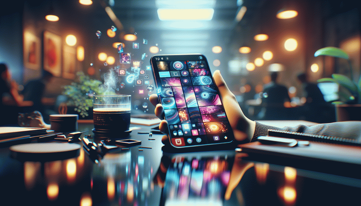
Visual Trends in 2026: Swipe-Stopping Secrets Behind What Goes Viral on Social Platforms
Blink-and-Share Visuals: Why 5-9 Seconds Beat Everything Long
There is a reason micro videos win: in 5–9 seconds the brain locks in before the thumb swipes. Platforms auto-play, attention is costly, and people reward content that delivers an immediate payoff. Keep the story compact, make the first frame a grappling hook, and you win that precious completion metric.
Psychology and platform math line up here. Short clips reduce cognitive load, let viewers experience a full arc, and boost completion rates — which algorithms treat as engagement. Use bold beats: a setup, an unexpected turn, and a tiny payoff. Make the payoff emotional or useful; humor and utility convert especially well.
On the production side, think in three shots: hook, pivot, payoff. Fast cuts, readable captions, and one clear call to action keep viewers till the end. If you want a visibility kick for experiments, consider using buy Instagram views today to test which 5–9 second idea scales.
Distribution matters. Publish native vertical, add captions for mute playback, choose the frame that stops the scroll as your cover, and lead with sound when appropriate. Crosspost tiny edits to stories and feeds, then watch which clip earns shares and saves. Treat each micro video like a repeatable unit.
Quick checklist: 1) Hook in 0.5–1 sec, 2) pivot by 3–6 sec, 3) payoff before 9 sec, 4) single idea only, 5) iterate fast. Short content forces clarity. Make it surprising, useful, or emotive, and you will earn not just a glance but a share. Blink, and they will share.
Color That Clicks: Neon Pops, Cozy Neutrals, and the Perfect Contrast
Skip the bland — the quickest way to make a thumb stop is contrast with intention. Start with a warm, cozy neutral canvas (oatmeal, warm gray, buttery beige) and add a strategic neon pop — magenta, electric lime, or cyan — as a single repeatable accent. That neon pixel becomes a visual magnet: use it for buttons, captions, or the subject's accessory to create instant hierarchy.
Contrast isn't just dramatic — it works. Keep text legible by pairing neon accents with high-contrast type (dark charcoal or pure white) and give bright hues room to breathe with generous negative space. Quick trick: if neon feels overwhelming, mute it with a soft shadow or a 20–30% desaturated overlay; you keep the punch without the eye fatigue.
Match the mood to the platform: fast feeds reward high-energy neon hits on TT and Twitch, while longer-form posts and carousels thrive on cozy neutrals that invite lingering. Test a neon CTA versus a neutral CTA to see which converts on a given channel; platform behavior can flip expectations, so treat each palette as an experiment.
Playbook to try today: pick one base neutral and stick to it for consistency; choose one neon accent and reserve it for CTAs and highlights; validate with A/B tests and simple accessibility checks (contrast, font size, spacing). Small, deliberate contrast choices win attention and trust — color smart, not just loud.
Bold Type, Bigger Impact: Text-Heavy Frames That Stop the Scroll
Big bold type acts like a visual megaphone in crowded feeds. Oversized letterforms and tight, decisive copy create an immediate anchor point that interrupts scrolling. Use a single short phrase or a number set in heavy weight to communicate the core idea in a glance. Clarity beats cleverness when attention is the currency.
Design moves are simple but strict: push type to the crop edge, let letters breathe, and lean into negative space. Pair a condensed sans for the opener with a neutral face for supporting lines. Contrast is the job of tone and luminance more than color alone. A muted photo masked under type adds depth without stealing focus.
Testing is cheap and revealing. Build three variants that swap headline size, color, and CTA placement and run quick daytime tests on target platforms. Then iterate on the winner. If you want to amplify reach with a minimal budget, try a small paid push via buy Instagram boosting service to jumpstart social proof while organic signals build.
Mind the small things that break big ideas. Use variable fonts to switch weights without extra loads and avoid heavy raster shadows that blur on low resolution screens. Check legibility in both bright daylight and dark mode, and keep contrast ratios high for headline text over images. Subpixel details matter more than raw size.
Wrap each frame like a tiny ad: bold opener, one-line subhead with a single supporting fact, micro CTA. Create three modular templates for rapid swaps and track which glyph sizes and color keys convert. Bold type wins when it is readable, shareable, and designed to be skimmed at speed.
Lo-Fi Beats High-Fi: Unpolished, Human Content Outperforms Studio Shine
Forget immaculate lighting rigs and week-long color grades: audiences are increasingly choosing relatability over perfection. When someone hears a half-laughed comment, a camera wobble, or an honest off-script pause, they see a person, not a product. That translates to more comments, saves, and shares because people connect with the messy stuff — it feels real, accessible, and worth reacting to.
Make that raw energy work for you with three simple moves that scale: keep stories short, lean into natural sound, and invite participation. Small, consistent choices beat occasional over-polish. Try these quick pivots to convert everyday footage into swipe-stopping clips:
- Authenticity: Ship first, tweak later — a candid take often outperforms a lab-perfect edit.
- Tempo: Match natural speech rhythms — slow down on punchlines, quicken through setup.
- Hook: Start with a tiny surprise or question in the first 1–2 seconds to force a double-tap.
On the production side, steal studio efficiency without the sheen: batch five short clips in one session, use your phone mic but layer one ambient soundbed, and subtitle everything for silent-scroll viewers. Track which "flaws" drive engagement (messy laugh vs. scripted smile) and double down. The math is simple: more authentic posts → more feedback → faster learning. Embrace the imperfect — and iterate fast — because human moments are the new currency on social platforms.
AI-Assisted Aesthetics: How to Use Generative Tools Without Looking 'AI'
Think of generative tools as a secret studio assistant, not an art director. The quickest way to get that telltale "AI" sheen is to let the algorithm run unchecked. Instead, start with a clear narrative: what feeling should scroll-stoppers trigger in the first 1.5 seconds? Use references and moodboards, define lighting and texture, and insist on human imperfections like uneven hair, slight fabric wrinkles, or imperfect shadows. Those little cues sell realism.
Adopt a two-step workflow: generate with constraint, then humanize with intent. Seed images and targeted prompts produce strong bases; then mask, composite, and fix details by hand. Use AI to create backgrounds, props, or alternate colorways, but layer in a photographed subject or natural texture to anchor the image. Run multiple variations, pick the best elements from each, and merge them manually so the final asset reads like real craft, not a one-click novelty.
Finish like a photographer, not a factory. Add grain, adjust local contrast, introduce slight motion blur, and nudge skin texture back toward reality. Small lens artifacts and imperfect white balance make a big difference on phone screens. Export and preview at native sizes for each platform, because what reads as cinematic on a desktop can look flat on a 9:16 feed. Keep file sizes optimized but do not overcompress highlights.
Make testing your compass: quick A/B runs for 24 hours will show if an image gets swiped or tapped. Track engagement by watch time, swipe rate, and comments, then iterate fast. If you prefer to skip the learning curve, our studio blends generative speed with human craft to deliver swipe-stopping visuals that feel lived-in and real, every time.
Read also

Visual Trends in 2026: The Shockingly Simple Secrets Behind What Goes Viral on Social Platforms

Visual Trends in 2026: What Actually Goes Viral on Social Platforms (and How to Ride the Wave)

Visual Trends in 2026: The Eye-Popping Secrets Behind What Actually Goes Viral

Visual Trends in 2026: What Goes Viral on Social Platforms (and How to Hijack It)

Visual Trends 2026: What Actually Goes Viral on Social Platforms
