Visual Trends in 2025: What's Actually Going Viral on Social (Steal These Formats)
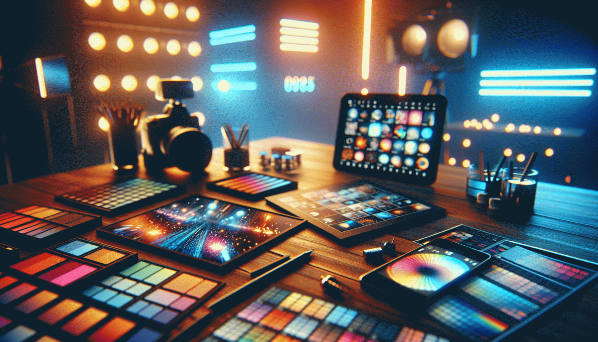
Hook in 3 Seconds: The Thumb-Stopping Cover Image Formula
Three seconds is a long time when a thumb is scrolling at full speed and a very short time when attention is divided. The cover image must scream relevance at first glance, promise value in a glance, and invite a tap without asking permission. Think of it as a tiny billboard that has to win a stare, an emotional register, and a question in the same blink.
Use this simple formula: Contrast + Cue + Face + Micro Copy. Contrast means color or tonal clashes that separate the subject from the background. Cue is an arrow, a hand, or a motion blur that points the eye. Face is a close up with one readable expression. Micro Copy is a three to five word hook that finishes the idea the image starts. When all four align you get the classic thumb stopper.
Practical rules for mobile first: make the face take 30 to 50 percent of frame, bump text size until it reads at a glance, ditch small patterns that create visual noise, and use a single accent color for calls to action. Test with one second, three second, and five second exposure checks on a phone screen to see what actually reads in the wild.
Want a fast boost while you iterate? Consider a small reach test to validate which cover wins before you scale. For a one click option that fits this workflow try buy impressions online to get a lightweight control group and real engagement signals without wrecking organic learning.
Final checklist: clear subject, one readable emotion, three word micro copy, bold contrast, and an obvious eye cue. Create three variants, run a 24 hour micro test, then double down on the winner. That is how covers go viral without relying on luck.
TikTok Aesthetics 2.0: CapCut-Native Looks That Crush the For You Page
Forget flashy captions and recycled challenges; the new wave is CapCut-native aesthetics that turn edits into platform fluent storytelling. These looks are built inside CapCut using templates, built in transitions, stickers and LUTs so the result feels custom but consistent. The algorithm loves predictable motion language and clean exports because they reduce visual friction and boost watch time. In practice that translates to more loops, more shares, and the kind of retention metrics editors brag about.
Adopt a small set of rules and repeat them. Lock your canvas to 9:16, commit to two signature transitions (mask reveals and a whip or zoom punch), and pick one color grade that becomes your visual fingerprint. Time cuts to the vocal line or percussion hit with quarter beat precision, add micro speed ramps of 10 to 30 percent to emphasize gestures, and finish with thin grain and chromatic aberration to sell texture. Export at 1080p H.264, 30fps for reliable mobile delivery.
Three rapid recipes to try this week:
- Speed: Use a punch-in at 1.2x then snap back to 1x on the beat to create momentum without nausea.
- Look: Pick a single LUT, raise midtones, mute shadows, and add a warm highlight for human skin tones that pop.
- Hook: Start with a question or visual mismatch in the first 1.5 seconds and resolve it at the beat drop to reward attention.
Rotate these formats across three posts and log retention at the 3, 6 and 15 second marks to see what really sticks.
Treat CapCut like secret sauce: small, repeatable design choices compound. Test variants, steal the strongest move from each clip, and scale the one that wins. The best part is that once you have a template library, cranking out For You Page ready edits becomes delightfully fast.
Text-on-Video That Converts: Fonts, Colors, and Timing That Sell
Text-on-video is the microcopy that makes scrolling stop. Treat every overlay like a tiny billboard: clear typographic hierarchy, tight line length (max 30 characters per line for mobile), and a single action verb per card. Use a bold geometric sans for headlines, a neutral humanist for subtext, and always check legibility at 320px width before you ship.
Design decisions that actually convert are surprisingly specific. Keep contrast high (text on mid-tone footage needs +200% contrast), animate only one line at a time, and align captions to faces or motion paths so the eye does not jump. Avoid thin scripts, large caps blocks, and neon rainbow gradients that compete with facial expressions.
- Contrast: Push text over a soft shadow or blurred rectangle to keep captions readable on busy clips.
- Timing: Reveal 2-3 words per beat, pause 250–400ms on the CTA line so it lands.
- Voice: Lead with benefit, not feature; open with why it matters in the first 1.5 seconds.
Want a quick testbed to try these settings? Try boost TT for templates and A/B data that show what wins. Final checklist before export: 1) safe margins on all sides, 2) 16:9 and vertical crops checked, 3) the CTA emphasized with color + microanimation. Small typographic tweaks equal big lift in clicks.
UGC Beats Studio Polish: Authenticity Cues Audiences Trust in 2025
People are less impressed by glossy production and more moved by proof that something actually happened. Short clips that show a real person discovering a product, fumbling a detail, then celebrating the win trigger a subtle trust response: the imperfection proves the outcome is believable. That means candid framing, ambient sound, and on-the-spot captions are now a creative advantage rather than a flaw.
Authenticity cues are concrete and repeatable. Leave the phone notification in frame, let the audio breathe, show timestamps or a quick unedited clip of the setup. Include one line that sounds unscripted and personal. These micro signals reduce skepticism and increase retention because viewers are calibrating for honesty, not production value.
Stealable formats that scale: rapid POV reveals where the camera moves from problem to solution, four-second reaction cuts after a first try, and behind-the-scenes micro-tutorials that end with a real reaction shot. When commissioning creators, ask for a raw take plus a trimmed version; this gives you authentic snippets to A/B test against polished assets.
Practical playbook: brief creators on the single authenticity cue you want (a laugh, a technical hiccup, a surprise), keep lighting natural, and caption every clip for silent viewers. Measure success by comments and saves first, then by view-through rate. If the raw version beats the polish, amplify it — organic trust becomes paid performance when paired with smart placement.
AI-Generated Meets IRL: Blend Synthetic and Real Without the Uncanny
Think of AI assets as guest stars, not body doubles. When you stitch synthetic elements into real footage, the trick is to treat them like physical props: match scale, lens choice, grain and motion. Hyperreal renders that float in a sharp, perfect bubble will read as fake unless you intentionally tether them to the scene with contact shadows, occlusion and a slight amount of analog degradation. Embrace believable flaws—the brain forgives texture far more often than polish.
Here are practical, actionable moves to beat the uncanny: sync light temperature and direction between live and synthetic layers, mimic camera shake and depth of field, and bake in micro imperfections like film grain, chromatic aberration and sensor noise. When an AI figure interacts with real items, shoot those hands and props in-camera to create literal contact points. Use subtle motion blur and non linear easing so movement feels organic, then export versions with and without overlays for platform testing.
Experiment platform-first: a tight 15 second hybrid clip for Reels, a 45 second narrative for YouTube, and vertical proof points for Stories. If you want a quick wins playbook, try the YouTube visibility boost approach—open with a candid IRL hook, introduce an AI element at the 3 to 6 second mark, and reveal a tactile payoff that rewards attention. That timing keeps curiosity high and prevents viewers from over-scrutinizing pixels while scrolling.
Finally, document everything and iterate. Save A/B pairs that change just one synthetic variable at a time, track where engagement spikes, and preserve human signifiers like breath, laughter and small mistakes. The goal is not technical perfection but emotional truth: when the viewer senses authenticity, they will watch, react and share. Blend boldly, break a few rules, and let controlled imperfections become the viral signal.
Read also

Visual Trends in 2026: What Actually Goes Viral on Social Platforms (and How to Ride the Wave)

Visual Trends 2026: What Actually Goes Viral on Social Platforms

Visual Trends in 2026: Steal the Viral Formula Social Feeds Crave

Visual Trends in 2026: Viral Visual Hacks Social Platforms Cannot Resist

Visual Trends in 2026: The Shockingly Simple Secrets Behind What Goes Viral on Social Platforms
