
Visual Trends in 2025: Steal These Viral Moves Before Your Competitors Do
Hook in 1 Second: The Thumb-Stopping Openers That Win the Feed
Stop the scroll in one heartbeat. Your opener must answer two silent questions in the first frame: what is happening and why should I care. Use an immediate visual question, a bold color pop, or a face reacting to something unusual to trigger curiosity instantly.
Motion beats stillness: a sudden zoom, a micro jump cut, or a whip pan creates momentum the thumb cannot ignore. Add an overlaid one-line hook and keep on-screen text under four words. High contrast and negative space let your focal point breathe and read fast.
Think platform micro playbooks. On loop-first platforms favor a repeatable reveal; for feeds that autoplay muted, design a silent punchline with expressive eyes and a single caption; in ephemeral stories build a two-frame mystery that forces a tap to continue. Tailor the opener to the scroll behavior.
Three quick experiments to run today: swap your opening frame for a close face and track first-second retention, test a bright background versus neutral for CTR lift, and pit a text-first hook against a visual-first reveal to see which moves people down the funnel. Run each for at least 24 hours and gather clear comparatives.
Measure ruthlessly and iterate. If first-second retention is weak, shorten to a single unmistakable moment. If taps rise but conversions stall, make the next step clearer. Keep a swipe file of winners, repeat what works, and let those small wins compound until competitors ask how you did it.
Duochrome Meets Texture: Color + Grain Combos That Scream "Save"
Think of duochrome as mood lighting and grain as tactile memory you can almost feel through the screen. When color shifts meet a toothy texture, images stop being background noise and become things people want to save. Start with a confident two-tone base and treat grain as the finishing touch.
Pick combos that tell a story: cool teal with punchy magenta reads futuristic; warm gold against soft violet feels luxe; chartreuse paired with inky indigo gives playful edge. Keep saturation choices intentional—one hue should sing while the other supports. This contrast is what makes viewers pause and tap save.
Texture is not one-size-fits-all. For portraits use subtle film grain at roughly 10–20% opacity to add warmth without masking skin detail. For backgrounds or product shots push to 30–40% and add soft dust or scratches to suggest authenticity. Small, consistent speckle beats heavy, uneven noise every time.
Layer like a pro: apply a duotone map, then a low-opacity grain layer set to Multiply or Overlay, and finish with a gentle vignette to guide the eye. Use clipping masks so texture respects subject edges. If you overdo contrast, mute the highlights by lowering whites instead of nuking saturation—preserve the shimmer.
Design with the platform in mind. Thumbnails and reels need bold edges and readable focal points; carousel covers can breathe with more subtle texture. For Instagram ensure the focal point sits inside the center 4:5 safe area so that the duochrome punch hits where thumbs land, increasing the chance of saves and shares.
Quick action checklist: test three duochrome pairs side-by-side; dial grain by subject type; lock composition before exporting. Try teal+magenta for energy, gold+violet for premium, lime+indigo for quirky. Save your favorite settings as presets so you can repeat the look and turn one-hit visuals into a recognizable visual signature.
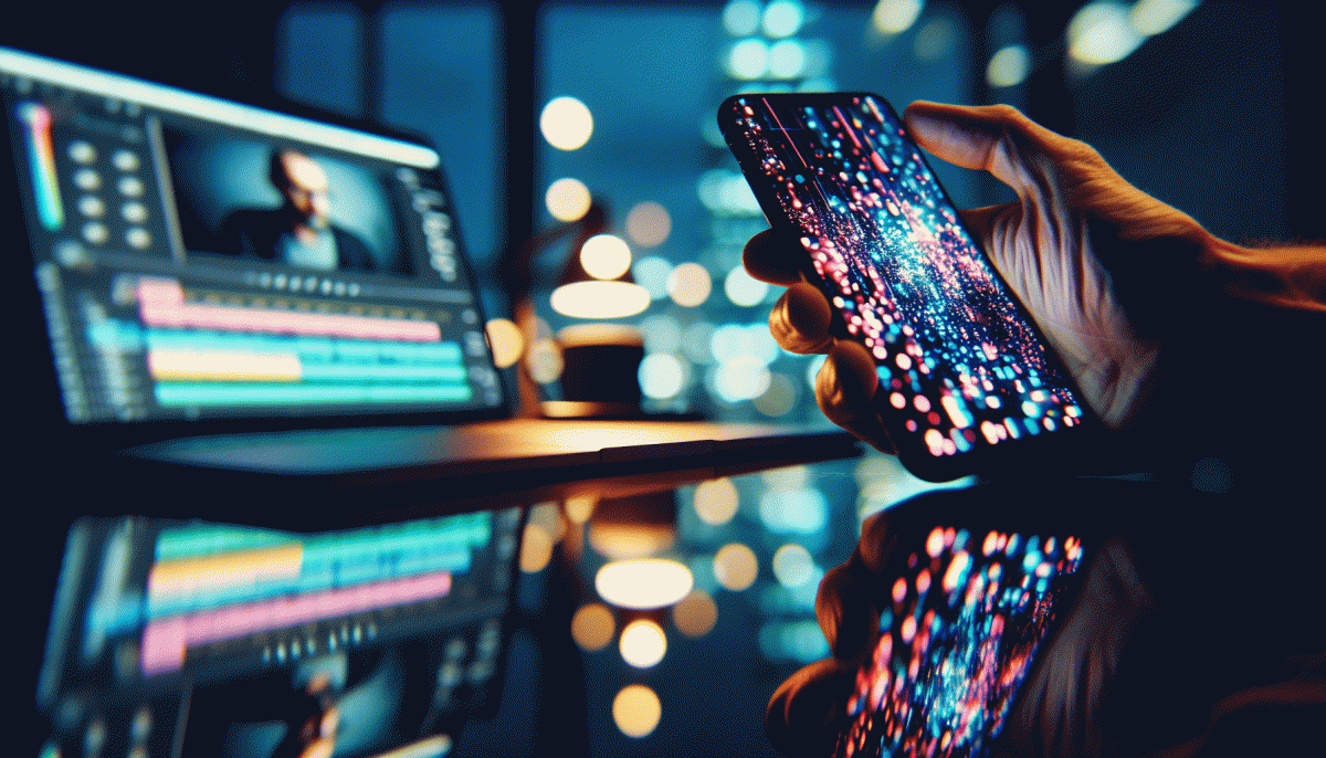
AI Looks, Human Feels: Blend Generative Flair with Real People
Mix a machine’s imagination with a real heartbeat: pick one AI flourish per shot—unexpected sky synth, painterly grain, or kinetic light—and pair it with a human who can sell the moment. Small, human-led imperfections (a crooked smile, an offbeat glance) make generative effects feel like design choices, not hallucinations, and help your brand voice stay recognizably human.
Practical trick: shoot a clean pass on set for accurate skin tones and natural catchlights, then export an isolated subject mask. Layer your AI background, texture, or pattern behind that mask and match light direction in post. Use subtle bloom, restrained color grading, and micro-contrast so the AI flair supports the face instead of stealing it.
Workflow rules to live by: moodboard → capture → AI experiment → human edit → test. Iterate fast, keep people in charge, and version everything. Annotate what was generated so teams can reproduce results and keep ethical guardrails—consent, credit, and diverse casting aren’t optional, they’re catalytic.
Want your visuals to reach real eyeballs without losing their soul? Pair the creative loop with smart promotion; start distribution with a focused push to build social proof and learn fast: boost Instagram and measure which AI+human combinations actually move metrics.
Quick checklist before you publish: A/B a faces-first shot vs an AI-first shot, caption the craft behind the image, test at multiple sizes, and optimize thumbnails. Those small, tactical moves turn novelty into a repeatable, shareable visual language.
Captions That Convert: On-screen Text, Subtitles, and Sticker CTAs
Think like a scroller. Most viewers watch without sound, so on screen text is your headline and subtitle copy is your translator. Keep lines short, use a large sans serif, and maintain high contrast so words remain legible on small screens. Use sentence sized bursts rather than paragraphs to make the feed flicker work for you.
Sticker CTAs are tiny stage directions that pull attention when timed with a visual beat. Place CTAs near the subject, animate entry on the second or third beat, and use brand colors for recognition but contrast for readability. Subtitles should be native language first, then a translated caption if you aim global: simple localization increases completion and click rates.
Use these rapid tactics to increase conversions:
- Hook: Lead with a three word opener that promises value and maps to your first on screen line.
- CTA: Test short sticker CTAs like Tap, Shop, or Save for immediate action and pair with a visual cue.
- Timing: Stagger subtitle lines to reveal on beats so eyes move with the motion, not against it.
Run simple A B tests: variant A uses bold primary color CTAs, variant B uses outline CTAs; measure clicks, completion, and drop at each subtitle cue. Iterate weekly, and you will steal attention before competitors know the move existed.
UGC 2.0: Polished Lo-Fi That Outscores Studio Shoots on Instagram
Think of the new UGC as “polished lo‑fi” — the sweet spot between slick studio ads and raw cellphone clips. On Instagram that means authenticity with craft: keep the lived‑in edges, but apply small technical choices that boost attention and trust. The payoff is real — higher saves, more shares, and comments that actually mention the product instead of just the cinematography.
Shooting recipe: use a phone with a 35–50mm feel, two light sources (window key + a soft fill), and frame for the vertical feed. Capture short, purposeful clips — 4–12 seconds each — with gentle handheld motion and one intentional imperfection (a laugh, a stumble, a sticker on the table). Record ambient audio and a clean voiceover take so you can mix for clarity without killing the vibe.
Post: apply a subtle film preset, lift shadows, mute highlights, and layer a fine grain overlay — think analog, not Instagram filter cheapness. Add on‑screen captions and a one‑line hook in the first second; put your CTA before the last cut. For briefs to creators: ask for a 30s demo, one candid reaction, and a short line that sounds unrehearsed. Specify format (1080×1920), fps, and a usable B‑roll clip that includes product context.
Measure and scale like a scientist: A/B studio vs polished lo‑fi on Reels and Stories, watch saves and view‑throughs. When a clip wins, repurpose frames into ads, product pages, and carousels. Budget tip: buy rights to 8–12 creator clips and iterate — you get the humanity of UGC with a production edge that actually outperforms staged studio shoots on Instagram.
Read also

Steal Back Your Day: Automate These Marketing Moves—But Don't Outsource Your Voice

Steal These Powerhouse Tools to Dominate Social Media in 2026 (Before Your Competitors Do)
What Hooks Actually Work in 2026? Steal These Scroll-Stoppers Before Your Competitors Do

Campaign Burnout? Steal These No Rebuild Moves to Wake Your Metrics Up

Visual Trends in 2026: Steal the Viral Formula Social Feeds Crave
