Visual Trends in 2025: Steal the Viral Look Before Your Competitors Do
Thumb stopping color combos: bold duos and high contrast gradients that halt the scroll
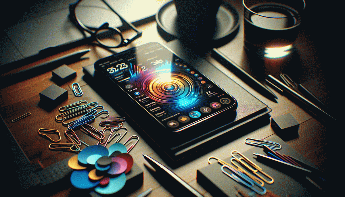
Think of color as your thumbnail's megaphone: the right pair interrupts a thumb mid-scroll without needing a perfect photo. In 2025 that's happening with bold duos and high-contrast gradients—pairs like electric coral + teal, neon lime + charcoal, or magenta + cyan that read instantly at tiny sizes. These combinations feel modern because they push saturation and value apart, forcing the eye to land and linger.
Make it actionable: use a dominant color + one accent and stick to a 60/30/10 rule for hierarchy. For gradients, pick an angle that follows viewer focus (diagonal or bottom-left to top-right) and add a subtle midstop to avoid harsh banding. Overlay your copy on a 20–40% desaturated strip or soft vignette so headlines stay legible in feed previews.
Don't forget motion and texture: a slow gradient drift, a micro-glow behind text, or a faint noise layer turns static duos into living visuals without stealing brand clarity. Always test at thumbnail scale—what looks balanced at 1080px can collapse at 120px. Run a grayscale test to catch accidental low-contrast combos and aim for WCAG-friendly contrast for readable CTAs.
Quick checklist before you publish: A/B two color treatments, export 3 thumbnail sizes, save brand-safe swatches, and create a muted version for long-form posts. Nail these bold duos and high-contrast gradients once, and you'll get a lot more seconds of attention—and a lot less scroll inertia—across feeds.
Lo fi wins: human first visuals that beat polished studio shoots
Forget glossy perfection — people now prefer textures, flaws and a face they could bump into at a coffee shop. Lo-fi visuals read as permission: lower production equals higher trust. A shaky crop, a backlit silhouette or a real laugh signals human authorship and makes viewers linger, react and share. That rawness builds personality and lowers the psychological cost of engagement, so audiences opt in more readily.
Make lo-fi work without looking lazy. Focus on gesture, eye contact and context over flawless retouching; let ambient noise and natural light do the heavy lifting. Frame close, keep subtle movement, and name the moment so the viewer feels invited. Try these quick setups to get authentic content fast:
- Raw: Shoot vertical on a phone, keep one unedited take, publish the behind-the-scenes version as an insight not an ad.
- Persona: Feature a named team member telling a tiny story in ten seconds; familiar faces build trust faster than logos.
- Timing: Post within hours of creation to catch trend momentum and the conversational spike that fuels virality.
Algorithms and people both reward content that invites a response. Lo-fi assets are cheaper, faster to A/B test, and far easier to repurpose into shorts, stories and community posts. Younger audiences prize process over polish, so a candid frame becomes a neon sign in a sea of studio-perfect images. Start small: batch ten real takes, pick two winners, track engagement at 24 and 72 hours, then double down on the formats that spark conversation. Think of lo-fi as a creative discipline — when authenticity is the currency, imperfect content pays dividends.
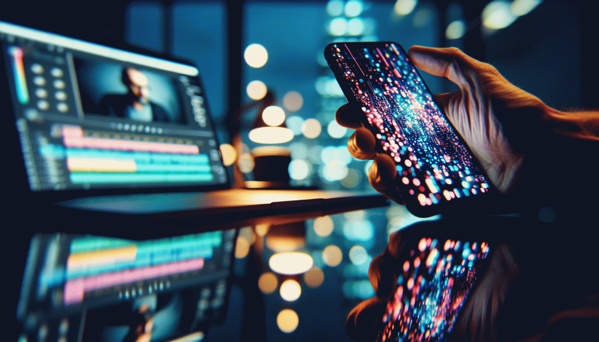
Text on video that hooks in 2 seconds: captions, kinetic type, smart framing
In a feed-full world, you have two seconds to turn a skim into a swipe-stopping stare. Make every millisecond count by treating captions like the headline of a tiny billboard: bold, unambiguous, and emotionally tuned. Aim for a single idea per frame so viewers instantly get the payoff and keep watching past the first beat.
Captions should be more than transcription. Use punchy verbs, numbers, and a hook up front — think "2 hacks" or "Stop wasting X." Keep line length short, contrast high, and font weight heavy so captions read at a glance on small screens. Time them to enter before the sound cue so silent scrollers are accounted for.
Kinetic type is your secret sauce: animate single words to mirror rhythm, not to distract. Favor simple movements — pop, slide, or scale — and match motion to audio accents. Use consistent easing and avoid long motion trails; micro-animations should clarify, not compete. Reserve flashy transitions for key reveals to create visual peaks viewers remember.
Smart framing ties captions and kinetic type together. Respect safe zones, track faces so text never covers eyes, and design for vertical crops first. When staging scenes, place your message where platform UI will not obscure it. If you want inspiration on scaling these tactics to platform-specific campaigns, see instant YouTube growth boost.
Actionable mini-checklist: 1) Draft a 3-word hook for the first frame. 2) Test caption size at thumb scale. 3) Animate one bold word per beat. 4) Keep CTAs visible within the safe zone. Iterate with quick A/B clips and steal what works — fast, cheerful, and unapologetically readable.
Meme native branding: ride trends without looking like a try hard
Memes aren't marketing props; they're language. When a trend peaks, brands that win speak the dialect of the platform—its cadence, crop, and sticker etiquette—so their posts feel like contributions, not billboard interruptions. The secret is to behave like a participant: reuse the joke's rules, keep the punchline lean, and let the format do the heavy lifting. Over-branding or over-explaining breaks the spell; subtlety is your friend.
Start with three rules: native form, brand POV, and microscale testing. Native form means matching aspect ratios, framing, and sound cues people expect. Brand POV is a single, repeatable take you can own across variants. Microscale testing means one caption, two visuals, watch reactions—scale what lands, kill what feels forced. Timing matters more than polish; meme currency decays fast.
Practical workflow: monitor trends in the morning, prototype by midday, publish light versions to Stories or ephemeral channels, then amplify winners to main feed. Build modular assets—templates that swap in copy and faces—so you can jump into a trend without redesigning from scratch. Partner with creators who already 'get' the joke; their authenticity converts faster than any produced ad. Ship small, learn fast, and don't be afraid to retire a concept the community has outgrown.
Finally, set simple guardrails: no long monologues, no logo bombs, and no forced calls-to-action. Measure with the metrics that matter for memes—shares, comments, saves, and reaction velocity—rather than vanity view counts. If something makes the community laugh and tag a friend, you're doing it right; if people are explaining your post, pull it and iterate.
Carousel and collage comeback: pack story, proof, and CTA into one swipe
Carousels and collages are not retro fluff, they are the compact narrative engine every brand needs. Treat each swipe like a beat in a story: open with an irrepressible visual hook, move through proof points that remove doubt, and close with a clear button style CTA that feels earned, not shoved. Design with thumbs in mind so users can get the message in under five seconds per frame.
Keep layouts tight and sequence intentional. Lead with a promise, follow with one to three pieces of social proof or demonstration shots, then give a single, obvious next step. Use a consistent color lane and a bold type hierarchy so each card reads at a glance and stacks into a rhythm that encourages swiping instead of skipping.
- Hook: Use a curiosity line and arresting image to force the first swipe
- Proof: Show a mini case, testimonial quote, or before and after in one clean frame
- CTA: End with one action: Save, Shop, Book, or Visit link in bio
Copy formulas that work: Problem, three benefits or steps, single CTA. Run quick A B tests on first frame thumbnails and last frame verbs, then repurpose high performers into stories and short videos. Do that and your next swipe will be the one competitors wish they had.
Read also

Visual Trends in 2026: Steal the Viral Formula Social Feeds Crave

Visual Trends in 2026: Viral Visual Hacks Social Platforms Cannot Resist

Visual Trends in 2026: The Viral Secrets Dominating Your Feed

Steal These Powerhouse Tools to Dominate Social Media in 2026 (Before Your Competitors Do)
What Hooks Actually Work in 2026? Steal These Scroll-Stoppers Before Your Competitors Do