Visual Trends 2025: Swipe-Stopping Secrets Behind What Actually Goes Viral
From Glossy to Gritty: Why imperfect visuals beat studio polish
Brands used to chase the flawless, glossy ad. Today audiences stop for texture: smudged glass, shaky frames, background laughter. Imperfection reads as human, and human equals trust. Swap one perfectly lit hero shot for a five-second clip with a stray cat and a crooked shelf and watch engagement climb — relatability triggers taps far faster than polish ever did.
Practical move: film in motion, let the phone camera breathe, and keep edits raw — quick cuts, imperfect color, honest captions. If you need early reach to test gritty variants, consider a small boost to get that first wave of views: buy instant real YouTube views. Use the resulting signal to decide which rough cut deserves refinement.
The secret is cognitive: rough edges break the pattern of perfection people scroll past. A finger in frame or an un-staged laugh creates curiosity, perceived authenticity, and a feeling that content was made for people like the viewer. Treat studio polish as an occasional finish, not the baseline; authenticity scales attention, and attention is the currency.
Quick checklist to experiment: shoot vertical handheld for 10–20 seconds, lean into ambient light and lens flare, keep at least one candid audio clip, avoid heavy smoothing filters, publish three micro-variants and let the best-performing one earn the edit budget. Think gritty, iterate fast, and let realness do the heavy lifting.
Hook in 1.5 Seconds: Text overlays, bold captions, and thumb-stopping first frames
You've got roughly 1.5 seconds to arrest a scroller's attention—so make that opening frame earn its keep. Treat the first still like a headline: bright contrast, a single dominant subject, and a visual promise that answers the unspoken question "what's in it for me?" Skip the logo and zap curiosity immediately.
Text overlays are your fast lane. Use three to six punchy words, bold type, and a high-contrast background block so captions stay legible at thumb-size. Favor active verbs over descriptions and stick to one font family with heavy weight for emphasis. Place copy in the safe zone and align it with motion to create a natural reading path.
Bold captions do heavy lifting when sound is off: lead with emotion, a curiosity hook, or a surprising stat and let one line steal the scene. Avoid full sentences—think instant headlines that pair with the image. Test a single emoji as a visual anchor; it can increase scannability but turns flimsy if overused.
For thumb-stopping first frames, prioritize faces, direct eye contact, and asymmetry—humans notice faces before fonts. Suggest motion with a pose, leading lines, or tilted crops, and use negative space to make your subject pop. Swap muted backgrounds for a color punch and trim visual weight so viewers can parse intent in a blink.
Turn these ideas into experiments: A/B three lead frames, two overlay styles, and caption variants with and without numbers. Track retention at 1.5s and 3s, optimize for mute playback, and iterate rapidly. Bottom line: your opening 1.5 seconds should be loud, crystal clear, and impossible to scroll past.
Make It Memeable: Remix-friendly formats that travel fast across feeds
Make shareable content by designing for remix from day one: think templates, empty beats, and frames that invite edits. Start with a tiny, repeatable idea — a two-second visual hook or beat drop — and build layers people can swap out. The easier the edit, the faster it spreads.
Prioritize loopability and predictable structure. Lead with a recognizable first frame, keep clips 4–12 seconds, and use a looping ending that makes your content feel infinite. Offer an original sound bite with a clear fill-in moment so creators can drop their punchline without hunting for timing.
Give creators ready-to-use assets: transparent PNG stickers, captioned starter frames, and an editable project file or template. Use bold, high-contrast elements and large type so text survives tiny phone screens. Export versions in vertical and square crops so remixes don't require weird re-editing.
Seed the remix ecosystem with smart CTAs: a cheeky prompt, an easy-to-copy caption, or a hashtag challenge that reduces decision fatigue. Launch with a few creator examples (your staff or micro-influencers) so others can mimic format and feel safe riffing. Reward the best remixes with features — social currency travels fast.
Measure virality by tracking remixes, audio uses, and reshares rather than raw likes. Build a tiny playbook: one reusable template, one signature sound, one measurable CTA. Iterate weekly; when a format breathes, scale it. Memeable content isn't random — it's repeatable design with an invitation.
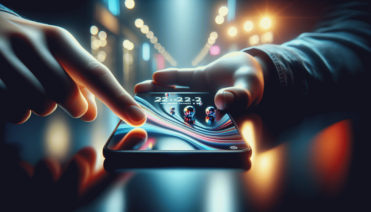
Color That Clicks: Dopamine palettes, duotones, and motion that magnetizes
Think of color as an instant scroll‑stopper—tiny shocks your audience's brain reads as rewards. Today that means dopamine palettes: high‑saturation pops tempered by neutral anchors, duotones that simplify complex imagery, and motion that magnetizes without annoying. These are the visual levers that actually get people to stop, tap and forward.
Build a dopamine palette by choosing one hyper‑saturated "payoff" color, two mid‑tone supports and a grounded neutral. Try saturation near 90–100% for the payoff and 30–60% for supports; aim for a 60/30/10 balance so the bright color hits like a notification. If in doubt, nudge saturation down on text blocks to keep legibility, and always test contrast for common forms of color blindness.
Duotones translate busy photography into shorthand emotion. Pair a warm hue with a cool one—think magenta + teal or amber + indigo—and use graded blends or screen/multiply layers. Keep highlights and shadows readable, export a static fallback for platforms that strip blended layers, and remember duotones create flexible brand moods you can swap seasonally.
Add motion with intent: a 150–600ms micro‑interaction to draw the eye, looping subtle parallax for depth, or animated duotone reveals that change on hover or tap. Favor lightweight formats (looped MP4 or optimized APNG/WebP), trim frames to keep load times down, and avoid flashing high‑contrast strobe effects that hurt accessibility.
Ship with a two‑step experiment: thumbnail A uses full saturation + motion, B tones it down; measure clicks, watch time and shares. Iterate fast, lock in a signature palette, make it your fingerprint across captions and end cards, and you'll turn curious scrollers into repeat visitors.
AI as Your Co-Creator: Prompt-to-post workflows for endless variations
Think of AI as the colleague who never sleeps and loves exploring tiny visual riff variations. Start with a seed prompt that describes mood, palette, and focal object, then spin parameters like aspect ratio, camera distance, and motion blur. The goal is not one perfect post but a handful of swipe-stopping options that feed rapid testing and trend-hopping.
Turn prompts into a simple pipeline: write a base prompt, create 8 modifiers for style and emotion, and batch-render snapshots at three aspect ratios. Swap one token per batch to isolate impact. Use short negative cues to prevent unwanted elements. Automate naming so every output links back to the exact prompt used for quick iteration.
Scale across formats by templating the highest-performing frames: crop for reels, extract a hero frame for thumbnails, and export a looped snippet for Stories. Keep a brand layer file with approved fonts and color hexes that gets composited after generation. Human review stays essential for voice and legal checks, so schedule rapid approvals and a final polish pass.
Try this mini checklist before you publish: Test: three variants per asset, Measure: CTR and watch time, Refine: mutate winning prompts by 10 to 20 percent. Repeat weekly to ride microtrends. With a tidy prompt-to-post workflow, creativity expands while the guesswork shrinks.
Read also

Visual Trends in 2026: The Eye-Popping Secrets Behind What Actually Goes Viral

Visual Trends in 2026: The Shockingly Simple Secrets Behind What Goes Viral on Social Platforms

Visual Trends in 2026: What Actually Goes Viral on Social Platforms (and How to Ride the Wave)

Visual Trends 2026: What Actually Goes Viral on Social Platforms

Visual Trends in 2026: What Goes Viral on Social Platforms (and How to Hijack It)