These 2025 Visual Trends Are About to Hijack Your Feed
From Beige to Bold: Color Stories That Trigger Instant Saves
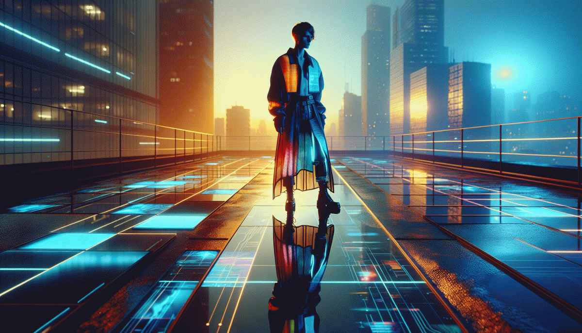
Color used to be background noise; now it is the headline. Audiences save posts when a palette tells a micro story in a glance — a mood, a promise, a feeling of urgency. Move past beige and safe neutrals toward color narratives that pair one dominant hue with two supporting accents. The trick is contrast and simplicity: a clear focal point plus a chromatic hook.
Make a quick recipe for saveable content: pick a hero color, assign a purpose to each supporting shade, and limit type palettes so composition reads instantly on mobile. Use high-contrast callouts and small bursts of neon to direct the eye. Test animated gradients for looped video thumbnails; motion plus bold color increases bookmark likelihood. Keep captions tight and let color carry the narrative.
Trend combos to try include saturated pastels with a single neon accent, deep earthy jewel tones punctuated by sunlit orange, and muted beige bases with one saturated pop to shock the scroll. Pair texture with flat color to create a tactile feel on screen. For brand grids, build rows with consistent accent placement so each tile reads as part of a larger palette.
Ready to make saves spike? Start by posting three color variants, track saves per design, then scale the winner. If you want a shortcut to more eyeballs while you test palettes, consider a supportive promo like cheap Instagram boosting service to amplify early traction. Then double down on what the data prefers and turn those saves into repeat viewers.
Lo-Fi Looks, High Shares: Why Imperfect Wins on Instagram
Think grainy phone videos and crooked framing are design crimes? Think again. Instagram's current mood rewards work that looks like someone living a life, not staging one—thumb-sticky loops, quick edits and candid light. Those little flaws feel human, and humans are what drive comments, saves and follows.
Why does it work? Imperfection signals truth: raw lighting, imperfect edits and offbeat sound choices lower the barrier for viewers to relate and respond. When people see an approachable creator, they're more likely to drop a tag, save for later or share with a friend — all the signals the platform's algorithm eats for breakfast.
Try three micro-strategies to lean in:
- Production: Favor handheld shots and natural light over studio polish; authenticity trumps slickness.
- Pacing: Short, uneven cuts keep attention—stutter edits and breathing room feel conversational.
- Personality: Let quirks lead. A little awkward laugh or quick off-script line invites engagement.
Put a rule in your calendar: publish two candid posts for every high-gloss story. Use captions that ask tiny questions, add an honest emoji, and pin the most human comment—these moves make the lo-fi vibe clickable and repeatable.
In short: trade perfect pixels for permission to be real, run A/B tests, and watch imperfect content collect surprisingly perfect shares.
Text-on-Video Is Back: Captions, Kinetic Type, and Micro-Memes
Text on video is back because feeds are noisy and attention spans are thin. Captions, kinetic type, and micro memes give viewers an instant hook so content works with or without sound. The trick is to use text as a signal, not decoration, so every line answers Why watch.
Start with captions that respect scanning behavior. Limit lines to two on small screens, use sentence case for speed, and size type to cover roughly 12 to 16 percent of frame height for readability. Sync text bursts to mouth movement or music hits, and favor contrast plus soft shadow rather than heavy outlines to keep text legible across devices.
When you animate type, be surgical. Animate entrance, hold for a readable pause, then exit. Use easing to avoid jitter, keep durations tight around 300 to 600 ms per phrase depending on complexity, and pair one display font with a neutral companion to maintain hierarchy. Less is more when motion competes with imagery.
Micro memes live in remix culture. Create a repeatable visual hook, layer a crisp caption, and leave negative space for reactions and stickers. Run quick A B tests on phrasing, timing, and punch line placement. Fast iterations reveal which tiny idea will scale into a trend.
- Captions: Auto generate then quickly edit for tone and timing so text feels native.
- Pacing: Match read speed to emotion; slower for nuance, faster for comedy.
- Templates: Build three reusable frames to iterate rapidly and invite remixes.
Dupe the Algorithm: Thumbnail Tricks That Boost Click-Throughs
Thumbnails are the micro billboards of 2025: tiny, noisy, and judged in a blink. With feeds favoring bold visual shorthand, the goal is not to show everything but to promise one irresistible thing. Favor high contrast palettes, a single clear focal point, and exaggerated human expression so the image still reads when it is the size of a postage stamp. Compose for three crops at once — square, vertical, and the cruel one where half the top is chopped off — so no key element gets lost to a rogue UI.
Make typography do heavy lifting: one punchy word or short phrase in heavy weight, a drop shadow or stroke for legibility, and negative space that gives the eye somewhere to land. Use a face when possible; eyes drive attention. Add micro cues like badges, motion streaks, or faux app chrome to mimic platform affordances and tap into learned attention patterns. Ship A/B buckets of three variants and let real CTRs decide which visual grammar wins.
- Contrast: Maximize tonal difference so thumbnails pop on any background.
- Face: Tight crop, clear gaze, amplified expression to boost engagement.
- Tease: One short hook word that creates a curiosity gap without lying.
Track performance with simple metrics: measure CTR uplift versus your baseline, not vanity impressions, and swap out the losing art after two days. Keep a templated asset library so you can iterate fast and stay on brand while chasing trends. Think like a tiny billboard designer with a scientist on the back end: make bold bets, measure ruthlessly, and scale what moves the needle.
AI-Generated Aesthetics: How to Use Them Without Looking Like a Bot
AI-generated visuals can feel like a glossy robot takeover, but the secret trick is making them imperfectly human. Start by blending a real photo with an AI-generated background, add subtle film grain, slightly off-center framing, or a stray shadow — those tiny "flaws" signal craft. Resist the urge to spam prompts with "ultra-detailed" or "hyperreal"; restraint keeps images relatable and thumb-stopping.
Write prompts like a photographer, not a machine. Include camera type, lens, time of day and a human emotion (for example: shot on 35mm, golden hour, candid laugh). Seed your prompt with brand colors and a short shot list, then lock those elements when regenerating. Save prompts as templates and tweak one variable at a time so you can measure what actually improves engagement.
Composition and consistency matter more than pure photorealism. Pick a limited palette, repeat a signature typographic treatment, and keep consistent crop ratios so your feed reads as a series. Produce 3–5 variations and pick the one with the most believable interaction between subject and environment. Run quick A/B tests in a small audience before scaling to avoid mass-producing sterile content.
Finally, be transparent and add a human edit pass. Credit the tools used, avoid deepfake-style deception, and consider a light watermark or a small caption like AI-assisted to keep trust intact. Treat AI as a creative assistant — not a replacement — and you'll get visuals that feel fresh, human, and oddly addictive.
Read also

Visual Trends in 2026: The Viral Secrets Dominating Your Feed

Visual Trends in 2026: Viral Visual Hacks Social Platforms Cannot Resist
Steal Back Your Day: Automate These Marketing Moves—But Don't Outsource Your Voice

Visual Trends in 2026: What Goes Viral on Social Platforms (and How to Hijack It)

Campaign Burnout? Steal These No Rebuild Moves to Wake Your Metrics Up
