The One Thing That Drives Clicks on YouTube? Your Thumbnail—Here's the Cheat Code
Why Thumbnails Beat Titles: The 0.5-Second Decision Window
Your brain makes a split second call — roughly 0.5 seconds — to decide if a thumbnail is worth a click. Visual processing is orders of magnitude faster than reading, so an image that signals emotion, benefit, or mystery will trigger attention before a clever title gets read. In practice that means thumbnails own the first impression and win the click race.
- Contrast: High contrast and bold colors stop the scroll and make small images readable on mobile.
- Emotion: Faces with exaggerated expressions or clear actions create instant curiosity and trust.
- Text: Keep micro copy to three words max; use ultra bold type so the message reads at a glance.
Treat thumbnails like ad creatives and run rapid A/B tests. Swap background color, face crop, or micro copy and track CTR across 24 to 72 hour windows. Small visual moves can lift CTR by double digits. If you want a fast way to scale thumbnail experiments try YouTube marketing services that include thumbnail tests and CTR reporting.
Actionable checklist: frame a single subject, boost contrast, dial up emotion, then iterate. Make thumbnail first, title second. When you design for that half second, titles become icing and thumbnails become the traffic engine.
Design the Stop-Scroll: Color, Contrast, and Curiosity
Thumbnails must stop the scroll in a single glance, and color is the fastest signal. Pick a 2–3 color palette that punches through YouTube dark mode: think saturated warm for subject, cool for background. Use one accent color for callouts. Keep text big, bold, and limited to 2–3 words so color does the heavy lifting. Contrast is not optional; it is the thumbnail language.
High contrast creates instant readability. Apply figure to ground: separate subject with edge contrast, a subtle stroke, or a small drop shadow to prevent mid tone blending with the player UI. Crop tight on faces or objects so the eye sees the subject first. If skin tones are similar to the background, change background hue instead of desaturating the subject.
Curiosity nudges a click when color and contrast have done their job. Show a partial reveal, freeze a reaction face, or overlay a bold number that promises value. Use verbs like See, Fix, How because action words read fast at thumbnail size. Avoid lying: tease a real pay off to protect retention and build long term channel trust.
Make this repeatable: build a template that locks in composition and type, then batch export four color variants and test which version moves CTR. Treat color as an experiment variable and keep a simple tracking sheet with clicks, impressions, and watch time. Swap one element at a time. Over weeks the best hues emerge, and your thumbnails will stop more thumbs while keeping viewers watching.
Face, Gaze, and Big Words: The Psychology That Hooks
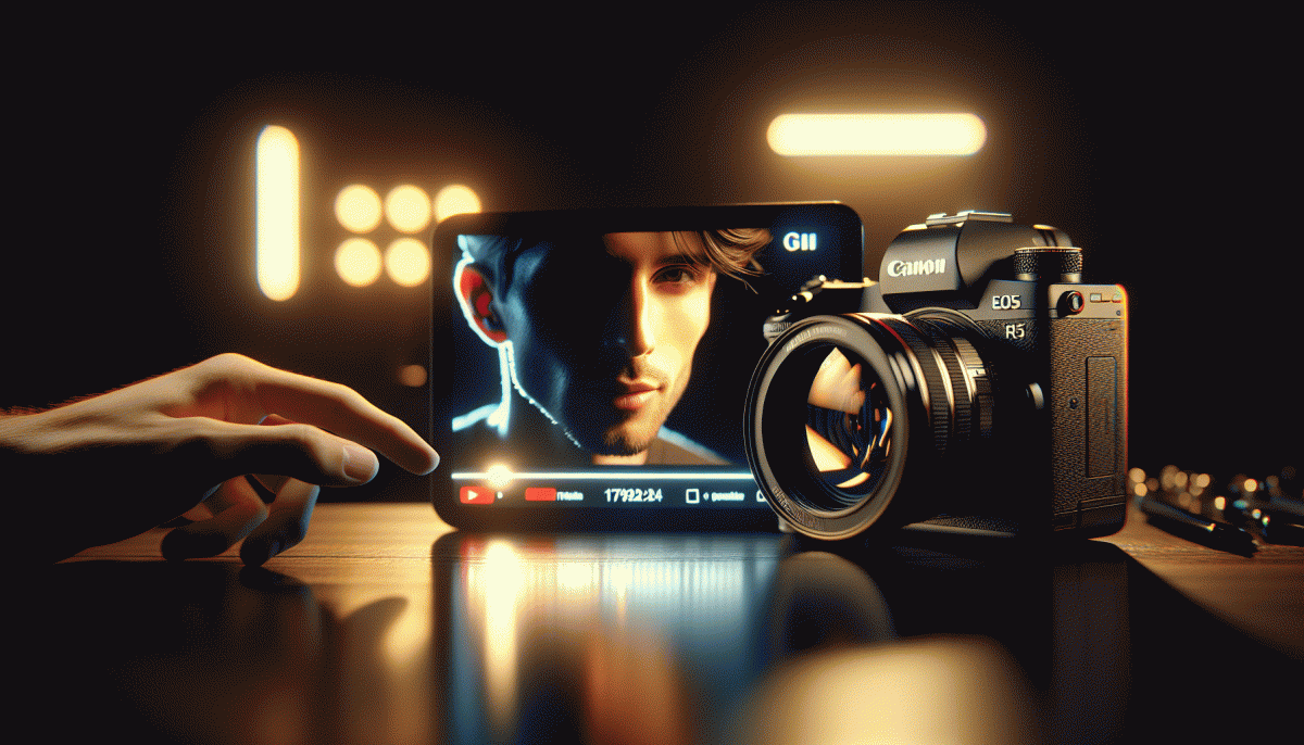
People spot faces faster than logos — it's hardwired. A close-up face in a thumbnail creates instant social proof: viewers see someone is human and pause. Make that pause count by showing real emotion; the brain prioritizes faces and will read any big, bold word next.
Eye direction is your secret pointer. If the subject looks at camera, the viewer feels addressed; if they look off-frame, curiosity pulls the eye toward whatever words or object you place there. Use gaze to lead viewers toward your headline or the action you want them to take.
Big words act like visual cymbals — short, punchy, emotionally loaded nouns work best. Keep it 2–4 words: Shock, Win Big, Don't Click — reverse psychology can work. Size, contrast, and simple fonts make that micro-message instantly readable on a phone.
A quick compositional checklist: crop tight on the face, keep one eye just off-center, boost contrast between skin and background, and drop a 3-word phrase in bold with 60-80% image opacity behind it. Test one change at a time and measure clicks.
- Gaze: Position eyes to guide attention toward text or logo
- Emotion: Choose an expression that matches the video's promise
- Words: Use 2–4 big, high-contrast words — readability beats cleverness
Steal This 3-Step Thumbnail Workflow (Template Included)
Stop guessing and start swiping: this compact, do-it-now workflow gives you a repeatable path from idea to exported PNG. In three tight moves you pick the winning angle, build the visual that forces a double-tap, and validate with a quick A/B. I even include a ready-to-copy template so you don’t reinvent the wheel — just swap the hero photo and export.
Step 1 — Pick the single promise: boil the video down to one emotional hook (shock, curiosity, relief). Spend 5 minutes scraping the top 10 thumbnails in your niche, then note the common elements: facial close-up vs. object, dominant color, and headline length. Create three micro-hypotheses (e.g., “big face + yellow border beats object + white”). Frame your shot using the rule of thirds so your subject sits on a power point.
Step 2 — Build for speed and clarity: open the template, drop in a 1280×720 hero image, remove the background, size the subject to ~60% of the frame, and add a 6–10px contrast stroke to separate it from busy backgrounds. Use a heavy sans for overlay text, limit to 1–3 words, and keep font sizing large enough to read on mobile. Apply a subtle vignette and an accent color that contrasts the thumbnail at thumb-scale.
Step 3 — Ship fast, test faster: export two variants (face vs no face, color A vs B), run each for 24–48 hours, then compare CTR and average view duration. Keep winning combos in your template folder; when you find a pattern, scale it into a series. The included template has labeled layers for hero, stroke, text, and accents — duplicate, swap, and export.
Measure What Matters: CTR Benchmarks and A/B Tests You Can Run Today
Clicks are the currency of discovery, and CTR is the clearest early indicator that your thumbnail is doing its job. Start by grouping videos by format (how-to, listicle, vlog) and record a baseline CTR for each group so any change has context. A single percentage point means nothing without the story behind impressions and audience source.
For quick reference, many channels see baseline CTRs in the 2–6% band; well-optimized thumbnails commonly land in the 6–12% range; breakout thumbnails can exceed 12% on a hit. Use those bands as directional benchmarks, and expect variation by niche, audience size, and traffic source.
Design A/B tests that isolate one element at a time: face versus no face, bold text versus no text, close-up versus wide shot. If you have access to A/B tools like TubeBuddy or VidIQ use them; if not, rotate variants for equal time windows and similar traffic days. Run each variant long enough to collect several hundred impressions, typically 7 to 14 days depending on view velocity.
Track CTR lift plus early retention (first 15–30 seconds) and view velocity. Ask two questions before declaring a winner: does CTR improve meaningfully, and does the audience stick around? If CTR rises but retention collapses, the thumbnail may be misleading and will hurt long term performance.
- Quick Win: Increase contrast and test a one-word hook on the thumbnail.
- Audience Check: Compare CTR by traffic source to spot where the thumbnail over- or under-performs.
- Scale: Roll a validated winner to similar videos and monitor for consistent uplift.
Read also

The One Thing That Drives Clicks on YouTube (Hint: Your Thumbnail Rules the Game)

The One Thing That Drives Clicks on YouTube (Spoiler: It's Not Your Video)

The One Thing That Drives Clicks on YouTube (You're Probably Ignoring It)

I Tested 97 Posts—Here Is the One Thing That Actually Drives Clicks on LinkedIn

The One Thing That Drives Clicks on YouTube (No, Not the Algorithm)
