The One Thing That Drives Clicks on YouTube (No, It's Not What You Think)
Spoiler: It's Your Thumbnail—Here's Why It Wins the Click
Think of your thumbnail as a tiny billboard facing a traffic jam of videos. In a single glance people decide whether to click or swipe, so design for split second brains and instant curiosity. A thumbnail that tells a clear story outruns a clever title because vision is faster than reading. Make the image answer the question: what will I get if I click?
Keep it bold and legible on mobile: tight close ups, expressive faces, and one short block of text (two to three words) that amplifies the emotion. Use high contrast, saturated colors, and simple composition so icons and small screens do not erase your message. Avoid clutter; negative space is your friend because it directs the eye to the focal point.
Make variations and test. Upload a few thumbnail options, track CTR by audience and video theme, then double down on winners. Small percentage gains compound: a ten percent lift on evergreen content can mean thousands more views over months. Use consistent visual language so subscribers recognize your videos at a glance and new viewers learn your vibe faster.
Create a thumbnail template, save presets, and treat every frame like a headline edit. Resist cheap clickbait since promises must match the video or retention will tank. The equation is simple: better thumbnails equals more clicks equals more ranking signals equals more reach. Start iterating this week and watch how tiny design choices change channel performance.
The Curiosity Gap Formula: One Image, One Promise, Zero Confusion
Think of the curiosity gap like a well-timed joke: give just enough detail to make the mind lean in, but not so much that it finishes the punchline. In thumbnail language that means one bold image, one clear promise, and zero competing clues. The single image should telegraph the outcome — a before/after, an expressive face, a crisp object — while the promise in the title does the heavy lifting of desire.
Start by choosing the one thing you want viewers to care about: faster results, a surprising hack, or a flipped mindset. Design the image to raise a question: what happened here? Avoid tiny text, cluttered overlays, or two competing subjects. If you want to amplify reach beyond YouTube try Instagram boosting as a traffic multiplier, but do not break congruence between thumbnail and video.
Treat the thumbnail as a promise card. Show outcome, not process. Faces with intense emotion, a single prop placed off-center, or a dramatic crop create a visual cliffhanger. Keep color contrast high and borders minimal so the image reads even at tiny sizes. Then pair it with a title that answers the question the image asks — that is the secret to turning looks into clicks.
A fast checklist: pick one promise and write it in a tight clause, craft an image that raises exactly one question, remove anything that distracts, and test two variants for a week. Track CTR, watch retention for mismatch, and iterate. Small, repeated tweaks to this formula often beat big creative swings. Make curiosity your system, not your accident.
Faces, Bold Words, and Contrast: The CTR Trifecta
Thumbnails that actually pull a click rely on three primitive visual hooks working together: a human face, bold microcopy, and strong contrast. Faces signal social relevance, bold words promise a quick payoff, and contrast guarantees legibility when the image is shrunk to mobile size. Think of the thumbnail as a microbillboard that must communicate in a blink.
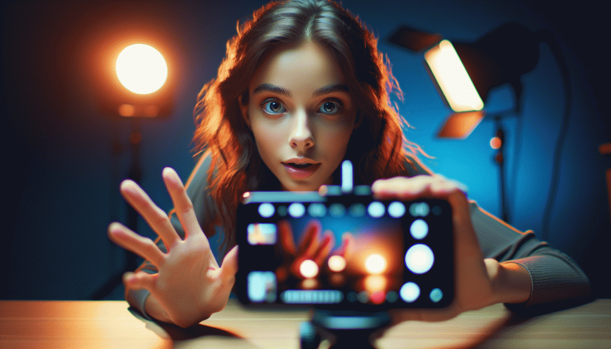
For faces, go tight. Aim for the head to fill roughly 40 to 60 percent of the frame so expression reads even at 200 pixels wide. Choose an expression that matches the emotional promise of the video, and use gaze or a pointing hand to direct attention toward the text or product. Avoid distant portraits and complex backgrounds that compete with the face.
Text is a headline, not an essay. Limit yourself to two to four words, favor verbs or numbers, and use heavyweight, condensed typefaces for instant impact. Add a one to three pixel stroke or a thin drop shadow to separate letters from busy imagery. Uppercase is fine for emphasis but balance it with rhythm so the copy does not become visual noise.
Three micro habits to adopt right now:
- Face: Close crop, readable expression, and directional gaze.
- Hook: 2--4 big words that promise value or curiosity.
- Contrast: Strong foreground/background difference, solid color blocks, or a silhouette behind the subject.
Make changes one variable at a time and track CTR. Swap the face, then the text, then the palette to learn what moves your audience. Small, repeatable wins on thumbnails often drive more views than chasing algorithmic hacks, so iterate fast and keep what converts.
Pairing Titles with Thumbnails: Hooks That Stop the Scroll
Think of the thumbnail and the title as a short play. The thumbnail is your one second of stage presence; make it loud, legible, and slightly mysterious so the thumb stops. The title is the second act that rewards that curiosity with a promise the viewer can understand in a blink. When those two acts agree, you do not merely earn a view, you earn attention that can turn into watch time.
Design experiments around three quick signals that human eyeballs read before they parse words. Keep these visual hooks bold and consistent so your channel develops a recognizable rhythm:
- Offer: Show the payoff visually; a split before and after, a clear product, or a number that signals value.
- Action: Use motion cues or cropped gestures to imply movement and urgency without clutter.
- Emotion: Faces, contrast, and a single strong color make feelings read instantly on small screens.
Match the title to the thumbnail by finishing the story the image starts. If the thumbnail teases a transformation, the title should specify the angle: speed, cost, or result. For more structural ideas and to explore how pairing affects growth across platforms, check out best Instagram boosting service for inspiration on visual-first messaging.
Finally, treat pairing like an experiment. Swap text sizes, test curiosity versus clarity, and track clickthrough versus retention. A thumbnail that stops the scroll plus a title that keeps a promise is your fastest route from view to engaged viewer.
A/B Testing on YouTube: Fast Experiments, Faster Clicks
Think of A/B testing as your channel's quick-fire laboratory: tiny, controlled experiments that reveal what actually makes people click. Instead of waiting for a single viral swing, you run short bets on thumbnails, titles, and opening frames, gather real viewer behavior, and let the data do the heavy lifting. It's not magic—just faster feedback loops that turn guesswork into reliable wins.
Start small and ruthless: change only one variable per test. Swap a thumbnail color, try a title with a question versus a statement, or test a direct face shot against an abstract image. Launch both versions simultaneously to comparable audiences, then watch impressions and clicks. If you're running multiple tests, keep a spreadsheet so you don't accidentally compare apples to spaceships.
Measure the right things. Click-through rate is the gatekeeper—if nobody clicks, nothing else matters—yet watch time, average view duration, and subscriber conversion tell the rest of the story. A spike in CTR with a crash in retention is usually thin clickbait; a modest CTR rise with better retention is a true winner because it signals satisfied viewers and better long-term reach.
Move quickly when you get a signal. Kill clear losers, double down on winners, and iterate with micro-variations: tweak copy, color, or face angle rather than reinventing the wheel each time. Make a habit of running one small experiment per week so you accumulate reliable patterns: which fonts pop, which thumbnail poses outperform, which verbs in titles trigger curiosity.
Finally, treat testing as creative work, not a chore. Keep hypotheses short, log results, and turn consistent winners into templates for future uploads. If you build discipline around tiny experiments, clicks stop being mysterious and start being repeatable—one smart tweak at a time.
Read also

The One Thing That Drives Clicks on YouTube (Spoiler: It's Not Your Video)

The One Thing That Drives Clicks on YouTube (You're Probably Ignoring It)

The One Thing That Drives Clicks on YouTube (No, Not the Algorithm)

The One Thing That Drives Clicks on YouTube (Hint: Your Thumbnail Rules the Game)

The One Thing That Drives Clicks on LinkedIn (You're Probably Ignoring It)
