The 2026 Visual Trends Everyone Will Copy — Here's What Actually Goes Viral
Lo-Fi, High Trust: Why Unpolished Visuals Win This Year
Think of polished campaigns as stage makeup — perfect from ten feet away, questionable up close. This year, audiences reward the opposite: rough edges, shaky frames, and visible edits feel human. Lo-fi visuals cut through ad fatigue because they look like something a friend would send, not a rehearsed commercial read.
Why? Imperfection signals honesty. A blown-out exposure, an accidental zoom or a grainy clip lowers viewers' defenses and invites curiosity. Native, unfiltered posts also tend to spark faster engagement — the very signals platforms use to decide what to show more people — so authenticity becomes a growth lever, not just an aesthetic choice.
Make it work: use your phone, shoot vertical, embrace natural light, and keep clips short. Prioritize relatable moments over slick storytelling: a real reaction, a candid blooper, or a quick fix. Add bold captions for sound-off viewers and lean into raw audio instead of overproducing every track.
Flip examples into formats: turn product demos into candid "oops and then" moments, surface customer clips as social proof, and let creators stitch genuine reactions instead of scripting perfect replies. Often the simplest reply video or behind-the-scenes cut gets more traction than a fully polished promo.
Treat lo-fi as an experiment: A/B test raw versus produced creative and watch watch-through, comment sentiment, and share rate. Scale templates that earn real engagement, iterate fast, and enjoy lower production cost — you'll be making more content that feels earned, and that's the currency of virality in 2026.
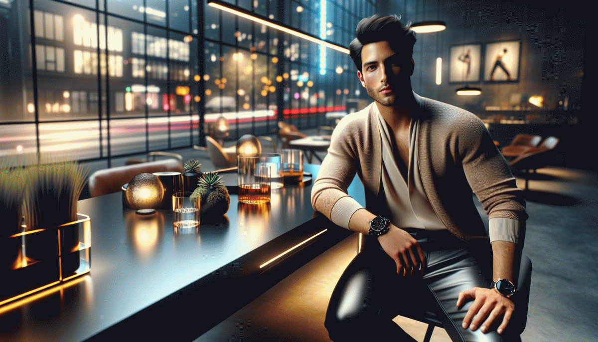
AI as Your Art Director: Get Human-Looking Results From Machine-Made Ideas
Think of an AI as a wildly efficient art director that never sleeps: it will serve up dozens of bold concepts in minutes, but it is your eye that makes them sing. To keep results human-looking, give the model limits—mood, focal point, and one deliberate imperfection that signals authenticity.
Start with a micro-brief: three adjectives, one lighting reference, one camera angle, and an emotion. Seed the model with a single real photo or a tiny moodboard so outputs inherit a consistent texture. Ask for subtle inconsistencies like slightly asymmetrical hair, imperfect shadows, or a lived-in backdrop to avoid that uncanny, over-perfect sheen.
Once the image arrives, treat it like a raw file. Adjust color temperature, nudge composition, and add tactile layers—grain, edge wear, or a shadow grab from a real prop. Swap in real typography and hand-tune the kerning. These micro-edits are what make algorithmic ideas feel like human-made stories.
Turn ideas into performance by batching variations and running quick platform tests: crop differently for square versus vertical feeds, raise contrast for tiny thumbnails, soften texture for long-form video. When you need a quick boost to reach actual people, consider buy instant real Instagram views to validate which art director concepts resonate.
The trick is not to trust the machine blindly but to be ruthlessly playful with its output. Use AI to expand your imagination, and your edits to prove you still have taste. That mix is what goes viral.
Color That Clicks: Neon Pops Meet Warm Neutrals
In a feed saturated with polished flat color, the visual trick that actually stops thumbs is contrast with warmth. Bright neons act like tiny spotlights, cutting through noise, while warm neutrals lend a lived in, tactile anchor. Together they deliver the best of both extremes: high energy that does not scream, and familiarity that invites a tap. Use neon as punctuation and neutral as narrative and you have a composition that feels both fresh and trustworthy.
Start with a three color rule: one neon, one warm neutral, and one muted accent. Try electric melon paired with toasted almond, and a cool gray as buffer. Give neon 10 to 20 percent of real estate for maximum pop without fatigue. In photography, let neon appear on edges, reflections, or micro props while skin tones and fabrics sit in warm neutrals. Textures like raw paper, wool, and soft grain keep the neon from feeling clinical.
On thumbnails and cover images, outline a subject in neon to lift it from a neutral backdrop. For motion, animate neon at micro beats to create rhythmic eye cues. In UI, reserve neon for CTAs and status indicators but test contrast to keep accessibility intact. Platforms that favor scroll speed reward high contrast reads, while slower platforms let you indulge longer ambient gradients. Tailor intensity to platform speed and audience expectation.
Experiment with A B tests that vary neon hue, size, and placement rather than overall palette. Shoot a variant where neon is foreground accessory and one where it is reflected in glass. Measure clicks, watch time, and micro engagements like saves or repeat views. If a neon accent consistently lifts a metric by a few points, scale it into templates. The result is a repeatable, viral ready look that grabs attention without losing human warmth.
Kinetic Type, Snappy Cuts: Motion That Stops the Scroll
Make your words move like they have someplace urgent to be. Kinetic type is not fancy typography for the sake of looking clever; it is a tiny performance that must announce meaning in an instant. Use bold, single-word punches that enter with velocity and exit before attention fatigues. Pair those hits with snappy cuts that accentuate motion rather than drown it: think stop-action clarity, not a blur of effects.
- Timing: Keep motion bursts under one second so viewers perceive a single, memorable beat.
- Pacing: Cut on movement peaks to create satisfying rhythm and avoid visual stutter.
- Clarity: One readable word per frame gives viewers an onramp to your message without asking them to work.
Want to test these ideas on a larger audience fast? Try an audience boost and watch how slight timing tweaks change engagement. best Twitter boosting service
Action plan: storyboard three micro-variants (bold-entry, delayed-exit, bounce-ease), run a quick A/B across 1–3 days, and keep the winner under two edits. Motion that stops the scroll does not need miracles—just ruthlessly clear intent, a tight cut, and a readable headline that hits like a wink.
Nostalgia Sells: Y2K, Analog Grain, and Cozy Core Comebacks
We're entering an era where memory is a design weapon: sentimental visuals cut through noise because they're instantly relatable, snackable, and algorithm-friendly. Nostalgic cues trigger dopamine, but the trick is to remix, not copy — serve familiarity with a modern twist and watch engagement climb.
Think in textures, not just motifs. Y2K returns as glossy gradients, chrome buttons, bubble typography and playful UI micro-interactions. Analog grain shows up as filmic overlays, light leaks and imperfect polaroids. Cozy core lives in warm color temperatures, knit textures, home vignettes and candid close-ups that feel lived-in.
Practical moves: layer subtle film grain and dust over high-res shots, add a 2000s-style button as a playful CTA, or crop images to intimate 4:5 ratios. Caption with a one-line nostalgia hook like "remember when..." to invite comments. Keep edits imperfect — little scars and smudges read authentic, not lazy.
Format to platform: short looping reels and vertical stories win on video-first feeds, tactile carousels and mood boards convert on Pinterest, polished process case studies thrive on Dribbble, and candid home scenes score on Instagram and Letterboxd. Cross-post, but always tweak natively for each audience.
Quick checklist: 1) remix references, 2) prioritize texture, 3) optimize format, 4) write nostalgic microcopy. Do not overdo pastiche — aim for a wink, not parody. Most importantly, be playful: nostalgia sells best when it feels like a cozy invitation, not a museum exhibit.
Read also

Visual Trends in 2026: What Actually Goes Viral on Social Platforms (and How to Ride the Wave)

Visual Trends in 2026: The Eye-Popping Secrets Behind What Actually Goes Viral

Visual Trends 2026: What Actually Goes Viral on Social Platforms

Visual Trends in 2026: The Scroll-Stopping Looks Everyone Will Copy by Friday

Visual Trends in 2026: The Shockingly Simple Secrets Behind What Goes Viral on Social Platforms
