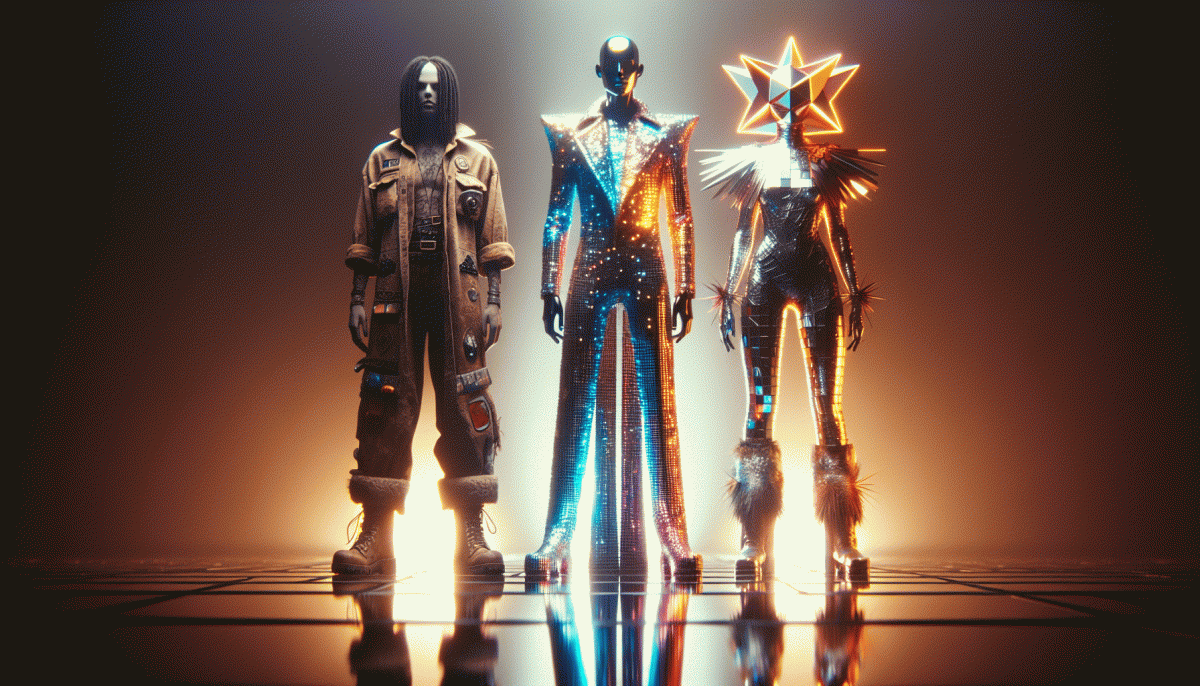
Raw vs Flashy vs Weird: The Creative Showdown You Never Saw Coming
Raw: The scrappy style that converts by keeping it real
Think of the raw approach as the scrappy cousin of high-production marketing: grainy phone clips, off-the-cuff captions and human-sized mistakes that make people lean in rather than scroll past. When your message feels like a person not a billboard, conversion stops being a cold metric and becomes a tiny relationship. No fancy cameras required.
Practical production is simple: use your phone, shoot vertical, keep clips under 30 seconds and lead with an emotion or a problem. Speak like a friend. Swap jargon for one-sentence explanations. Frame faces at eye level, use natural sound, and end with a tiny prompt. Add one clear action—visit, DM, try—that a viewer can actually do in the next minute.
Content ideas that convert: raw demos, candid testimonials, a behind-the-scenes failure rewind, or real-time reaction videos. The payoff comes from contrast: when everything else is polished perfection, an honest imperfection becomes a trust signal. Trust wins every time. Turn clips into short reels to build credibility.
Track micro-conversions common to grassroots content: view-through rate, replies, saves and DMs. Run short A/B tests: same hook but refined delivery versus glossy production. Often the raw version will win engagement even if its absolute reach is smaller—because engaged viewers are the ones who act. Use polls and pinned comments for proof.
A quick checklist to start today: film one 30-second clip of a real problem, post with a two-sentence caption that names the outcome, invite one specific response, and watch comments for proof. Iterate weekly; repeat what works and kill what does not; speed beats perfection. The scrappy signal compounds faster than most brands expect.
Flashy: High gloss, big hooks, and when to use them
Flashy creative is the dial turned to maximum polish: glossy visuals, bold hooks, cinematic cuts, and a clear desire to stop scrolling and start a conversation. It is the marketing equivalent of a neon sign on a busy street that demands a second look. It does not replace substance; it accelerates discovery and surfaces candidates for deeper engagement.
Use this style when attention is scarce and stakes are high: product launches, seasonal promotions, rapid growth pushes, or viral bets where you must communicate value in three seconds or less. Prioritize clarity above cleverness. Start with one unmistakable promise, one clear benefit, and a visual that scaffolds that message across formats and sizes so the hook survives glitches and small screens.
Create the effect by layering a dominant hero image, a punchy headline, tight pacing, and a single clear call to action. Use motion, contrast, and scale to guide the eye, and lean on sound design for short form. Add one piece of social proof like a compelling metric, a short rating badge, or a micro testimonial to convert curiosity into trust quickly.
Watch out for hollow sparkle. Overproduced assets that do not match the product experience lead to disappointed users and wasted spend. Avoid effects that obstruct clarity or create impossible expectations. Mitigate risk with an authenticity touchpoint: a candid voiceover, a short behind the scenes cut, a real customer clip, or a quick low fidelity proof that verifies the headline.
Quick action checklist you can execute in an afternoon: pick one crisp benefit, design a hero shot that frames that benefit in the first 1.5 seconds, trim copy to a single CTA, place one trust cue near the action, and test a raw variant against the glossy version. When flashy wins, it moves metrics fast and makes room for raw and weird experiments to validate and scale.
Weird: Why delightful oddity stops the scroll
There is a superpower in being a little offbeat. When everything in the feed looks airbrushed and predictable, a charmingly strange moment acts like a neon sign: it interrupts muscle memory, makes people blink, and creates a tiny pause where attention can be won. That pause is the currency of modern content, and delightful oddity buys more of it than polish on its own.
Why does weird work? Because human brains love patterns and are wired to scan for exceptions. A small mismatch between expectation and reality triggers curiosity, and curiosity drives clicks, rewatches, and shares. The trick is not to be strange for shock alone, but to pair incongruity with a clear emotional hook so the audience stays rather than bails. Think of oddity as a hook, not the entire fish.
Start small and measurable. Introduce one unexpected prop, a surreal cut, an offbeat sound, or a playful caption twist, then compare watch time and engagement to your baseline. Keep brand signals consistent so the oddity amplifies recognition rather than causes confusion. If you want to scale reach while you test, consider get Twitter followers today as a way to seed early momentum; use the data to refine where the weird lands best.
Make weirdness a repeatable tool, not a swing for the fences. Bookmark the small formats that catch on, iterate with tight A/Bs, and treat constraints as creative fuel. Embrace the delightful odd, and you will stop more scrolls without losing your brand voice.
Match the style to the mission: funnel stage, audience, and goal
Creative direction works best when it is pragmatic and playful: pick a tone that does the job, not the one that makes your design team feel clever. For cold audiences at the top of the funnel, favor raw authenticity and low friction. For warm prospects, crank the polish and clarity so the value proposition reads fast. For tiny tribes, let weirdness run experiments and see what sticks.
- Awareness: Short, candid clips that invite curiosity and lower the barrier to first engagement.
- Consideration: Brighter visuals and clearer benefits to shorten decision time and boost watch depth.
- Conversion: Direct, actionable creative with bold CTAs and social proof to remove doubt.
Practical checks before you hit publish: align the KPI to the stage, trim frictions in the viewer journey, and set a 48 hour test window to compare raw vs flashy vs weird. Keep one variable per test, measure micro conversions, and double down on the winner. If the audience is niche, let weird run but set strict measurement so you do not confuse volume for value.
Swipeable tests: 3 quick experiments to pick a winner this week
Treat this like a Tinder match for creative: three swipeable micro-experiments you can launch in a few hours to pick a winner this week. Choose one core idea and turn it into three 6–10 second creatives that lean raw, flashy, and weird. Keep audience slices identical and budget even so the data is the referee.
1) Raw test — a single-take, handheld clip or candid voiceover that feels human and immediate. Keep edits minimal and captions honest.
Measure: swipe rate and first 3s retention. Run for 48 hours; if swipe rate is 10–15% higher than others, ramp up and extend the story into longer formats.
2) Flashy test — bold thumbnail, quick cuts, punchy on-screen copy, and a clear final CTA. Make the visual language sell the emotion in the first second.
Measure: clickthroughs and immediate post-swipe actions. Flashy often grabs attention fast, so check saves and comments before you pour more budget in.
3) Weird test — do something that breaks the pattern: odd audio, surreal visual, or a cryptic hook that demands decoding. Let the audience finish the thought.
Measure: shares, comments, and saves as signals of virality. Run each variant for 48–72 hours, declare a winner by lift thresholds, then remix that winning energy into new experiments.
Read also

Raw vs Flashy vs Weird: The Creative Cage Match No One Saw Coming

Raw vs. Flashy vs. Weird: The Showdown Your Brand Didn’t Know It Needed

Raw vs. Flashy vs. Weird: We Ran the Showdown—Guess Which Style Actually Wins?

Raw, Flashy, or Weird? The One Style That Crushes Conversions Might Surprise You
Organic vs Paid vs Boosted: The Follower Growth Showdown — What Actually Works Now