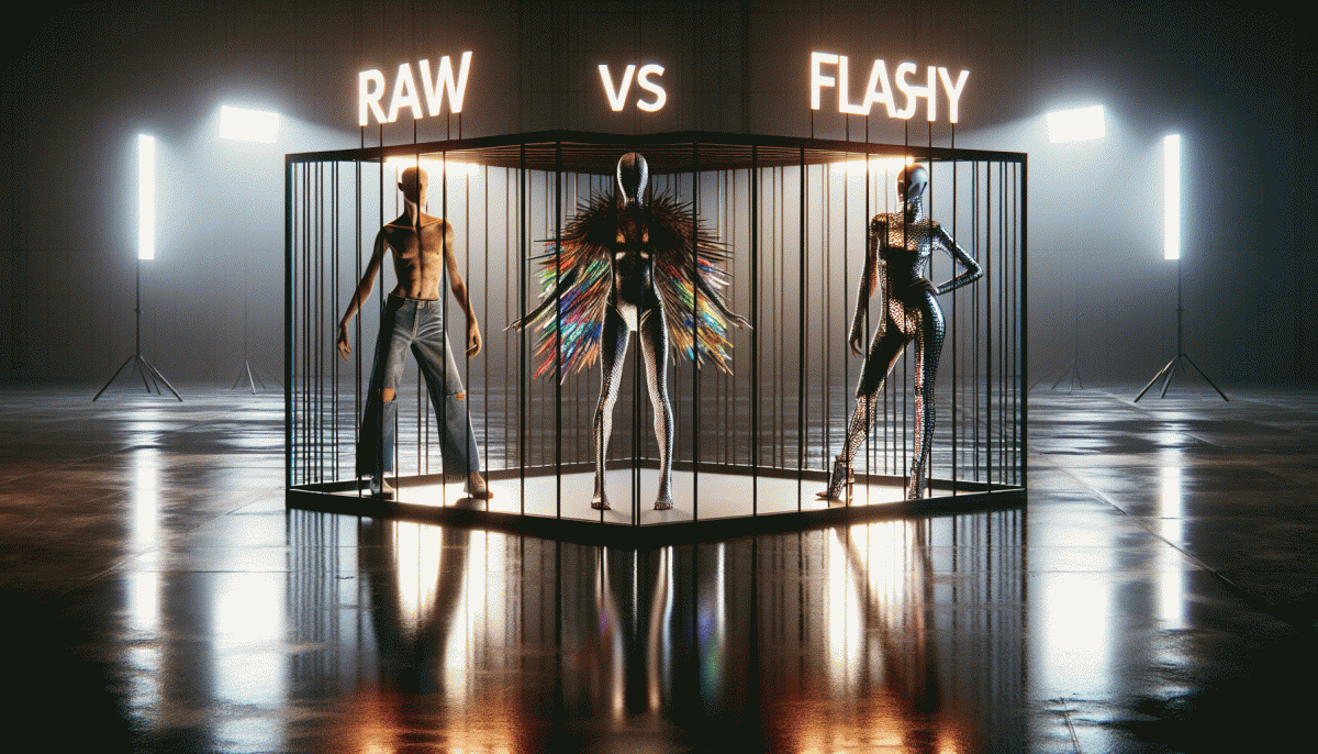
Raw vs Flashy vs Weird: The Creative Cage Match You Never Saw Coming
Why Raw Works: Imperfection That Converts
There is a magnetic logic to unpolished work: when a clip looks like it was made by a human who had a thought and hit record, viewers lean in. Imperfections are not bugs, they are signals that say this is real. Raw textures lower the cognitive filters that flashy production triggers; rather than selling, they invite a micro-conversation. That small friction — a shaky frame, a voice crack, an unscripted laugh — does the heavy lifting of trust that big budgets try to buy.
If you want to amplify those candid moments without losing momentum, focus on one control variable at a time: keep audio clear, trim only the boring bits, and craft a tiny hook in the first three seconds. To scale this approach, pair authentic clips with smart exposure tactics like a gentle boost on the platform where your audience already lives — for instance, try boost your YouTube account for free to give genuine content the reach it deserves.
- Authenticity: Let small flaws remain so viewers feel invited rather than pitched to.
- Pacing: Cut the filler fast; keep the rhythm conversational and human.
- Engage: Ask one simple question or add a tiny CTA that sparks replies, not clicks.
Measure the effect with conversions, not vanity metrics: do views turn into comments, DMs, or signups? Run A/B tests where the only difference is polish level and watch which variant builds deeper relationships. In short, raw works because it bypasses the polished helmet of skepticism and starts a real exchange; treat imperfection as a strategic asset, not a flaw, and you will see it convert.
Flashy FTW: When High-Gloss Sells the Dream
Gloss and glamour are not vanity — they are strategic currency. When you wrap an idea in high-polish visuals, you are selling a promise before users even read the copy: lifestyle, ease, status. The trick is to make the shine authentic, not masking flakiness. Use lighting, motion, and color to choreograph attention so that the first impression pulls viewers into the second moment: the benefit.
Think of flashy as a funnel head that accelerates curiosity. Employ strong contrasts to guide the eye, pair aspirational imagery with one concrete fact, and keep compositions readable at thumb size. Overdesign is the enemy of conversion, so use glamour as seasoning, not the whole meal. Below are three fast moves to implement on creative briefs and mockups:
- Lead with Emotion: Use a single evocative scene that implies benefit; emotion opens wallets faster than specs.
- Simplify the Frame: Remove clutter; three visual elements max keeps the message legible on mobile.
- ⭐ Add a Signature Spark: One repeatable visual flourish makes your content instantly recognizable across channels.
Finally, measure like a scientist and iterate like an artist. A/B test glossy versus pared versions, track click quality not just volume, and tune the shine until it reliably improves retention. Flashy wins when it amplifies truth, not when it hides it. Use it to magnetize attention and funnel it toward substance.
Get Weird or Get Ignored: The Power of Oddball Branding
When the feed is full of glossy polish and blunt authenticity, oddball moves act like a magnet. Strange prompts, unexpected mascots, or a voice that sounds like a human who drank three espressos will stop thumbs and start conversations. In crowded categories that magnetism is a practical advantage, not a stunt: curiosity becomes memory and memory becomes preference.
Pick a single strange thing and commit to it. Maybe it is a visual motif, a recurring joke, a ritual customers can replicate, or a left field call to action that breaks scrolling muscle memory. Keep that quirk consistent across design, copy, and micro interactions so the oddity becomes a signature rather than a one off glitch. Small, repeated surprises scale into recognizability.
Be playful but test like a scientist. Run short pilots and A B tests where the quirky element is the variable, then measure lift in attention, recall, share rate, and downstream conversion. Watch for hard negative signals such as a sharp drop in click through while valuing longer term gains in retention and word of mouth. If something shocks without delight, iterate fast and tune the tone.
Ready to experiment? Add one weird lever to your next campaign on a small budget, document reactions, and double down when a modest bet produces outsized attention. Keep the voice human, the code of conduct clear, and the bar high for creativity. In the creative cage match, the oddball that earns trust and repeat attention wins more than applause.
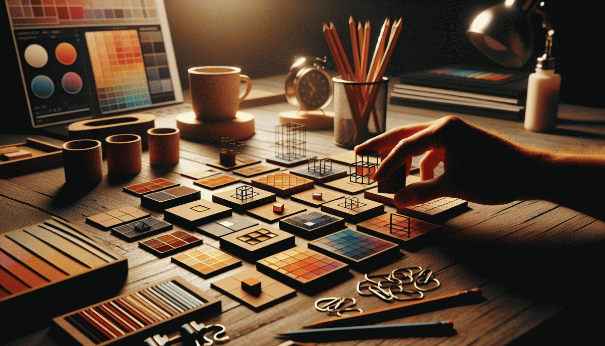
How to Pick Your Style: A 60-Second Litmus Test
Set a 60-second timer and treat it like a design lie-detector: if your work passes this mini-test it probably knows what it wants. You don't need analytics or a committee, just a fast gut scan that separates honest moments from polish and glorious oddities.
Start: show the piece to someone or stare at it yourself and answer three lightning questions: 1) Do I feel a human in it? 2) Would I stop scrolling? 3) Would I explain it to a friend? Answer quickly, don't rationalize — speed is the point.
Map the answers to one of the buckets. If you felt vulnerable and relatable, lean Raw. If it made you gasp or click, it's probably Flashy. If you were bemused but curious, you're flirting with Weird. That single label guides tone, color, and cadence.
Then do a 10-second platform check: for discovery platforms pick Flashy, for community-first spaces choose Raw, for niche tribes experiment with Weird. Also ask: is my goal to convert, to be remembered, or to test boundaries? Match style to objective before you double down.
Finish with one constraint: limit palette, cut the caption, or twist the headline — commit to that test for a week and measure one metric (stops, shares, replies). Keep a swipe file of winners. In sixty seconds you can pick a style; in sixty posts you can own it.
Mix-and-Match Playbook: Turn Styles into Shareable Gold
Think of your creative voice as a wardrobe: start with one bold piece, then raid two different closets. Pick a grounding aesthetic—something raw and honest, glossy and loud, or deliciously weird—then graft tiny, unexpected accents from the others. Those micro-contrasts are what make audiences stop scrolling and start sharing.
Step 1: Lock in a pillar idea and a single measurable goal.
Step 2: Add one incongruent element—an abrasive sound, a neon edit, or an offbeat line of copy—and test it across formats.
Step 3: Trim anything that distracts from the hook. Keep iterations fast: a dozen experiments beats one polished idea that feels safe.
Concrete swaps: swap a cinematic thumbnail for a candid close-up to humanize flash; layer a synth sting under a raw monologue for tension; use a weirder caption font or unexpected emoji to give familiar content a personality twist. Repurpose the best-performing combo into a short-form reel, a static carousel, and a micro-essay—same core, three flavors. That multiplies shareability without doubling your workload.
Final rule: track one signal—shares, saves, or comments—and double down on the mix that moves it. If something gets funny reactions but no saves, don't mourn it; remix the parts that sparked conversation. Keep the playbook playful, ruthless, and repeatable, and you'll turn stylistic mismatches into shareable gold.
Read also

Raw vs Flashy vs Weird: The Creative Cage Match No One Saw Coming

Raw, Flashy, or Weird? The One Style That Crushes Conversions Might Surprise You

Raw vs. Flashy vs. Weird: The Showdown Your Brand Didn’t Know It Needed

Raw vs. Flashy vs. Weird: We Ran the Showdown—Guess Which Style Actually Wins?

This 3x3 Creative Testing Framework Saved Us Thousands—Steal the Playbook