Raw, Flashy, or Weird? The Unlikely Style That Crushes Engagement
Raw Rules: When imperfect beats expensive
Think glossy is king? Audiences often prefer the human wobble. A shaky frame, a missed line, or a camera cut that accidentally reveals the crew can trigger curiosity and trust faster than high production values. Raw content signals honesty and invites participation; polish can signal distance. When budgets are tight and attention is thinner than ever, showing the work in progress feels like an invitation rather than a polished broadcast.
Make raw content strategic, not sloppy. Start with a strong hook in the first three seconds, film vertical for mobile, and keep clips tight so each moment earns its place. Light can be natural and directional instead of studio perfect; audio can be fixed with subtitles rather than overdubs. Edit for rhythm and reaction, not for absence of mistakes. Small constraints force creativity and make production repeatable.
Real examples sell this: behind the scenes clips, off script replies to fans, and early demo fails that end with a learned tweak. These formats spark comments, saves, and remixes because they feel like invitations to join a story. If you want a little lift while you validate the creative, consider pairing organic tests with light amplification such as the best smm panel to jumpstart distribution without smoothing out the human edge.
Run a quick split test: one polished flagship versus three raw variants across a week. Track view through, comments, saves, and retention at 3 and 15 seconds. Double down on the raw winner and iterate daily with micro improvements. Remember that imperfect content often needs more refreshes, not more budget. Make raw a repeatable format and you will build attention and loyalty faster than chasing the next glossy ad.
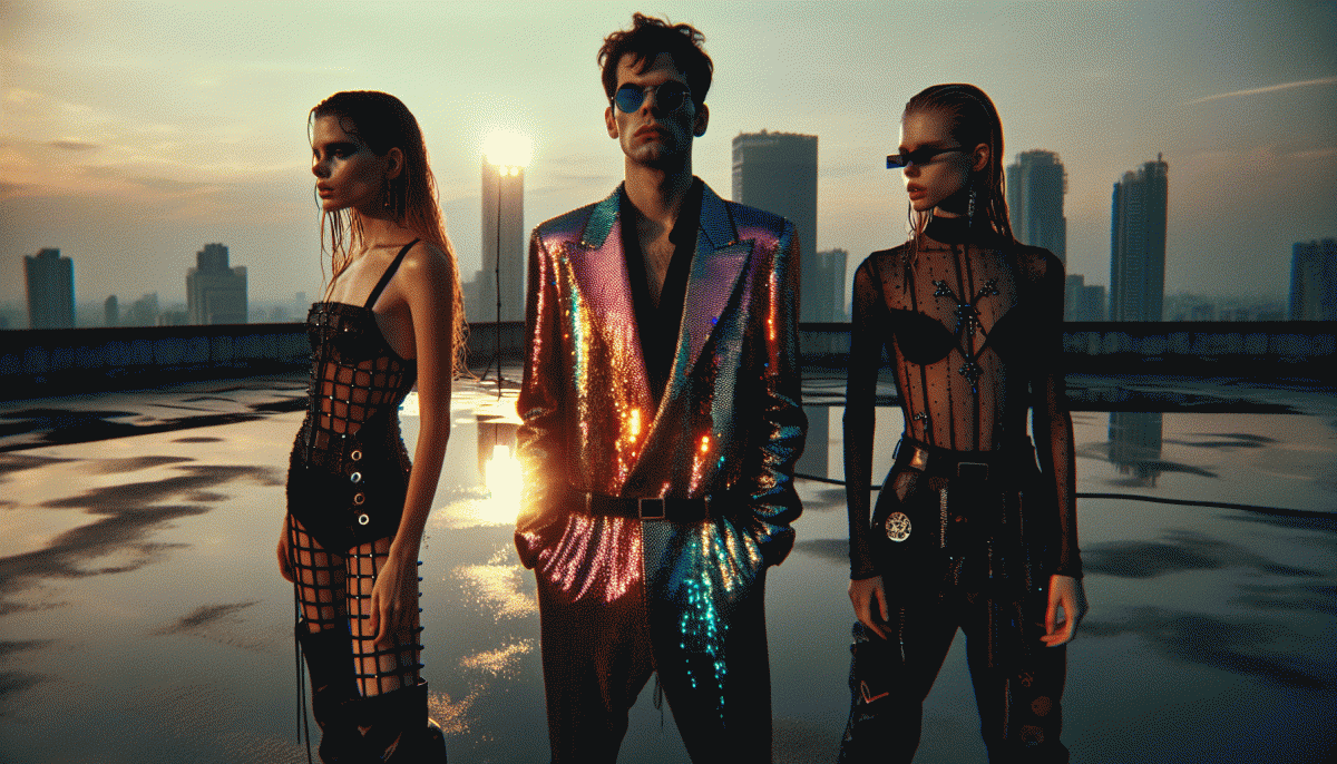
Flashy Done Right: Shine bright without burning trust
Flashy isn't an aesthetic; it's a promise. Make that promise useful: pick one element to steal the spotlight — a neon CTA, a motion headline, or a bold hero image — and make everything else earn its silence. When each glint serves a clear behavior (subscribe, buy, share), you get attention without the itch of sleaze.
Design like a magician, not a carnival barker. Use contrast, scale, and timing: big readable type for the message, a single accent color (two max), and micro-animations around 150–300ms. Respect the eyes—no glitter-wall backgrounds or autoplay sound—and tune motion so it aids comprehension. Microcopy should be witty but clear, guiding clicks instead of tricking them.
Build trust into the sparkle. Pair flashy cues with transparent intent: clear CTAs, visible pricing, honest testimonials with context, and easy exits. Show one verifiable metric or badge rather than a dozen vague counters. If you use influencers or boosted stats, provide proof or samples — authenticity converts better than hype.
Finally, treat shine like an experiment. A/B test degrees of flashiness and measure engagement, scroll depth, conversion, and retention. Keep iterations small, collect qualitative feedback, and remove what triggers skepticism. The best flash is repeatable: memorable, measurable, and never trying too hard — confident, not loud.
Get Weird: Quirky hooks that turn scrollers into buyers
To make people stop mid-scroll, drop the glossy symmetry and invite them into a small, delicious oddity. A sideways joke, a tiny contradiction, or a surreal visual primes curiosity fast. Weirdness is not noise when it leads somewhere—use it to open a question the eye cannot ignore, then answer it with a clear microproof.
Frame the first three seconds as a puzzle, then deliver one fast payoff. A reliable formula: odd hook → proof beat → ritual CTA. If you want help pushing tests to the right audience, try best Twitter boosting service to land early attention at scale, but always tie that attention to one measurable action.
Tiny templates you can copy and paste into captions and ads:
- Hook: Lead with a tiny impossible claim, then follow with a concrete demo.
- Contrast: Show the expected, then flip it—expectation met with a weird twist.
- Ritual: Teach a one-line action for the viewer to try right now; make it oddly specific.
Run rapid A/Bs with three levels of oddness and measure clicks, watch time, and purchases. Scale the version that increases conversion, not just views. Keep copy short, visuals bold, and the payoff obvious. Weird gets the glance; clarity gets the checkout.
Battle-Test It: A 7-day split test to crown your champion
Start by picking three clear creative identities — one candid and human, one glossy and attention-grabbing, and one intentionally odd. Lock every other variable: audience, offer, headline formula and CTA. When everything else stays the same, any lift you see is actually caused by style, not by timing or targeting luck.
Run the split over seven days with a simple cadence: days 1–3 seed each variant evenly and collect baseline metrics; day 4 is a pruning point for underperformers; days 5–7 concentrate spend on the top two, then consolidate to the leader on day 7. Measure CTR, engagement rate, CPA, and qualitative signals like comment tone.
- Raw: Short candid clips or unedited captions that feel immediate and believable.
- Flashy: High-contrast visuals, motion, and bold on-screen copy that stops the scroll.
- Weird: Odd edits, unexpected metaphors, and playful absurdity that spark curiosity.
Decide by relative lift and consistency rather than a single big day. If one style shows a steady edge in CTR plus lower CPA and better share rate across two days, call it. If results bounce, extend the test or increase sample size; early social signals like saves and comments often predict longer-term wins.
Treat this as a launch template: document the winning hooks and micro-elements, then iterate fast. Double down on the winner, but keep a rotating wildcard slot to test micro-variants — sometimes the weirdest tweak becomes the next breakout.
Scorecard: Metrics that prove what actually works
Think of a scorecard as a referee for creative bets: it settles arguments, highlights winners, and keeps ego out of optimization. Pick a compact set of signals that answer three quick questions — did people stop, did they stay, and did they do anything next — so your team can launch more experiments instead of more meetings.
Track a handful of clear metrics and give each one a short interpretation.
Engagement rate: reactions, comments and likes per view; target 3–6% to know a format resonates.
Watch time / Retention: average seconds or percent watched; aim for a retention bump over baseline, not perfection.
Share rate: shares per view; anything above 1% is a flashing green light for virality.
CTR: link or thumbnail clickthrough; 2–4% is a healthy range to validate hooks.
Conversion: signups, saves, or follows tied to the asset; treat this as business truth even if it lags.
Turn metrics into a composite score so you can rank styles. Example weights: Engagement 30%, Retention 30%, Share 25%, Conversion 15%. Require a minimum sample (around 1,000 impressions or a 7–14 day window) before declaring a winner, and run A/B tests in rolling cohorts to avoid one-off spikes. Log qualitative cues like comment themes as tiebreakers.
Use this scorecard to compare raw versus flashy versus weird with cold objectivity: run four variants for two weeks, pick the highest composite scorer, then iterate. Metrics do the heavy lifting; creativity gets the applause. Stay curious, keep the scoreboard honest, and let the data nudge your boldest moves.
Read also

Raw, Flashy, or Weird? The One Style That Crushes Conversions Might Surprise You

We Pitted Instagram Formats Head to Head — Here Is the One That Crushes Engagement

Stop Scrolling: The Instagram Format That Crushes Engagement (Backed by A/B Tests)

Stop Scrolling: The Instagram Creative Format That Crushes Engagement

Raw vs. Flashy vs. Weird: We Ran the Showdown—Guess Which Style Actually Wins?
