Raw, Flashy, or Weird? The Outlier That Crushes Clicks and Conversions
How to A/B Test Creative Personality in 48 Hours (Without a Big Budget)
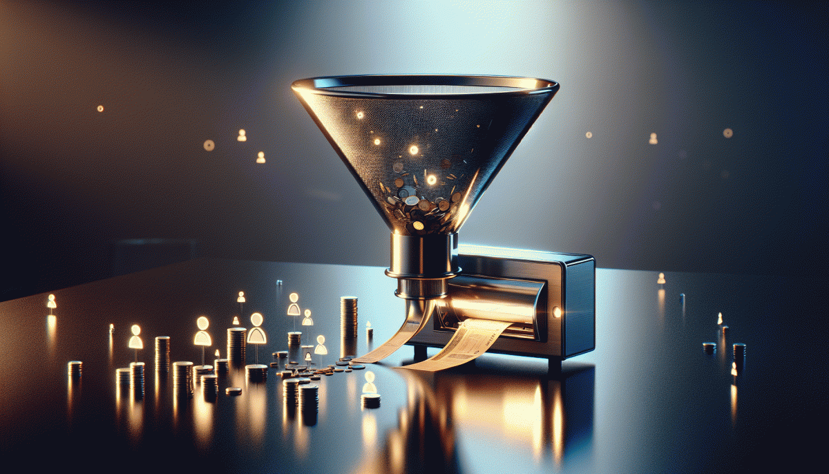
Start with a ruthless focus on one metric and a tiny budget. Choose either clicks or conversions as the north star and build three quick creative directions that map to distinct personalities: raw, flashy, and weird. The aim is not perfection. The aim is a clear signal in 48 hours so you can act fast.
Set up three identical campaigns that differ only by creative. Use the same targeting, bid strategy, and landing page so the personality is the only variable. Split your budget evenly across variants; for most small tests $30 to $60 total is enough to surface winners. If platform reporting lets you, split audience by randomization to avoid overlap.
Produce each creative on a shoestring. For raw use handheld video, natural lighting, and one unscripted moment. For flashy lean into motion, bright color blocks, and bold text overlays. For weird introduce an odd prop or an unexpected cut to create cognitive friction. Keep the core message and call to action identical across all versions.
Control thumbnails and copy to isolate personality. Use the same headline length, the same CTA verb, and identical landing URL. If possible, test 15 second variants for mobile feed speed. Free tools like Canva and phone editing apps will get you polished enough assets in under an hour per variant.
Run the test for the full 48 hours unless one variant clearly dominates early. Watch CTR as the attention signal and conversion rate plus cost per acquisition as the business signal. Look for a sustained 20 percent lift in CTR or a 15 percent lift in conversion rate before declaring a winner, with at least a handful of conversions to avoid chasing noise.
When you find a winner, scale it immediately by 2x to 5x while cloning slight iterations to keep ad fatigue low. Archive your briefs and one minute production recipes so the process becomes repeatable. Small budget, fast cycle, big learning. Repeat and let the outlier that wins lead your next creative playbook.
The Psychology: Why Messy Honesty Beats Polished Perfection—Until It Doesn't
People are wired to notice realness. When a video is a little rough, a caption is candid, or a headline admits a flaw, that small imperfection acts like a neon sign for attention. Messy honesty lowers the cognitive guard: viewers relax, relate, and often reward authenticity with more clicks. That raw edge reads as human, not rehearsed, and in many feeds that human signal outperforms slick polish.
That said, authenticity has limits. For high value offers, regulated industries, or first time purchases, polish still provides comfort. Clean design communicates competence, clear structure reduces friction, and professional production can be necessary to justify price. In short, messy wins attention, while polished wins trust, and the right choice depends on what you need in that moment of the funnel.
Decide by matching style to stage and stakes. Use messy honesty for top funnel scrollers: test unfiltered hooks, authentic testimonials, and behind the scenes clips to identify what breaks through. For conversion moments, layer in polish: crisp product images, simple UX, and explicit guarantees. Run small A/B tests that swap tone but keep the same offer to see what moves metrics for your audience.
Practical hybrid moves make this actionable. Start campaigns raw to harvest ideas, then double down on winners with a polished variant that preserves the core genuine element. Keep one trust marker visible—a clear price, a deadline, a guarantee—and iterate weekly. By treating honesty and polish as tools instead of rival aesthetics, you get the best of both: attention that converts.
When to Go Full Fireworks: Flashy Ads That Legit Earn the Scroll-Stopping Badge
Flashy ads earn the scroll stopping badge when the goal is to interrupt, excite, and create a memory fast. Use them to plant a vivid first impression—product debuts, seasonal drops, or attention battles in feeds where every other tile is playing it safe. The core idea: flashiness must amplify a single, clear hook, not compete with noisy copy.
Deploy fireworks best when three conditions align:
- Launch: Big new releases or category entries where novelty drives curiosity and trial
- Burst: Limited time promos that need rapid reach and social buzz
- Persona: Audiences that reward spectacle and shareable moments, such as Gen Z or creator communities
Practical creative rules: pick one dominant visual treatment (color, motion, sound), lean into rhythm and contrast, and make the CTA obvious in the first 2 seconds. Run A/B tests that isolate the visual treatment from message copy so you know what is doing the heavy lifting. Also provision a toned down creative for retargeting cohorts that prefer clarity over chaos.
Measure liberally: CTR, view through rate, and most importantly conversion lift and CPA. If CTR doubles but CPA explodes, it is time to tweak cadence or landing experience. When done right, flashy ads do not just grab attention; they speed up the funnel and make prospects remember why they clicked.
Weird Works: 7 Offbeat Hooks That Made Normal Products Unforgettable
Oddball hooks are not novelty stunts; they are attention magnets that graft personality to low-glam products. A weird visual, an absurd promise, or an unexpected voice can interrupt scrolling and seed curiosity. Brands that lean into tasteful strangeness turn commodity into story — and stories convert.
Shock Reframe: flip category norms to make people rethink value; Micro-Myth: invent a tiny origin tale that humanizes a thing; Anti-Benefit: admit a small flaw to build trust; Pet POV: show the product through an animal's eyes; Ridiculous Ritual: prescribe a silly five-second routine; Hyper-Specific Niche: name the oddly narrow use case; Absurd Comparison: liken it to something wildly unrelated to provoke a chuckle.
These hooks work because they create an emotional shortcut: surprise, laughter, or curiosity. Practical wins show up fast — higher share rates, lower cost-per-click, and stickier recall. Simple products become memorable when the creative gives people permission to stop and smile, then learn more.
Quick playbook: pick two hooks from above, produce one 15-second spot for each, run a three-day A/B on a single platform, and measure CTR plus view-through. Scale the winner with variant swaps (voice, setting, call-to-action) but keep one element happily odd; that single mismatch is often the conversion lever.
A Simple Pick-Your-Style Framework: Match Objective, Audience, and Risk
Think of your creative direction as three sliders: Objective, Audience, and Risk. Objective is the outcome you want—awareness, engagement, or conversion. Audience is who will see the piece—cold, warm, or niche. Risk is how much brand wiggle room exists: low means safe and polished, high means bold or bizarre. Set those three first and the style options start to line up like obedient backup dancers.
Match them with simple rules. If Objective is awareness, Audience is cold, and Risk is low, go flashy: bold visuals, clear hooks, and high reach tactics. If Audience is niche and Risk is high, let weird reign—micro references, inside jokes, and formats that reward attention. Need a quick amplification route for broad reach? Consider a targeted purchase to kickstart momentum: buy Twitter retweets instantly today.
Make the framework actionable with small experiments. Run A/Bs that hold Objective constant and vary style. Track one primary KPI per campaign and one secondary curiosity metric. If conversions move with a raw, unfiltered cut, scale with controlled budgets. If flashy wins engagement but not conversion, add a conversion layer like social proof or clearer CTAs before scaling spend.
Finish with a three step checklist: pick the Objective, calibrate Audience tone, and set Risk tolerance. Then choose raw for urgency, flashy for velocity, or weird for memorability. Treat the first run as data not destiny and iterate fast. That is how a clear pick your style framework turns creative chaos into repeatable results.
Read also

Raw, Flashy, or Weird? The One Style That Crushes Conversions Might Surprise You

We Pitted Instagram Formats Head to Head — Here Is the One That Crushes Engagement

The One Thing That Drives Clicks on YouTube (Spoiler: It's Not Your Video)

Raw vs. Flashy vs. Weird: The Showdown Your Brand Didn’t Know It Needed

Clickbait vs Value: The Shocking Truth That Skyrockets Conversions