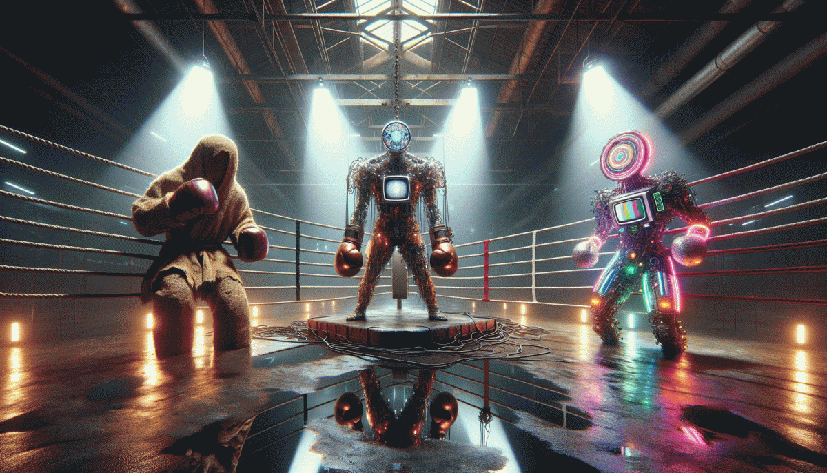
Raw, Flashy, or Weird? The Creative Cage Match You Will Not See Coming
Spoiler alert: Raw is not just messy, it converts
Raw creative is not sloppy by accident; it is a deliberate vibe that trades polish for trust. When you let texture, offbeat timing, and a human voice lead, audiences relax and engage. That drop in production sheen can raise clickthroughs because viewers feel like they are observing something real, not a billboard. Think candid lighting, small mistakes, and laughable tangents that humanize the brand.
Start small: film a thirty second behind the scenes clip, post an unedited take, and measure micro conversions. Watch watch time, comments, and shares for clues. If you want fast signal on social experiments, consider options that move reach while you test — like buy likes for a short burst. Use data to prune what feels authentic versus what is just careless, and record learnings in a simple doc.
Keep variables minimal: run a single change per post so results are clear. Prioritize story: open with a human beat in the first three seconds and close with a clear small ask. Reward engagement with a playful challenge or a micro incentive. These small edits flip passive scroll into active behavior without losing the raw aesthetic, and you can repeat winners quickly.
Finally, iterate like a scientist and present like a friend. Scale the slices that earn attention and abandon the ones that look messy for the wrong reasons. Raw is a tool not a style prison; use it to build trust quickly and let your metrics decide when to polish. Ready to try? Post one unpolished clip this week, collect the numbers, and double down on the parts that move people.
Flashy flair vs audience fatigue: where to draw the neon line
Neon visuals can feel like a fist bump to the senses—thrilling for a moment, then background noise. Aim for flair that earns attention rather than demanding it. If every frame screams, nothing stands out; let brightness be a punctuation mark, not a power drill on repeat.
Apply the three second rule: can a viewer grasp the idea before they scroll? If not, simplify. Use one bold element per asset—color, motion, or copy—and let the rest support it. This keeps content punchy while preventing visual exhaustion across a feed.
Build a fatigue budget: decide how often high-octane pieces run versus calm posts. A predictable rhythm makes flashes feel like treats. Reserve your most intense effects for launches, finales, or paid pushes, and use subtler variations to maintain presence without numbing the audience.
Measure signals, not vanity. Track retention curves, comment tone, and repeat view rates to detect irritation before it becomes drop off. A/B test intensity levels and monitor saves and shares; sometimes dialing back contrast raises long term loyalty more than a week of viral fireworks ever could.
Creative prompts to try: mute backgrounds to spotlight a neon object, swap full motion for micro-transitions, and schedule a weekly breath post with minimalism in place of flash. Small edits can restore sparkle and keep neon from becoming noise.
Weird that works: how oddball ideas spark unforgettable brands
The brands that stick are often the ones that dare to be deliciously odd — not odd for shock, but odd by design. Embrace one eccentricity, amplify it, then surround it with consistent execution. Weirdness acts like a highlighter on the human brain: it surfaces in feeds, sparks conversation, and shortcuts attention in a crowded market.
Start small: pick a tiny, defensible quirk—an unusual color palette, a snarky voice, or a ritualized unboxing—and test it on a narrow audience. Run rapid experiments, measure share rates and mentions, iterate fast. If you need distribution muscle for social experiments, consider boost Instagram to get early signal and proof before you scale.
Weird works because it creates a simple story your audience can repeat. Think mismatched mascots, intentionally awkward photography, or products named like inside jokes—each is a memory hook. Keep the rest of the brand scaffolding simple so the oddity reads like a deliberate choice, not a mistake. Use constraints to make strange ideas feel coherent.
Three micro-tasks to try this week: 1) pick one outlandish idea and draft a 15-second clip, 2) A/B the caption tone for laugh vs. confusion, 3) invite 10 superfans to react and give feedback. Track what people repeat and what they don't. The goal isn't to be weird for its own sake—it's to be memorable, shareable, and unmistakably you.
Speed run: choosing a style when you have 24 hours and a tiny budget
Goal first. With only 24 hours and pocket-change funds, the smartest move is triage: pick the single emotional reaction you want—authentic chuckle, jaw-drop sheen, or baffled intrigue—and let that choice simplify every other decision. Don't chase all three; pick the one that matches your audience and available space.
Raw: lean into reality. Use a window as your softbox, film handheld on a smartphone, and capture long takes so editing is just trim-and-go. Prioritize clear dialogue or a killer live moment over perfect framing. One clean location, two reliable angles, and a natural sound clip will sell grit faster than fancy polish.
Flashy: cheat the budget with contrast: cheap gels (cellophane works), one portable LED, and a bold wardrobe piece. Keep edits fast—30–90 second runtime—and slam an energetic track under punchy cuts. Templates in mobile editors can fake motion graphics; use a bright thumbnail to grab the scroll.
Weird: commit to one odd choice and amplify it: reversal edits, a tiny prop that becomes the star, or exaggerated sound design. Micro-stunts and clever timing create shareable mystery without expensive gear. Remember: strange needs clarity, not clutter.
Finish with a micro-plan: storyboard three shots, shoot in 2–3 hours, edit in the next 3, and export with platform presets. Prioritize a sharp 3–5 second hook, decent audio, and a clear deliverable size. When time and money are tiny, boldness and focus win.
The remix recipe: blend all three without creating brand whiplash
Start the remix by picking a clear base voice so the mashup has a spine. Decide which of the three—raw grit, flash, or weirdness—plays lead, and treat the others as featured artists. This single choice keeps experiments from collapsing into chaos.
Layer deliberately: use raw for texture and authenticity, flash for high impact moments like hero shots or product reveals, and weird for tiny signature touches that invite curiosity. Try a 60/30/10 split to begin and adapt from actual audience signals.
Guardrails are your anti-whiplash seatbelts. Define nonnegotiables such as core tone, primary color, logo treatment, and pacing. Create a short dos and do nots list so every creator knows which riffs are allowed and which derail the brand.
Map intensity by platform: what reads raw on Instagram may feel abrasive on LinkedIn, and flashy on TikTok may be noise on Pinterest. Pilot small runs, measure engagement and watch time, then dial each element up or down per channel.
Anchor experiments in calendar beats: assign theme weeks, format templates, and a signature microelement that returns each month. Those recurring anchors make even wild combos feel familiar and help your audience learn to expect delight rather than confusion.
Start with one microtest, track attention and sentiment, then scale what actually sticks. The trick is to be bold without abandoning a single thread the audience can follow. Mix fearlessly, but keep one true north.
Read also

Raw vs Flashy vs Weird: The Creative Cage Match No One Saw Coming

Raw, Flashy, or Weird? The One Style That Crushes Conversions Might Surprise You

Raw vs. Flashy vs. Weird: The Showdown Your Brand Didn’t Know It Needed

Raw vs. Flashy vs. Weird: We Ran the Showdown—Guess Which Style Actually Wins?

SEO in 2026: Dead or Dominating? The Answer Will Surprise You
