We Tested 3 Creative Styles — Guess Which One Crushed It: Raw, Flashy, or Weird?
Raw: The Unpolished Truth That Converts (When to Stop Editing)
Raw is the creative version of walking into a room with messy hair and a brilliant one liner: the aesthetic is imperfect, the intent is sharp. Grain, small stumbles, and offhand jokes humanize the creator and shrink the distance between brand and audience. In testing, those small signs of life often spark faster engagement and clearer conversion than something polished to death.
Before you keep editing, run a rapid check so editing becomes a filter not a habit. Ask whether the message lands, whether someone can act on it, and whether the human moment is intact.
- Clarity: The core idea lands in the first five seconds.
- Emotion: It makes someone laugh, nod, or react in a way that maps to behavior.
- Offer: The next step is obvious: a swipe, a click, or a reply.
Practical stop rules keep perfectionism from killing speed: limit takes to three, set a ten minute edit cap, and do a single listen test where you play it back and ask if it still feels real. Trim long intros, add a single caption line if needed, and only fix filler words that block comprehension. These constraints preserve the spark while avoiding sloppy.
Deploy raw where immediacy and personality matter most: short video, stories, live streams, voice notes, and replies. Run quick A/B trials versus a glossy version and track CTR, comment rate, and direct messages rather than vanity watch time. Raw often wins on completion and response because imperfection invites participation.
Final note: publish when the idea is clear, the emotion works, and the call to action is clean. Replace endless tweaks with weekly experiments: three raw pieces against one polished piece and keep what moves the numbers. Publishing before perfect is not a shortcut, it is a faster path to real conversion.
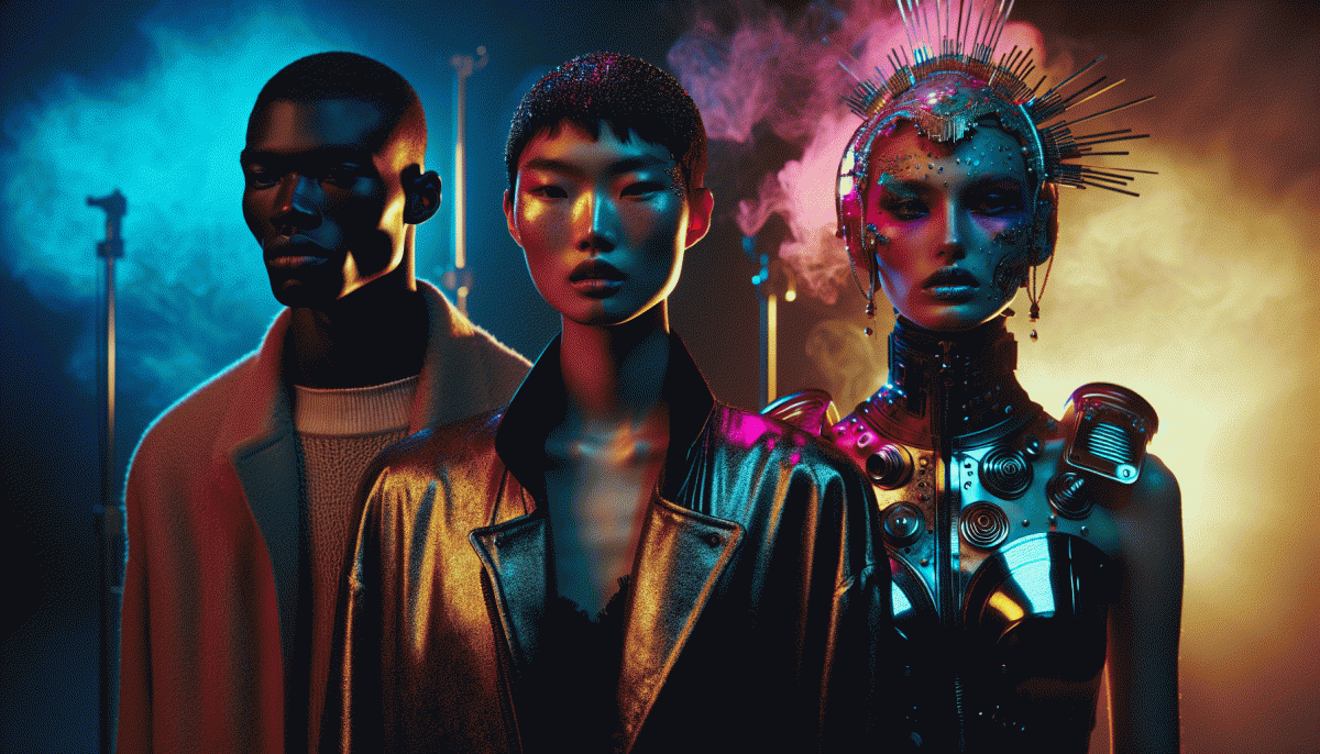
Flashy: Glitz, Glam, and the Science of Scroll-Stopping Shine
Flashy is where theater meets chemistry: high shine, high contrast, and a hook so loud it makes thumbs pause. The key moment arrives before sound is even on, so craft an opening frame that answers a single question in one beat: why should I stop scrolling? Make that answer visual, bold, and impossible to miss.
Build that answer with design choices that actually move behavior. Amp up saturation and highlights, use kinetic typography for bite sized promises, and lean into motion with quick 0.5 to 1.5 second cuts. Sync visual punches with a clean audio cue when available and place readable captions in the same area every time so eyes learn the pattern. Small tweaks like tighter crop, a brighter key, or a simpler headline can double attention.
Turn sparkle into science by testing with clear metrics. Track CTR, 3 second view rate, completion rate, and saves or shares as proxies for attention and intent. Run three variants: hyper glossy, stripped down, and a hybrid; let each run for 24 to 48 hours or until you have a few thousand impressions, then scale the top performer. Log the specific tweak that moved the needle so you know if it was color, motion, or copy.
Finally, flash responsibly. Maintain a consistent brand cue so shine feels like you rather than decoration, and repurpose winning clips into square and vertical formats to maximize reach. When a creative wins organically, amplify it with a modest spend to turn a scroll stopper into a reliable growth engine.
Weird: The Oddball Hook That Makes People Care
Weird wins because it makes people stop scrolling. An oddball hook flips polite indifference into a loud blink: a tiny mismatch or a strange juxtaposition creates immediate curiosity. That pause is the currency of attention — a second to wonder why something feels off, then to click, watch, or read. Use weird to earn that precious moment.
It works for three simple reasons: pattern interruption, emotional contrast, and memorability. Break an expectation, pair joy with mild absurdity, or drop a line that initially feels like a joke and then becomes earnest. Examples: an ad that looks like a lost pet poster but sells an app, or a product photo where scale is hilariously wrong. The surprise sticks in memory.
Make one with a tight recipe: start from a concrete pain point, twist it with a metaphor or visual oddity, then escalate with a tiny emotional payoff. Headlines can be surreal, visuals can mis-scale reality, captions can land on a micro punchline. Keep brand voice present so weird does not read as random: oddball plus meaning beats oddball for attention alone.
Test like a scientist: run A/Bs where the only change is the odd element, track CTR and view time, and read comments for clarity signals. If a weird variant lifts engagement without breaking comprehension, double down and spin off related odd hooks. Small bets, fast learning, and a disciplined touch of weird are the shortcut from noticed to beloved.
The A/B/C Showdown: Metrics That Actually Decide the Winner
We let data referee a three-way creative rumble and discovered that victory is rarely obvious until you pick the right stats. Views alone are noisy; a winning creative converts attention into action. Think like a scientist: choose the metric that maps to business impact, then measure relentlessly so the numbers outvote your gut.
Focus on a short list of decisive KPIs that separate hype from results. Below are the three we treated as round-one eliminators in every test:
- CTR: Click-through rate shows whether the creative stops the scroll and earns an initial engagement.
- Conversion: The clean measure of whether interest becomes a signup, lead, or sale.
- Engagement: Time on asset, watch percentage, and shares reveal whether the creative creates real attention.
Weight them: make one primary, one secondary, one tie-breaker. In our runs raw tended to win CTR, flashy took watch time, and weird drove shares; conversions were the final arbiter. Next steps: set a KPI hierarchy, run short microtests with proper sample sizes, then scale the creative that moves your primary metric. Let the numbers direct the next creative sprint.
Steal This Playbook: How to Mix All Three Without Making a Mess
Think of this as a recipe rather than a rescue mission: you are blending three flavors—raw honesty for credibility, flashy polish for eyeballs, and weird spice for memorability. Start by deciding which role each style will play in a single asset: one should open the conversation, one should keep the scroll stop, and one should make people text a friend. Keep hierarchy strict so the mix does not collapse into chaos.
- Hook: Use flashy visuals or headlines to earn the first two seconds.
- Foundation: Layer raw, human details next to build trust fast.
- Twist: Drop a weird, unexpected element at the end to make the idea stick.
Operationally, create three modular elements—core clip, polish frame, and oddball cut—and assemble them like building blocks. Run quick A/B tests where only one element changes each time so you know what moved the needle. If you want a performance shortcut, consider a targeted growth boost: buy Instagram followers instantly today to accelerate social proof while your creative mix proves itself.
Metrics to watch: attention (first 3 seconds), retention (through 15 seconds), and action (clicks or messages). Iterate in 2-week cycles, keep the raw part honest, the flashy part bold, and the weird part rare but golden. The safe play is to let one style lead, let the others support, then flip roles across posts so your feed never gets predictable.
Read also

We Tested 7 Instagram Post Formats—Guess Which One Crushed Engagement?

Raw vs. Flashy vs. Weird: We Ran the Showdown—Guess Which Style Actually Wins?

Raw vs Flashy vs Weird: The Creative Cage Match No One Saw Coming

Raw, Flashy, or Weird? The One Style That Crushes Conversions Might Surprise You

Raw vs. Flashy vs. Weird: The Showdown Your Brand Didn’t Know It Needed