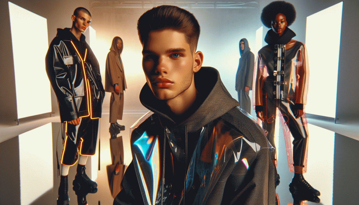
Visual Trends in 2026: Steal These Viral Looks Before Everyone Does
Loop It to Win It: Micro Motions That Freeze the Thumb
Think tiny, move often: the micro motion that makes people pause is not a crazy stunt but a perfectly repeatable action they can watch on loop. Pick a single, satisfying motion — a wrist flick, a lid click, a hair toss — and design every frame so the end matches the start. The brain loves symmetry; a seamless five to eight frame cycle will freeze the thumb every time.
Shoot for simplicity. Frame tight, light cleanly, and use higher frame rates like 60 fps so small accelerations look buttery when retimed. Compose vertically, leave negative space on the outside edge for captions and stickers, and use a neutral background so the motion reads at a glance. Execute the move at a consistent tempo so the edit requires only a single trim to loop.
Edit like a magician. Use match cuts, reverse overlays, and subframe cuts instead of big dissolves. Trim to the exact frame where motion velocity equals zero, then crossfade a 2 to 6 frame overlap or use frame-blend for ghosted continuity. Add a micro audio cue on the loop point and a one-frame speed ramp to hide the seam. Color pop and contrast help the eye lock onto the motion.
Publish with intent: thumbnail the frozen peak, lead with a one line caption that invites watching again, and repurpose the same loop across platforms with platform specific crops. Test two loop lengths, measure completion, and double down on the winner. Small motions, big hooks: master the loop and you will earn the repeat view.
Big Type, Bigger Reach: On Screen Text That Sells on Mute
When sound is off, type becomes your brand voice — loud, clear and impossible to ignore. Treat each headline like a tiny billboard: pick one dominant idea, then support it with a brisk subhead that explains the benefit in a single scan. Favor chunky, mobile-safe fonts, generous tracking and bold weights so words survive motion and compression. Add subtle motion to type to guide the eye, but never sacrifice legibility for fancy animation.
Small production wins translate into big engagement when captions feel intentional. Try these micro-rules that designers and creators swear by:
- Contrast: Use maximum brightness or a heavy outline so text stays readable against busy footage and dark modes.
- Tempo: Sync caption pace to the edit rhythm; give each short phrase 1.5–3 seconds depending on length so viewers can read without replaying.
- Hook: Lead with a curiosity word or bold claim in the first two words to stop the scroll and promise something worth watching.
Make A/B testing your best friend: swap headline size, color, or timing and measure retention at 3, 7 and 15 seconds. For creators who want to scale distribution while refining captions, explore quick promotional tools like cheap smm panel to extend initial reach and get faster performance signals across platforms.
Final checklist before publish: one dominant headline, one concise subhead, high-contrast styling, caption durations tuned to reading speed, and a compression-safe outline or shadow. Test with sound off and with sound on; if the core message lands without audio, the creative is working. Go craft bold on-screen copy that sells in silence and makes viewers hit replay.
AI Glow Up: Generative Styles That Boost Reach Without the Creep Factor
The best AI enhancements for visuals in 2026 are the ones your audience notices but does not overthink. Think light touch over robotic overhaul: color nudges, micro-retouches, and generative backgrounds that match your brand mood. These moves lift engagement because they feel curated not manufactured. The secret is to design with human context in mind so the tech amplifies emotion rather than steals it.
Start with three squeezeable tricks you can reuse across platforms:
- Preset: Build a signature AI filter for consistent tone and reuse it to create instant series that feel familiar.
- Persona: Use subtle style models to keep faces and expressions natural while enhancing lighting and texture.
- Motion: Add micro-animations to stills for feeds and stories to increase dwell time without yelling for attention.
Operationalize this by batching assets, keeping original files, and documenting your prompt recipes. A simple A/B test per week will tell you whether warmth, saturation, or motion lifts your metrics. Add guardrails: limit facial alterations, keep metadata transparent, and ask for consent when edits are personal. Finally, mix generative content with real behind the scenes clips to maintain trust and human connection.
Quick checklist to ship tomorrow: pick one preset, test on three posts, measure reach and comments, then scale what works. Small, consistent AI polish wins the reach game in 2026 so your feed feels fresh, not freaky.
Messy on Purpose: Lo Fi Vibes That Spark Comments and Saves
Think messy and you will get saved. The purposeful Lo Fi aesthetic trades polish for personality: handheld framing, film grain, muted color shifts, sketchy doodles, and captions that feel like whispered notes. That easy imperfection invites conversation because it looks remixable and human. Aim for moments that feel lived in, not staged—those are the posts that spark comments and saves faster than flawless studio shots.
Start with tiny experiments: mute saturation, drop in VHS grain, leave a thumb at the edge of frame, or underexpose slightly to add mood. Pair visuals with captions that ask one simple, weird question to force a reply. If reach matters, amplify early traction with targeted promotion like buy TT boosting to seed more initial engagement and increase the chance of organic saves.
- Texture: Layer grain or tape artifacts at low opacity to feel analog.
- Speed: Use jump cuts and short loops to invite replays.
- Caption: Start with a micro prompt that begs a one line answer.
Iterate fast and track saves and comments more than vanity likes. Keep a swipe file of messy winners, tweak color temperature and timing, then double down on the variants that get saves. The trick is to make imperfection feel intentional so followers feel invited to react, remix, and come back for more.
Palette Power: 2026 Color Combos People Share Nonstop
Color right now is a social currency; the palettes that pop are the ones people copy, remix, and save. Think of color as a personality: daring, cozy, or slightly glitchy. Use tones that photograph well and translate into gradients and UI elements that get tapped, screenshotted, and reposted across feeds.
Try Digital Lavender + Asphalt: gentle futurism for product shots; Moss Green + Burnt Coral: earthy warmth that feels handcrafted; Sunrise Neon + Clay: high-energy hero hues for headlines and reels; Vintage Teal + Mustard: retro-cool pair for thumbnails and posters. Each combo needs a neutral anchor.
For execution, use a 60/30/10 rule — dominant, secondary, accent — and add texture or grain to avoid flatness. Test contrast for accessibility and low-light viewing. Create micro-animations that nudge the accent hue and save the palette as a branded swatch. On Instagram, favor bold accents in the first thumbnail.
Swipeable carousels, short format videos, and mockups are the fastest ways to make a combo contagious. Save three versions: color-forward, toned-down, and monochrome accent. Shop your moodboard, not the trend, then post with a clear color credit and watch others steal it—because viral color is the nicest compliment.
Read also

Visual Trends in 2026: Steal the Viral Formula Social Feeds Crave

Visual Trends in 2026: Viral Visual Hacks Social Platforms Cannot Resist

Visual Trends in 2026: The Scroll-Stopping Looks Everyone Will Copy by Friday
Shh... Grey Hat Marketing Tactics That Still Work in 2026 (Use Them Before Everyone Does)

Visual Trends in 2026: 11 Viral Triggers Social Platforms Cannot Resist
