Visual Trends in 2025: What Goes Viral on Social Platforms? Here's What's Blowing Up RN
Hook in 1 Second: The short-form formula that stops the scroll
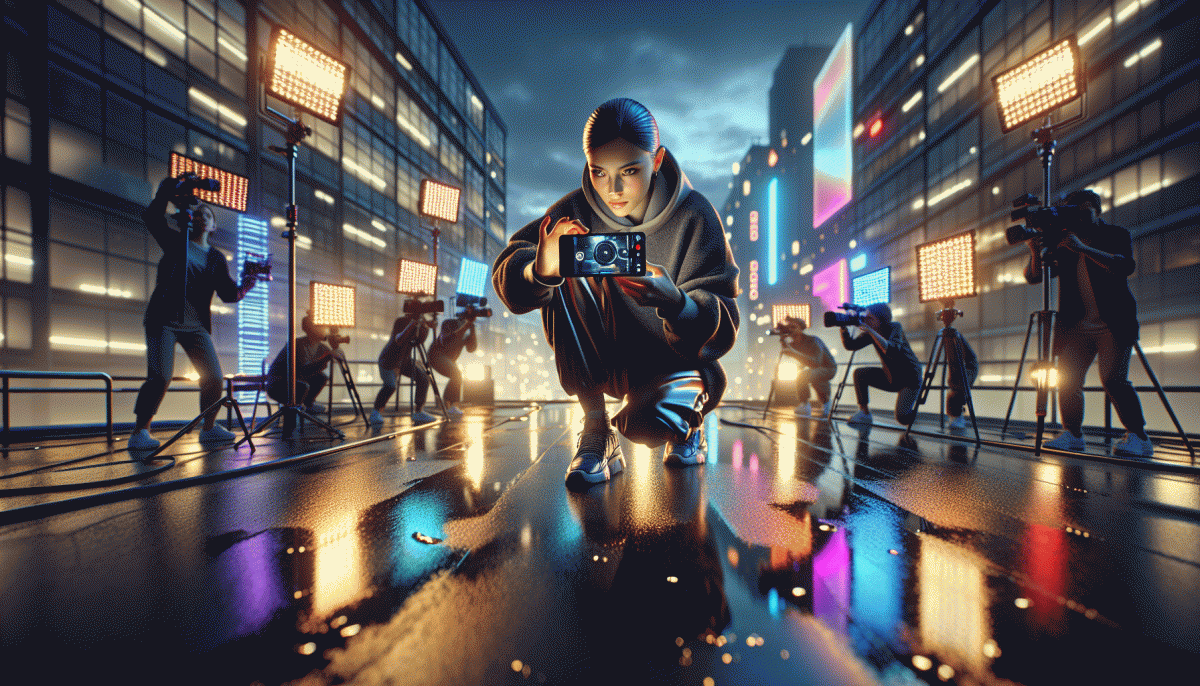
First frames decide fate. In the span of one blink you must deliver a readable visual that teases a microstory: a clear subject, dramatic motion or pop color, and a tiny promise of payoff. Aim for contrast, a near-face or big shape, and a single readable word or icon that viewers can grasp while scrolling fast.
Try a compact toolkit that jacks up stop rates:
- Contrast: Use one bold color against neutral background so the thumb can parse subject instantly.
- Movement: Add an early micro motion or jump cut in frame 0.2 seconds to arrest the eye.
- Promise: Deliver a clear benefit in image or sticker so the viewer knows why to stay.
Want to validate hooks quickly across a real audience? Try TT boosting service to test multiple thumbnails and opening beats without waiting months for organic lift. Then iterate: measure watchthrough for the first second, swap the opener that underperforms, and repeat until you have a short-form loop that stops the scroll.
Lo-Fi Looks Win: Raw, real, and shot on your phone
Authenticity is the secret sauce of the lo-fi wave — not because filters are lazy, but because realness sells. Swap staged perfection for the messy, heartbeat-y moments: a shaky pan into a candid laugh, imperfect framing that feels intimate, and a grainy sunset that says "I was there." These are the visual cues that stop thumbs and invite double-taps across TikTok, Reels, and Shorts.
Practical hacks make the aesthetic repeatable. Use natural side-lighting, shoot in portrait, and keep clips short enough to loop cleanly; handheld movement and a tiny bit of motion blur read as personality, not error. For edit, favor contrast over polish: bump shadows, add a whisper of film grain, and cut to the beat. Keep color tweaks subtle so the footage still looks like it came from your pocket rather than a studio.
Content-first thinking wins: build formats that lean on truth. A quick 10–15s behind-the-scenes, a candid confession with on-screen captions, or a day-in-30-seconds montage all thrive when captions and stickers highlight the human detail. Use one signature move — a wink, a snap transition, or a recurring phrase — so viewers start anticipating your content and naturally share it.
Finally, plan for platform rhythm: repurpose a vertical clip across platforms but trim or retitle for each audience, and always end with a small ask — a question or a simple CTA — to turn passive viewers into followers. The lo-fi playbook is simple: be human, be present, and make your phone look like the storytelling tool it already is.
Bold Type + Big Captions: Text-on-video that boosts watch time
Text layered over video is not decoration; it is the primary way to sell the next five seconds of attention. Bold captions act like neon arrows: they clarify context, deliver the punchline early, and rescue your message when sound is off. Aim for clarity first and personality second — typography should do heavy lifting, not create mystery.
Start with legibility rules and make them sacred. Use a heavy sans serif, set line length so words never crowd faces, and keep a consistent color system with a readable stroke or shadow. Animate sparingly: micro motion draws the eye, but too much motion will fatigue viewers and reduce retention. Always time captions to beats and cuts to maximize that dopamine snap.
Small experiments with three knobs yield big lifts:
- Contrast: High-contrast fills with a thin stroke or drop shadow for every lighting condition.
- Timing: Split longer lines into punchy two-to-four word bursts synced to edits or sound cues.
- Localization: Swap text length and sizing per language so translations stay bold and readable.
Platform matters. On ultra-fast feeds like TikTok, deliver the hook in the first frame and let captions repeat the promise. Instagram viewers expect polished type and brand voice; YouTube Shorts tolerate more explanatory caps since session time is longer. Test variants: same clip, different type treatment, then optimize toward the one that raises average view duration.
Practical next steps: build three caption templates, run A/B tests across core platforms, and prioritize the one that increases watch time and first-second retention. Little typographic choices compound into massive watch time gains, so make your words loud, fast, and impossible to miss.
Dopamine Color Palettes: Bright hues that spark saves and shares
Color that hits like a sugar rush is not a fad — it is a performance hack for attention. Dopamine palettes use saturated, high contrast hues to trigger eye stops, encourage saves and prompt shares. Think acid pastels clashing with neon accents, not muddy neutrals; the goal is instant emotional punctuation.
Start by picking two anchor colors: one warm, one cool, and decide which will dominate. Push saturation on the dominant tone and use white or near black as contrast gutters. Keep copy concise in high impact chips and let color do the heavy lifting. For video, cue color pops at rhythm changes to signal a shareable moment.
- Contrast: Maximize readability and drama with bright on dark or dark on bright combinations; make text pop.
- Accent: Reserve a neon tone for CTAs or save prompts so the eye has a single action target across the frame.
- Timing: Shift color at 0:02 to 0:04 and on hook points to increase loopability, replay value and saves.
Accessibility still matters: test contrast ratios and offer a toned down variant inside the same post or in comments for colorblind audiences. Save rates rise when bright palettes are balanced with clear utility — a tip, template, timestamp, or sticker that adds value. Micro interactions like a pulsing save icon can seal the deal.
Quick checklist — export a swatch sheet, pin hex codes in captions, batch create three templates with different primary neons, and A/B for 48 hours. Track saves and shares as primary KPIs; if a color triggers a spike, scale it into thumbnails, story covers and ads. Dopamine is short lived; design systems keep the wins sustainable.
AI + Human Touch: Generative visuals without the robot vibe
Generative visuals are taking over feeds, but the ones that truly stick feel human-made. Swap the perfect-for-a-demo polish for warmth: small flaws, personality, and context make AI art feel like it belongs to a person, not a factory. This is especially true on platforms where quick scrollers judge authenticity in a blink.
Start with the machine, finish with the human. Let the model draft composition and mood, then import into your editor to tweak skin tones, add grain, or erase uncanny elements. Iterate three times and pick the version with the quirks that match your brand voice. Make micro-adjustments to facial expressions and gaze; tiny changes alter relatability.
Textures and mistakes sell authenticity: subtle paper fibers, brush strokes, off-register printing, or a misaligned shadow. Use layer blending and hand-drawn overlays to break vector perfectness. Even a 2 percent tilt, warm shadows, or a cropped hand can trigger real-world empathy and cut through scroll fatigue.
Toolchain tip: pair a text-to-image engine with a raster editor and a motion tool. Export high-res passes, mask in human scribbles, animate micro-movements for stories. Keep a prompt log and seed numbers so you can reproduce the feel, not just the file. Use nondestructive edits so you can roll back when an AI pass was actually the best base.
Prompt like a director: assign roles, limits, and moodboards. Example: Director: gritty travel photographer; Limit: only three colors; Mood: late golden hour. Then ask a designer to add a signature flourish and have a content writer craft a caption that matches the image imperfections. Those small constraints force creativity and brand coherence.
Test small, publish often. A/B test images with subtle versus polished human tweaks and measure saves, shares, and comments. Small human touches consistently lift engagement because audiences reward perceived care. Track qualitative feedback too—comments often reveal if something feels staged. Let AI do the heavy lifting and humans add the charm.
Read also

Visual Trends in 2026: The Shockingly Simple Secrets Behind What Goes Viral on Social Platforms

Visual Trends in 2026: What Actually Goes Viral on Social Platforms (and How to Ride the Wave)

Visual Trends in 2026: What Goes Viral on Social Platforms (and How to Hijack It)

Visual Trends 2026: What Actually Goes Viral on Social Platforms

Visual Trends in 2026: Viral Visual Hacks Social Platforms Cannot Resist
