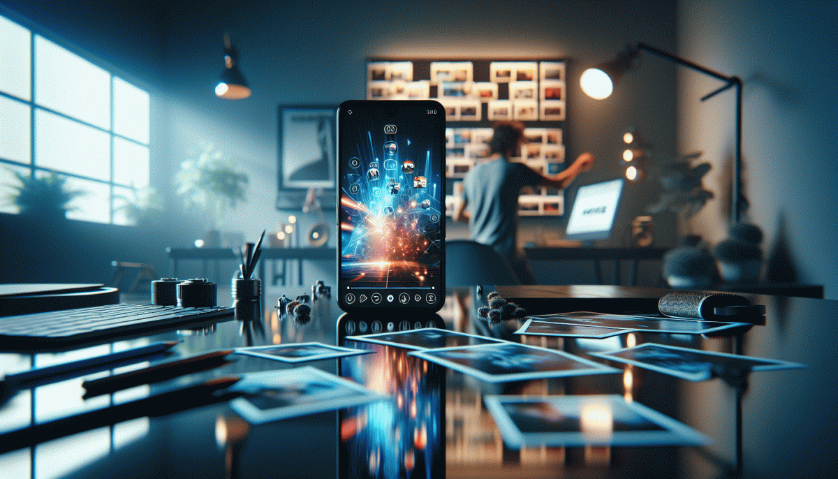
Visual Trends in 2025: The Shockingly Simple Secrets Behind What Goes Viral on Social Platforms
Stop the Scroll: Color, Contrast, and Composition That Win the Feed
Make the first frame do the heavy lifting. Social feeds are scanners, not readers: your image has under a second to promise value. Pick a dominant shape, one clearest color, and a single, readable word or face if you can. That tiny tradeoff—fewer competing details—turns casual glances into a pause.
Color is your mood shortcut. Use a bold accent hue against a muted background to create "pop" (think neon orange on soft gray), or apply intentional color blocking to guide the eye across the story. Test one saturated pixel in the corner: if it pulls attention, amplify it. Don't chase every trend color—choose palettes that match the emotion you want people to feel.
Contrast is the accessibility and legibility secret. High luminance contrast for text, mid-tone contrast for faces, and edge contrast to lift subjects from backgrounds make scrolling fingers stop. Add subtle drop shadows or hard outlines for small thumbnails, and check your composition in dark and light modes—what looks crisp on one can vanish in the other.
Composition is where geometry meets instinct. Use the rule of thirds, but break it: place a subject off-center with negative space to the dominant side so captions and stickers have breathing room. Crop tighter on faces and action to increase intimacy; leave movement direction toward the empty space. Micro-crop variations often outperform the original.
Turn these rules into rituals: create three templates (portrait, square, thumbnail), pick two brand colors, and A/B one contrast tweak per post. Measure pause time and comment rate, then iterate fast. Small, deliberate shifts in color, contrast, and composition are the easiest, highest-return ways to stop the scroll.
Faces Beat Filters: Human Shots and Micro Emotions That Spark Shares
People are wired to read faces, not filters. When a thumbnail or short clip shows a genuine flicker of surprise, a micro smile, or a tiny wince, viewers pause. That pause is the gateway to shares. Leverage this by prioritizing close human shots over slick effects: a living, breathing face creates empathy faster than any AI polish.
Shoot for subtlety. Frame tight, focus on the eyes, and capture a couple of seconds before and after the moment you want. Micro emotions live in the milliseconds, so use higher frame rates for slow plays, or edit down to 1–3 second bursts that loop cleanly. Encourage natural reactions by asking simple prompts rather than staging a pose.
Edit with restraint. Dial back heavy smoothing and extreme color filters that flatten character. Instead, nudge exposure and contrast to let textures show. Keep captions or single-line context because most platforms autoplay on mute; a short line helps viewers interpret the expression and increases the chance they will tag a friend who will relate.
Design thumbnails that amplify the micro emotion: choose frames with clear eye contact or a readable expression, crop closer than you think, and leave space for a bold overlay if needed. Test two variants to see which expression stops the scroll. Small asymmetries and imperfect teeth often read as more authentic than a flawless, drilled smile.
Finally, make it a repeatable kit: a few trusted faces, consistent framing, and a set of prompts that spark real reactions. Build micro narratives across posts so audiences learn to expect those tiny emotional beats. When people see themselves in a face, they do more than watch — they share.
Text on Screen That Sells: Bold Type, Safe Zones, and Subtitles That Pop
Think of on-screen text as the thumbnail of your message — big, fast, and unavoidable. Favor bold typefaces with generous x-heights, limit styles to one family with two weights, and keep lines punchy: 1–3 words for hero blurbs, 6–9 words for supporting lines. Contrast is not optional; use blocks, outlines, or shadows to guarantee legibility on busy footage. If the copy can be read in a glance, it can stop a thumb-scroll.
Design safe zones like a small stage: leave roughly 10–12% of the frame free from important copy to avoid overlaps with UI and captions. Center or align consistently across cuts so the eye builds a rhythm. Reserve ALL CAPS for one-word or two-word emphasis only; long lines in caps slow reading and feel shouty. Size hierarchy matters more than color — establish scale first, then spice with color.
Subtitles must be treated as primary design elements, not afterthoughts. Always proof and time captions—edited auto-captions are fine if corrected—use short chunks timed to 150–200 wpm, and add a 200–300 ms buffer at phrase ends. Consider subtle color bars or speaker labels to speed comprehension and to help low-volume viewers. Sync text in and out with motion so it appears to belong to the scene.
Place CTAs inside the safe zone, make them bold and concise, and test placement across formats (9:16, 1:1, 16:9). Track retention spikes when text hits in the first two seconds and iterate: change weight, margin, or timing until the lift is real. In short: bold type, roomy safe zones, crisp subtitles — repeat with variations and you will turn attention into action.
Make It Loop: Motion, Micro Cuts, and Transitions Viewers Replay
Think of loopable clips as tiny riddles: the motion answers the question you didn't know you asked. When action flows so cleanly that the end becomes the new beginning, viewers instinctively hit replay to savor the trick. Micro cuts—those 0.08–0.4s snips between frames—create momentum; transitions hide the seams. The goal is a satisfying cycle, not a flashy one-off, so favor continuity of movement and a payoff that makes people want to see the trick again.
Start with a single anchor motion and chop around it. Make the first and last frames share an element: a glance, a hand, or a color burst. Use masked and match cuts to morph objects across shots, or whip pans and speed ramps to blur the edit. Count beats rather than frames: slice on 1/2 or 1/4 notes of your soundtrack to make each micro cut feel musical. Keep cuts short, but let the transition carry the eye so the viewer doesn't notice the jump—then notices it on replay.
Sound is the secret loop glue. A tiny whoosh, snap, or vocal tag aligned with the cut reinforces the illusion and becomes a replayable earworm. Build a visual “bookmark” at 0.9–1.2 seconds—an odd detail or reveal that rewards a second watch. Also, cheat with symmetry: reverse a segment or mirror motion to create perfect looping physics that look effortless but are meticulously planned.
- Hook: Begin and end with the same motion so the loop feels inevitable.
- Timing: Cut on musical subdivisions to make edits feel natural.
- ⚙️ Transition: Mask or match-cut key objects to hide the seam.
The 30 Minute Viral Visual: A Plug and Post Blueprint You Can Repeat
In 30 minutes you can make a visual that behaves like a tiny viral engine — not magic, just a repeatable recipe. Start with a three-part formula: a five-second hook, one clear visual promise, and a single action to take. Split the half hour into quick sprints: 7 minutes to decide the idea and thumbnail, 18 minutes to shoot and edit, 5 minutes to caption, tag and post. That structure forces choices that favor clarity over cleverness, and clarity wins on feeds.
Minute-by-minute, here's what actually happens: 0–7 sketch a bold headline and one visual beat (movement, contrast, or emotion). 7–25 capture two short takes and assemble the best frames — vertical, high-contrast, readable text at eye level. Use jump cuts, a repetitive beat, or a surprise ending to lock attention. 25–30 craft a 1-line caption, two hashtags, and a one-word CTA. Keep files named with the date and hook so you can reuse them.
Make it repeatable: build a swipe file of three headline formulas, three color palettes, and three micro-templates you can drop into any clip. Batch four of these in one afternoon and schedule the posts across channels. Track the first 24–48 hours for completion rate and where people stop watching; that's your feedback loop and your quickest path to smarter repeats.
To plug-and-post without overthinking, use this pocket checklist: Hook: bold claim in 5s, Visual: one clear motion or emotion, Post: caption + CTA + two tags. Do it today, repeat tomorrow — consistency plus this tiny system is the viral advantage most creators never build.
Read also

Visual Trends in 2026: The Shockingly Simple Secrets Behind What Goes Viral on Social Platforms

Visual Trends in 2026: What Actually Goes Viral on Social Platforms (and How to Ride the Wave)

Visual Trends in 2026: The Eye-Popping Secrets Behind What Actually Goes Viral

Visual Trends in 2026: What Goes Viral on Social Platforms (and How to Hijack It)

Visual Trends 2026: What Actually Goes Viral on Social Platforms
