The One Thing That Explodes Clicks on YouTube (And You Are Ignoring It)
Your Thumbnail Is the Ad — Make It Scream Tap Me
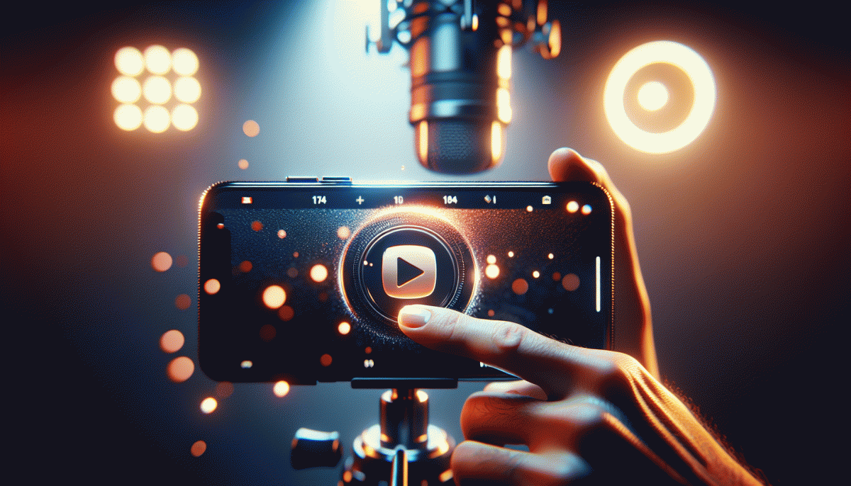
Treat the tiny image next to your title as the one-line commercial that decides if someone pauses a scroll. Every pixel competes with thumbnails, reels and notifications, so simplify: one dominant subject, screaming contrast, and a single emotion. Remove clutter, amplify a visual hook, and make the subject readable even at thumb size — that is where clicks are born.
Design decisions that lift click-through rate are specific and repeatable. Use high-contrast colors, tight crops, and large type that reads on mobile. Faces should show clear expression toward the camera or off-frame action; eyes and direction guide attention. Also, apply this micro-checklist before export:
- Hook: One clear focal element that answers "why watch?" at a glance.
- Readability: Bold, high-contrast text limited to 3–4 words max.
- Emotion: Exaggerated expression or motion to provoke curiosity.
Do not trust instinct alone — test. Upload three variants, wait for 24–72 hours, and let CTR tell the story. Keep the thumbnail consistent with your title and first 10 seconds of footage so viewers do not feel tricked. For your next upload, craft three thumbnails that follow the checklist, pick the top performer, and treat thumbnail work as weekly creative iteration, not a last-minute afterthought.
Face, Emotion, Big Text: The CTR Trifecta
Think of a thumbnail as a tiny billboard on a highway where attention lasts a blink. The most clicked thumbnails combine three simple signals that the brain processes instantly: a face that reads intent, an emotion that creates curiosity, and large readable text that explains the reward. When these three work together your CTR does not slowly climb, it jumps.
Start with the face. Close crops win because eyes create connection even at thumb size. Use a headshot that fills one side of the frame, keep the eyes visible, and add a subtle angle or tilt to avoid a static stare. Contrast the subject from the background with color or light so the silhouette reads on small screens.
Next, dial the emotion. Exaggerated expressions perform, but only when they feel real. Choose one clear emotion per thumbnail: shock, joy, disgust, determination. Combine that expression with a tiny prop or gesture to tell a micro story. If something looks staged, test softer intensity; audiences reward authenticity as much as drama.
Finally, make the text work like a neon sign. Limit copy to two to four high impact words in a bold sans serif, use strong contrast and an outline or shadow for legibility, and leave breathing room around the face. Export thumbnails at actual mobile size and eyeball them. Then iterate: make three versions, run a short A/B test, and keep the winner. Small tweaks here move CTR more than long content tweaks ever will.
Color, Contrast, Clean Edges: Design for the Scroll
Think of your thumbnail as a tiny billboard screaming for attention in a sea of moving thumbs. At that scale, color and contrast are your megaphone: saturated backgrounds make faces pop, complementary hues create instant separation, and a hard, clean edge stops your subject from bleeding into the chaos. Clutter and soft transitions are luxury the feed won't afford—strip visuals down to one bold shape, one clear face, and one short line of readable text.
Design like someone's scrolling with their thumb on a train: bold choices, zero hesitation. Pick a palette of two or three high-contrast colors, apply a crisp mask around the subject (no feathering), and use a heavy, geometric font with a slight stroke or shadow for legibility. Test at tiny sizes: shrink the image to 10–15% and ask, "Can I still read it? Do I know the emotion?" If the answer is no, simplify until it screams yes.
- Contrast: Pair light text on a dark patch or vice versa so critical elements read instantly.
- Silhouette: Cut subjects out with clean edges so shapes are recognizable even blurred.
- Emotion: Tight face shots with clear expressions convert better—eyes, mouth, and posture must be legible.
Finally, treat every thumbnail like an experiment: make two variants, swap them after 48 hours, and keep the one with the higher CTR. Keep a swipe file of thumbnails that worked (and why), and iterate—small wins compound fast. Be bold with color, ruthless about clutter, and always test: the scroll is merciless, but design that reads in a blink wins.
Title Plus Thumbnail Equals Story: Tease, Do Not Tell
Think of the title and thumbnail as a tiny movie trailer: together they sketch a beginning that begs for an ending. The trick is to hint at a drama or payoff without handing it over. A thumbnail that shows a shocked face plus a title that asks a question creates a promise; when a viewer clicks they expect a story arc, not a dry how-to. Make the first beat irresistible, then deliver in the video.
To build that promise use a curiosity gap: promise change, stakes, or a surprising number, but leave the key word out. Swap bland adjectives for strong verbs, pair a fractional number with an emotional hook, and test micro-variants. If you want a quick way to run experiments and scale thumbnail/title combos, try this smm panel to iterate fast and discover what kind of tease actually converts.
Design for legibility on a tiny phone screen: bold type, a single face or object, high contrast, and negative space. Use color to signal genre — warm tones for excitement, muted for mystery — and crop tight so the thumbnail reads at a glance. In titles, remove filler words and place the magic word where the eye lands. Small visual stories beat long descriptions every time.
Measure click action, not intuition: track CTR by audience, watch first 30 seconds for retention, then iterate. Keep experiments small and repeatable: change one word or one image element per trial. Above all, remember the rule: tease, do not tell. Make viewers feel they must click to finish the sentence you started.
Tiny A/B Tweaks That Move CTR Overnight
Stop trying to rearrange a whole video and start fiddling with the things viewers actually click on. Tiny visual edits — a tighter crop on a surprised face, a bump in thumbnail text size, or swapping a cold blue for a warm orange — are the kinds of surgical moves that nudge eyeballs from scrolling to tapping. Pick one baseline video, decide your CTR target, and treat each tweak like a hypothesis you can prove or kill fast.
What to test first: facial expression and proximity, text legibility and contrast, background clutter, color temperature, and the focal point placement. These are the low-effort, high-impact switches: a 10% crop closer to the face, +20% text size, or a shadowed outline around words often moves CTR more than re-editing content. Keep changes small so you know which lever you pulled.
Run controlled A/Bs: one variable at a time, enough impressions to see a trend (think hundreds to low thousands, not a handful), and 24–72 hour windows for initial signals. If you're confident, extend to a week. Track watch time too — a spike in CTR that tanks retention is a false win. Document results in a simple spreadsheet and label winners clearly so you don't re-test the same losing combo later.
Make a habit: build three quick variants for every new upload, rotate them, learn what your audience prefers, then iterate. Small, consistent experiments compound: the tweaks that look trivial today become the optimization playbook that explodes your channel growth tomorrow. Be annoying about testing — the clicks will thank you.
Read also

The One Thing That Drives Clicks on YouTube (You're Probably Ignoring It)

The One Thing That Drives Clicks on YouTube (Spoiler: It's Not Your Video)

The One Thing That Drives Clicks on LinkedIn (You're Probably Ignoring It)

The One Thing That Drives Clicks on YouTube (No, Not the Algorithm)

The One Thing That Drives Clicks on LinkedIn (And You're Probably Ignoring It)
