The One Thing That Drives Clicks on YouTube (No, It Isn't Your Upload Schedule)
Hook the Thumb: Thumbnails that Stop the Scroll in One Glance
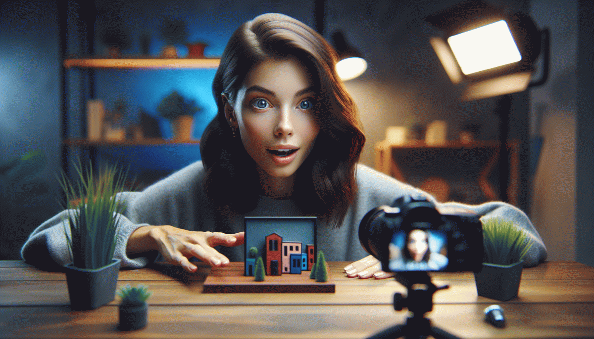
Think like a speed-date judge: you have a thumbnail and 0.8 seconds to earn a double-tap. Make one element dominate — a punchy face, a big object, or a bold word — and remove everything else that competes. When the thumb stops, curiosity should spike before the brain even finishes reading.
Work in layers: color contrast grabs attention, then composition guides the eye, then a tiny textual tease locks intent. Use high-contrast edges, warm colors for subjects, cool for backgrounds, and crop tighter than you think. If it's busy at 100%, it's illegible at 10%.
Three quick ingredients to test fast:
- Contrast: Maximize foreground/background separation so shapes pop at thumb-size.
- Face: Use exaggerated expressions or close-ups; eyes that look at the camera pull people in.
- Tease: A single provocative word or icon hints at payoff without telling the whole story.
Templates are your friend: build 3 thumbnail systems and rotate them, then double down on the winner. Keep logos subtle, never more than one small brand mark, and avoid text blocks — short, punchy copy wins. Consistency trains subscribers; novelty pulls newcomers.
Final checklist: clear focal point, readable at 200px, bold contrast, one emotion or object, and a promise. If your thumbnail answers “What will I get?” in a flash, YouTube will reward the click. Tweak, test, and don't be afraid to break your own template when the data calls for it.
Title Chemistry: Curiosity Without the Cringe
Think of a title as a chemistry set: elements combine to create a reaction — clicks. The trick is to create a curiosity gap that pulls viewers in without promising miracles. Aim for questions that tease a result, a tiny mystery, or a vivid detail. Keep it human, slightly specific, and skip the all caps and empty superlatives. Small specifics beat loud promises every time.
A simple formula works: setup + detail + micro promise. Example: instead of "You Must See This" use "How I fixed audio in 3 minutes" or "Why small color shifts made viewers watch longer". Add brackets for format like [Quick Fix] or a time marker like (5 min) when it helps. Use numbers, clear time frames, and a precise object. Bold one benefit so the brain can choose faster.
Edit ruthlessly. Cut weak adjectives, keep the object of curiosity visible, and replace vague verbs with exact ones like swap improve for cut edit time in half. Test 3 variants before publishing: a how title, a curiosity title, and a benefit title. Run each for several days and track click through rate and first 15 seconds retention to see which version truly earned attention.
Titles are tiny experiments with big returns. Pair a clean title with a matching thumbnail and a first 3 seconds that deliver on the tease. When retention dips, change one title element at a time instead of overhauling everything. Treat every video like a headline test lab and your channel will gain steady organic attention without ever sounding like clickbait.
Faces, Numbers, Outcomes: Visual Proof That Sells the Click
Think of a thumbnail as a tiny sales poster: the fastest route to a click combines a human face, a clear number, and a visible outcome. When those three elements align the brain reads intent in a blink and the finger moves to tap. This is not art for art sake; it is visual proof that a video will deliver.
Face: Use a close up with eye contact or an exaggerated reaction. Keep the face large enough to be legible on mobile, boost contrast between skin and background, and simplify accessories that steal attention. A candid grimace or a wide smile beats a neutral look every single time.
Number: Numerals convert faster than words. Use big, bold digits for list counts, percentages, times, or savings. Place the number near the face so the two lock together visually. Limit to one prominent number to avoid confusion and choose a font weight that remains readable at small sizes.
Outcome: Make the result explicit. Before and after, reaction shot, or a tiny prop that symbolizes the payoff will close the loop. Pair a short overlay like 3 Words Max: \"Save 10 Mins\", \"Gain 5 Habits\", \"Fix Bad Audio\". Match the promise to the content to build long term trust.
Design rules matter: high contrast, clean type, and a small border or drop shadow for separation from YouTube UI. Create two thumbnail variants, upload both, and measure CTR by audience segment. Swap colors or swap facial expressions to find what moves your viewers.
Treat thumbnails as experiments, not trophies. Build a reusable template, test 5 to 10 iterations per video batch, and aim for incremental CTR gains of a few percentage points. Those few points multiply into real watch time and growth.
The 10-Second Thumbnail Test: Would You Tap It?
Treat every thumbnail like a tiny movie poster with ten seconds to convince a stranger. Do a real 10-second test: set a timer, strip away context, and scroll past your own video—if it does not pull you in, it will likely fail in the feed. This forces ruthless editing and stops thumbnails that only look good at full size.
Run a blink-and-you-know checklist: Contrast: subject separated from background; Face: close-up with readable expression; Copy: three words max, giant and legible; Focus: one clear focal point; Color: choose one vivid hue to pop. If any of these fail in tiny preview, fix it.
Rapid experiments beat perfection. Export three bold variants, view them at mobile size, and ask two friends to pick their tap in ten seconds. Track CTR for 24-48 hours, then iterate. Small wins compound—tightening a crop, upping saturation, or swapping to a stronger glance can lift clicks more than a better upload time.
Make the 10-second test a ritual: if you would not tap it, neither will your audience. Prioritize curiosity plus clarity, bleed your brand subtly, and keep iterating until the feed gives you that confident thumb stop.
Test, Don't Guess: Quick A/B Tweaks that Win More Clicks
Micro-tests beat intuition: swap one thing, measure CTR and watch time, then keep the winner. Start by treating thumbnails and titles like experiments, not art projects. You don't need perfect design—clarity and contrast win more clicks than cleverness.
Pick one variable per test: thumbnail crop, facial expression, overlay text, title opening word, or even punctuation. Run the variant for 24–72 hours or until each version reaches 1,000 impressions (or a comfortable sample) so you reduce noise. Track CTR, average view duration, and conversion.
For thumbnails, small moves matter: 10% closer crop on the face, punchier color saturation, or removing busy backgrounds can lift clicks. For titles, try swapping the leading verb, shortening by 3–6 words, or adding a power word like 'how', 'why', or an emoji. Record what wins and why.
If you want a no-friction way to organize tests, plug results into a simple dashboard or use tools that rotate thumbnails and track clicks. For those who want a shortcut, try fast and safe social media growth to speed up early validation and scale winners faster.
After a win, iterate: push the winning combo across similar videos and keep testing adjacent variables. The goal is compounding gains — a steady string of tiny lifts will move your overall channel metrics more than any single upload schedule tweak.
Read also

The One Thing That Drives Clicks on YouTube (Spoiler: It's Not Your Video)

The One Thing That Drives Clicks on YouTube (Hint: Your Thumbnail Rules the Game)

The One Thing That Drives Clicks on YouTube (You're Probably Ignoring It)

The One Thing That Drives Clicks on YouTube (No, Not the Algorithm)

The One Thing That Drives Clicks on LinkedIn (You're Probably Ignoring It)
