The One Thing That Drives Clicks on YouTube (And You're Probably Ignoring It)
Spoiler: It's not your title—it's the story your thumbnail shouts at a glance
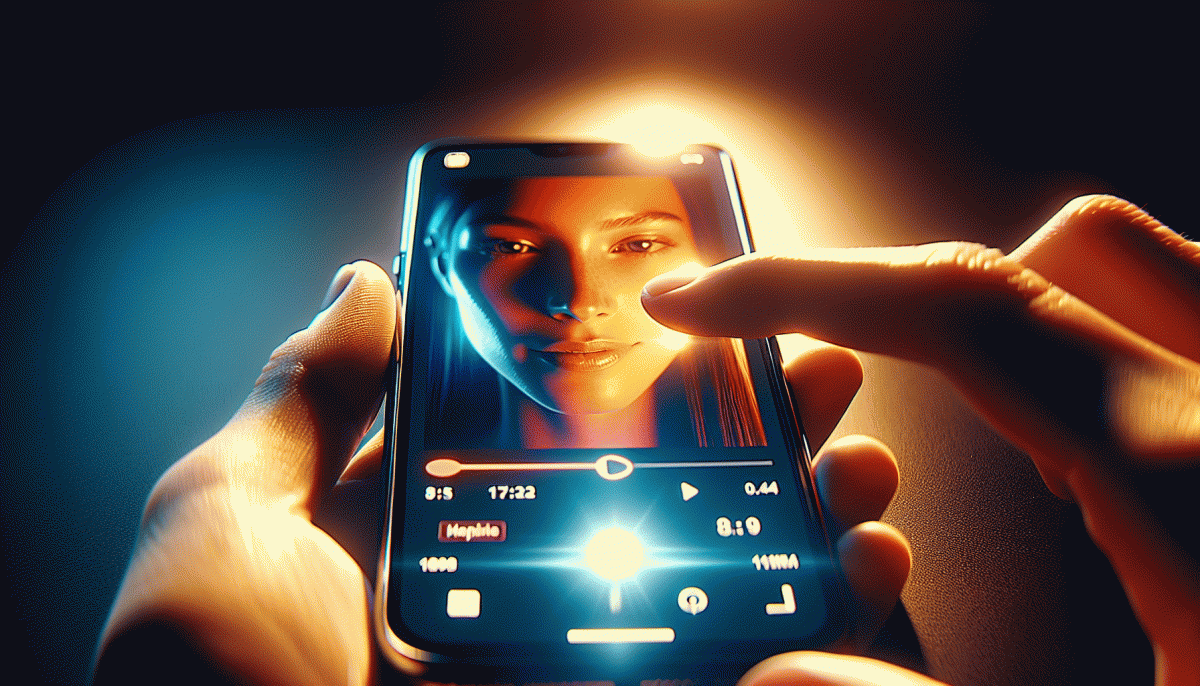
Think of a thumbnail as a billboard you get to design for half a second. Viewers don't read headlines; they make a gut call when pixels collide with emotion. If your image screams “who?” or “what?” instead of “wow,” the title never gets a chance. Great thumbnails compress a story — problem, hint of solution, and emotion — into one clear visual beat that clicks through curiosity.
Make that beat count: make the subject huge and isolated, choose a face or object with a clear expression or action, drop heavy contrast so elements pop on mobile, and use one punchy word max if you add text. Avoid clutter and tiny logos; they disappear on phones. Color contrast and gaze direction steer attention — people glance where the subject looks, so use it to point toward the hook.
Use this quick recipe when prototyping thumbnails:
- Emotion: Big face or bold object with readable expression.
- Clarity: One subject, high contrast, no tiny details.
- Curiosity: A visual question or partial reveal — enough to ping interest.
Experiment fast: swap thumbnails without changing titles, run short-lived tests, and watch CTR lift. Keep a tiny library of winning templates (colors, font weight, crop) so you can iterate without reinventing the wheel. The trick isn't mystery sauce— it's consistent, readable storytelling at a glance. Nail that, and your title becomes the finishing flourish rather than the sole attractor.
Hook them in 3 beats: face, contrast, curiosity—then watch CTR climb
First frame is a face. Human brains are wired to find eyes and emotion, so a clear close up with a readable expression stops the scroll. Crop tight, push the face forward in the composition, and favor exaggerated micro expressions—shock, delight, confusion—that telegraph stakes in one glance. Tiny faces or busy backgrounds are wasted real estate.
Second beat is contrast. Contrast is both color and context: pair a calm face with a chaotic backdrop, or a neutral expression with bold, high‑contrast text. Use complementary colors, heavy outlines, and simple shapes so the thumbnail reads at thumb size. Keep text to three words or fewer and let negative space do half the work.
Third beat is curiosity. Tease an unresolved question by showing an edge of an object, a cut off number, or a face looking at something off frame. The goal is a small gap in the viewer's story that only the video fills. Avoid giving the payoff away in the image or caption; imply a narrative rather than stating it.
Quick checklist to create a scroll‑stopping hook:
- Face: Use a tight, expressive close up so the viewer connects immediately.
- Contrast: Maximize color and tonal separation plus minimal readable text.
- Curiosity: Leave a tiny mystery that demands a click.
Combine these three beats, test two variations per thumbnail, and measure CTR lifts. Small visual moves often produce the biggest clicks.
Proven swaps: tiny thumbnail tweaks that triggered giant click spikes
Think tiny changes do nothing? Meet the thumbnail that went from wallflower to headline act with a three pixel nudge. Creators who treat thumbnails like experiments routinely see double and triple digit increases in click through rate after a few deliberate swaps. That works because the brain is wired for contrast and faces; a tiny shift in composition or color grabs attention faster than a long title. The trick is to change one variable at a time and measure quickly.
Color Pop: replace muted backgrounds with a single saturated hue to make the image stop a scroll.
Tight Crop: zoom on the face or main object so the emotion reads even at tiny sizes; aim for the subject to fill roughly 35 to 55 percent of the frame.
One Word Hook: add a short, high-contrast caption word like WIN or WAIT to create curiosity without clutter; use bold sans font and a subtle drop shadow for legibility.
A/B testing examples: swapping a pale blue for neon orange lifted CTR by 38 percent in one week on a lifestyle channel; switching from a half-body to a close face shot added 26 percent for a how-to series; removing logos and simplifying the scene gained 17 percent on a tech review. Practical testing: launch 3 variants, collect 500 to 2,000 impressions or until the winner is clear, then iterate every 3 to 7 days to capitalize on momentum.
Want ready-made experiments and swipeable thumbnail templates that convert? Check fast and safe social media growth for bundles and a free thumbnail checklist you can use to design five test thumbnails before your next upload; small swaps now mean big spikes later.
Words that win: the power phrases that make viewers tap without thinking
Words are the secret buttons on your thumbnail and title — the tiny phrases that make someone stop scrolling and tap before they think. Think less thesaurus, more trigger: pack your copy with concise cues that promise payoff, shock, or a quick win.
Focus on three psychological shortcuts: curiosity that begs for closure, urgency that compresses decision time, and social proof that says "others care, so maybe I should too." Those are the levers that turn casual browsers into instant clickers — and you can pull them with a few well-chosen words.
Use these power moves as building blocks:
- Curiosity: "You won't believe…" or "What happened next…" — tease the gap.
- Urgency: "Now," "Before it's gone," "Last chance" — a little time pressure boosts taps.
- Proof: "Proven," "Millions watched," "Top 3" — show that others found value.
Place them where the eye hits first: start the title with the strongest cue, repeat a trimmed version on the thumbnail, and echo a benefit in the first line of the description. Avoid vague hype — swap "amazing" for a specific promise like "fix in 60 seconds."
Test one phrase at a time, measure click-through, and iterate. A tiny tweak — a single bold word, a bracketed promise, or a number — can lift clicks more than rewrites of the whole script. Use data, stay curious, and write with the tap in mind.
Steal this 10-minute thumbnail makeover workflow (templates inside)
Think of a thumbnail as a neon sign: it gets one glance to sell the click. This 10-minute makeover is a tiny production sprint that forces decisions and removes fluff. Use the timer, follow the micro checklist below, and then drop in one of the provided templates to speed things up without guessing.
Minute 0-2: pick the strongest frame or background and crop to a clear subject.
Minute 2-5: boost contrast, punch the colors, and remove distracting bits.
Minute 5-8: add big readable text and a cropped reaction or product closeup.
Minute 8-10: export two variants and name them A and B for a fast upload split test.
Templates included in the pack cover three battle tested formulas: Face+Text for personality led hooks, Clean Product for tutorials and gear demos, and Mystery Crop for curiosity based thumbnails. Each template has a grid, font pairing, and color accents so nothing needs to be invented on the fly.
Drop a template into your editor, swap the photo, tweak the copy, and export. Small, consistent thumbnail upgrades like this are how channels move from invisible to clickable without spending hours per image.
Read also

The One Thing That Drives Clicks on YouTube (You're Probably Ignoring It)

The One Thing That Drives Clicks on LinkedIn (You're Probably Ignoring It)

The One Thing That Drives Clicks on LinkedIn (And You're Probably Ignoring It)

The One Thing That Drives Clicks on YouTube (Spoiler: It's Not Your Video)

The One Thing That Drives Clicks on YouTube (No, Not the Algorithm)
