The One Thing That Drives Clicks on YouTube — and How to Nail It Now
Your thumbnail decides the click before the title does
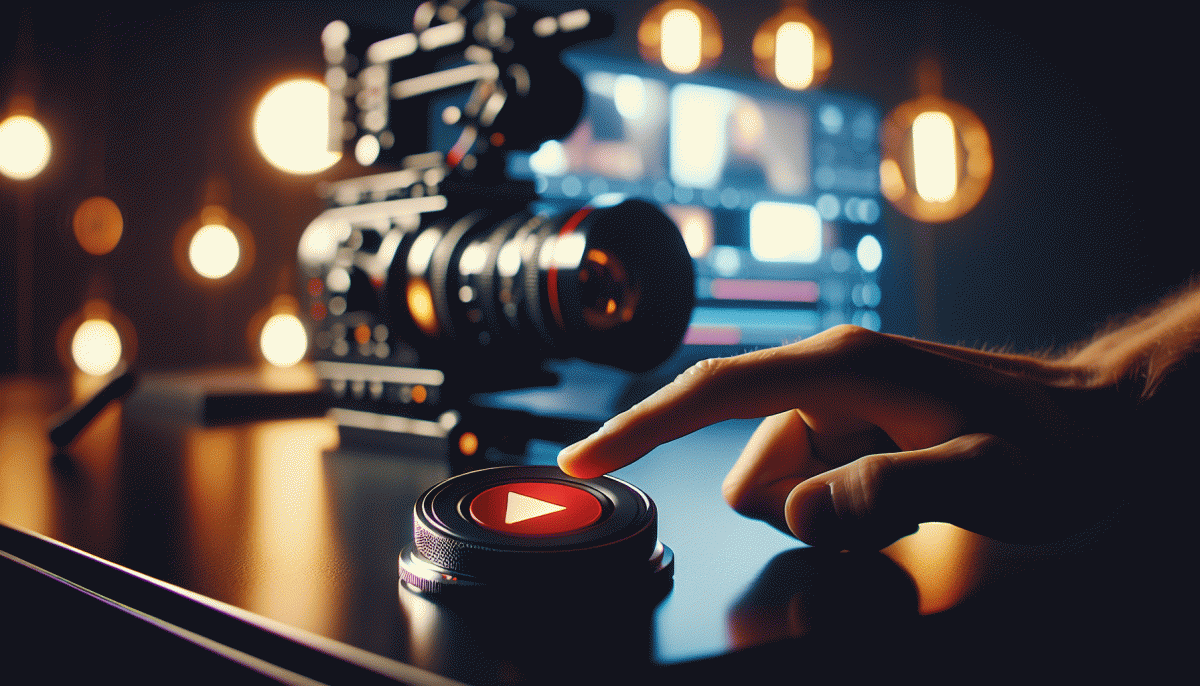
Before a viewer even reads your headline they decide whether to pause on your thumbnail. The brain processes images faster than words, so your still image is doing the heavy lifting: it must stop scroll inertia, telegraph the video promise, and feel like a natural click for that audience.
Design with intent. Use one clear focal point, ideally a close up with expressive eyes or action; keep backgrounds simple and boost contrast so the subject pops on tiny screens. Add a hint of mystery or a readable emotion—surprise, joy, frustration—so the viewer wants resolution. Avoid clutter; a single strong element beats five mediocre ones every time.
Make text huge and spare if you use it: three words or fewer, high-contrast strokes, and a bold typeface that still reads at 120px wide. Lock in a color palette and composition so your channel becomes instantly recognizable in a sea of thumbnails. Consistency builds subconscious trust, which raises click-through rate over time.
Treat thumbnails like experiments. Iterate based on CTR and first-minute retention: swap colors, test eye lines, swap imagery and measure the lift. When you want a fast creative refresh or support to scale thumbnail testing, check out smm panel for services that speed up variations and delivery.
Turn thumbnail work into a quick ritual: capture a punchy frame, crop tight, punch the color, and preview at small size before upload. Do this habitually and you will convert passive scrollers into active viewers far more often than polishing titles alone.
The curiosity gap formula that makes visuals irresistible
Think of the curiosity gap formula as a recipe for visual tension: give just enough context to spark a question, introduce a small oddity that the brain cannot ignore, and imply a payoff that feels worth a click. The trick is balance — too vague and people scroll past, too clear and there is no tension to resolve. Your thumbnail should whisper a problem and loudly promise the answer.
Break it into three moves that you can apply to any frame:
- Hint: Plant a familiar cue — a face, a tool, a headline fragment — so viewers know the category instantly.
- Anomaly: Add one thing that breaks expectation — an expression, color, or object that does not belong.
- Payoff: Signal the result without showing it — a reaction, a blurred reveal, or a bold word that promises value.
Practically, that means tighter crops, higher contrast, and text that completes the loop rather than repeating the title. Use faces for emotion, tilt or scale one element to create imbalance, and keep words to two to four strong tokens. Test “mild curiosity” versus “full mystery” to see which pulls harder for your niche.
Run a fast experiment: create three thumbnails that vary only in the anomaly level, run each for 48–72 hours, measure CTR and watch time, then iterate. Small visual nudges drive clicks more reliably than clever wording alone — once you know the formula, you can make every frame irresistible.
Faces, contrast, and big emotion — the click magnet combo
Faces are the fastest read on a tiny thumbnail. A close-up of eyes, a visible smile, or a mouth mid-word cuts through the noise and tells a story in a single frame. Crop tight, give the headroom that matches your platform, and keep composition simple — no tiny logos or distracting limbs in the background.
Contrast turns a good face into a thumb-stopper. Use darker backgrounds, brighter skin highlights, and one high-contrast accent color for text or props so the eye has a single place to land. Slight saturation boosts help, but keep skin tones natural and avoid busy patterns that dilute the focal point.
Big emotion is permission to click. Surprise, joy, anger, curiosity — amplified but authentic — creates immediate intrigue. Pair the expression with a short, readable graphic and a hook in the copy. Test variants fast; for scalable creative tools and bulk thumbnail tweaks check best smm panel.
Combine the three: face + contrast + emotion. Make three thumbnail drafts, swap background and color accents, then run quick A/Bs. Measure CTR and early watch time to pick winners instead of relying on vanity metrics. Small edits in expression or tint often move clicks more than new content. Iterate weekly and let the data and the algorithm reward the best combo.
Run the 3 second squint test and spot instant flops
Think of your thumbnail like a billboard zipping past at 40 mph — you get three seconds before the eye moves on. The squint test forces brutal clarity: if the core idea doesn't pop when you literally squint or shrink the image, it won't pop in the feed. This saves editing time and wasted uploads.
How to run it fast: shrink your thumbnail to phone-screen size, or close one eye and squint for three seconds. Ask yourself one question: can I name the video in a phrase? If not, tweak. Focus on one subject, one emotion, and one bold type or icon — that's the recipe for instant recognition.
Warning signs of an instant flop: tiny multiple faces that compete, long sentences in the thumbnail, washed-out backgrounds, or a grid of cluttered elements. Anything that makes the viewer pause to decode instead of react is a conversions killer. Your goal is impulse, not a reading test.
Quick rescue moves: remove extraneous props, boost contrast between subject and background, swap long text for a single punch word in bold, and crop tighter on the face or object. Test alternate colors — saturated accents win on mute autoplay. Iterate until the thumbnail reads at arm's length.
Final litmus: if you can explain the video in three words in under three seconds, upload it. If not, iterate one more time. Small wins on the thumbnail add up fast — squint, simplify, ship.
Win with fast A/B thumbnail tests and ruthless iteration
Treat every thumbnail like a tiny ad: start with a single, testable hypothesis. Do not tweak ten things at once. Pick one variable to change per round — color contrast, facial expression, headline copy, or background clarity — and state what success looks like before you launch. A crisp hypothesis keeps tests clean and results actionable.
Run fast A/B rounds with small, clear rules. Design 2 to 3 strong variants and expose them for a short window: aim for 48–72 hours or roughly 1,000–5,000 impressions when possible. If one design pulls a meaningful CTR lift early, promote it; if nothing moves, scrap it and iterate. Speed beats perfection when the goal is clicks.
Measure ruthlessly: prioritize uplift in clickthrough rate as your north star, then layer in watch time and audience retention to avoid false winners. If a thumbnail raises CTR but tanks average view duration, that is a false positive. Kill losers quickly, double down on winners, and always tie changes to downstream metrics so you are optimizing for real engagement, not vanity.
Put this into a routine: batch 8–12 thumbnails, keep a named library of templates, log each test with hypothesis, dates, impressions, CTR, and watch time. Schedule a weekly review to prune bad patterns and to scale winners. The faster you run tight experiments and the more ruthless you are about iteration, the quicker you will unlock consistent click growth.
Read also

The One Thing That Drives Clicks on YouTube (Spoiler: It's Not Your Video)

The One Thing That Drives Clicks on YouTube (You're Probably Ignoring It)

The One Thing That Drives Clicks on YouTube (No, Not the Algorithm)

The One Thing That Drives Clicks on YouTube (Hint: Your Thumbnail Rules the Game)

The One Thing That Drives Clicks on LinkedIn (You're Probably Ignoring It)
