Stop Scrolling: Visual Trends in 2025 That Go Viral on Social
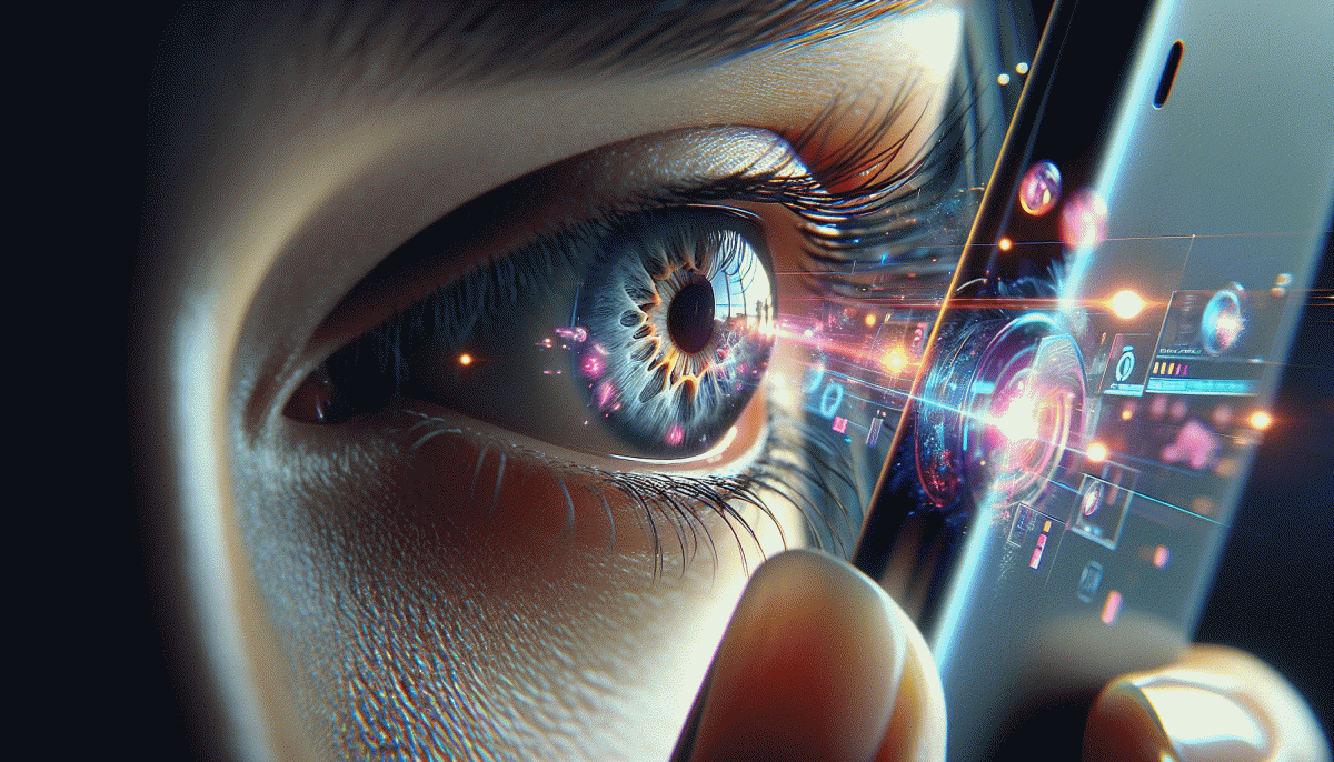
From Blink to Click: The 0.3-Second Visual Hooks That Win the Feed
In the blink between scrolls, make the feed do a double take. Treat the first frame like a billboard: bold shape, a splash of color, and an obvious subject. Aim to create visual clarity at a glance so your creative announces itself in 0.3 seconds and leaves no guessing for the thumb.
Five micro-hooks win that micro-window: High-contrast color to pop against the feed, eyes or faces engaging directly with the camera, bold typography that reads at a glance, unexpected motion — a fast reveal or tilt, and a tiny surprise that rewards a pause. Combine two for compound impact.
Plan your first 300ms like a mini storyboard. Frame 0–100ms: establish the subject with a strong silhouette. Frame 100–200ms: introduce motion or a text beat. Frame 200–300ms: deliver the hook or reveal that encourages a click or a longer watch. Trim clutter, elevate contrast, and keep the visual grammar simple.
Optimize by platform but keep the core hook consistent. Vertical crops need closer faces; thumbnail-driven platforms demand a dominant shape; looping formats benefit from a seamless transition at the 0.3s mark. Test two variations and measure lift in view-through and engagement to learn fast and iterate faster.
Production checklist: reduce initial clutter, boost midtones and saturation, animate one element, caption the key word, and export a crisp first frame. Execute these five edits and you turn a blink into a click.
Lo-Fi Beats High-Gloss: Why Raw, Real, and Unpolished Win
Polished perfection once stopped thumbs, but a shaky camera, a coffee spill, or a voice cracking with emotion now makes people pause. Raw visuals feel like an invite into real life rather than an ad. Short loops, candid edits, and lo-fi soundtracks create micro-moments that spark replays and comments — the exact behaviors platforms reward when they decide what goes viral.
Unpolished does not mean careless. Treat roughness like a design choice: leave small framing quirks, keep ambient sound, and caption candid lines so viewers can skim or linger. Open with a three second human detail, let the scene breathe, and close with a clear micro action. Those tiny decisions increase retention, saves, and shares faster than 60 seconds of slick polish.
- Authenticity: Show a flaw or behind the scenes moment that humanizes the brand and invites comments.
- Pacing: Use uneven cuts and natural pauses to encourage rewatches and dwell time.
- Boost: Pair organic clips with targeted testing to surface winners and scale quickly.
Run an experiment: publish a glossy version and a raw sibling, then measure 3, 7, and 28 day retention, saves, and shares. Small budgets can beat big studios if content feels honest. If the raw sibling wins, lean in and iterate in the moments where viewers reacted most; give people something that feels real and they will do the amplification for you.
Color Crush 2025: Palettes, Gradients, and Type that Pop on Mobile
Think small screen, big color. To stop the scroll you need palettes that read fast: a high contrast accent, a saturated hero shade, and a muted anchoring tone. Mobile pixels flatten nuance, so pick signals that register in a split second — alerts, CTAs, and emotional vibes must be unmistakable and legible at thumb reach.
Start with three actionable moves and apply them like a designer with a deadline:
- Contrast: Push text and icon contrast above the minimum; tiny labels need strong luminance gaps to remain readable in bright light.
- Gradient: Use bold duotones or angular gradients to guide the eye; pair a warm highlight with a cool shadow for depth on tiny canvases.
- Accent: Reserve one blast color for interaction states and microcopy emphasis so affordances are instantly clear.
Type and texture finish the job. Add a subtle stroke or a soft backdrop blur behind white text on busy images, test color on an actual handset in sunlight, and prefer blend modes that keep saturation without crushing legibility. Run quick A/Bs with real users and iterate: the most viral visuals feel effortless because every color choice was purposeful and visible the moment the feed stops moving.
Short, Snappy, Subtitled: The Video Formats Algorithms Push Now
Short, snappy videos with bold, readable subtitles are the currency of attention in 2025. Algorithms lean heavily on early retention signals, and because most people scroll with sound off, captions carry both the joke and the KPI—better view-through, higher share rate, and more saves. Make accessibility part of your growth strategy and you get reach as a side effect.
Hook hard in the first 1–2 seconds: reveal an outcome, show a human reaction, or drop a surprising stat. Keep the frame vertical (9:16), cut frequently but intentionally, and prefer quick micro-stories rather than a single long take. Burned-in subtitles work where SRTs vanish, and short loops (9–25 seconds) often outperform longer cuts because they drive replays and completion metrics.
- Hook: Lead with a visual payoff or cliffhanger that stops the thumb fast.
- Format: Vertical 9:16, high-contrast text, and 1–2 second shot rhythm.
- Caption: Large, sans-serif text; mirror speech to action and avoid dense blocks.
Run rapid A/B tests on thumbnail frames, caption color, and opening beats, and use analytics to prune what drags. For an extra nudge on distribution consider genuine TT boost service to seed early momentum; then double down on the variant that holds attention. Small edits, clear captions, and consistent cadence are the formula for going viral without losing your voice.
AI Meets Aesthetic: Smart Ways to Blend Generative Looks with Human Touch
AI visuals are everywhere, but the ones that stop the thumb feel handcrafted. Treat generative outputs like raw footage: don't publish the first perfect render—curate it. Think of the model as a brilliant intern that needs a human director: you give constraints, personality, and the little flaws that make an image believable in a feed full of polish.
Practical tweaks beat theory. Layer generated elements over real textures, nudge colors by hand, and introduce micro-imperfections—tiny stray hairs, uneven shadows, a hand-drawn scrawl—that signal a living creator. Use prompt chaining: produce several variants, harvest the best bits, and composite them. Finish with low-effort retouching (dodging/burning, grain, baked-in lens flare) so the aesthetic reads as intentional, not accidental.
Keep a short, repeatable playbook you can teach a team.
- Prompt: Iterate on 3–5 prompts, then mix favored features into one composite.
- Humanize: Add tactile details—textures, smudges, props—to break algorithmic symmetry.
- Polish: Apply a small set of manual color/contrast moves and export presets for scale.
Finally, test and measure: A/B the raw vs. humanized version, ask a colleague which one feels more authentic, and let winning combos become your templates. When generative flair is balanced with purposeful human edits, you get scroll-stoppers that feel fresh, real, and absolutely double-tap worthy.
Read also

Visual Trends in 2026: Viral Visual Hacks Social Platforms Cannot Resist

Visual Trends in 2026: Steal the Viral Formula Social Feeds Crave

Visual Trends in 2026: 11 Viral Triggers Social Platforms Cannot Resist

Visual Trends in 2026: The Shockingly Simple Secrets Behind What Goes Viral on Social Platforms

Visual Trends in 2026: What Actually Goes Viral on Social Platforms (and How to Ride the Wave)