Raw vs Flashy vs Weird: We Ran the Ultimate Showdown—You Will Not Believe the Winner
The Raw Truth: Why Imperfect Posts Outperform Polished Brags
Forget the glossy trophy shot; messy clips and candid captions win hearts because humans buy from humans, not billboards. When a creator leaves a stain, a flub, or a half baked thought on purpose, viewers lean in to see what happens next. Those tiny imperfections signal approachability, build credibility, and invite conversation.
Algorithms favor time spent and conversation over perfection. An unpolished post creates micro moments for comments, replies, and shares because someone wants to fix it, ask about it, or compliment the hustle. To leverage that, reveal one clear behind the scenes mistake, caption it honestly, and ask a simple question to start the thread.
Try this quick formula: open with a curiosity hook in three seconds, show 20 to 40 seconds of honest process with ambient audio and a breathing pace, then close with a one line prompt that asks for a one word reply. Drop the highly edited version later as a follow up to capture both reach and admiration.
Measure what matters: comments, saves, shares and direct messages often predict long term loyalty better than vanity likes. Run a simple A/B test over a week, compare conversation rate and retention signals, then double down on the raw variant that sparked the best replies. Be brave, be human, repeat.
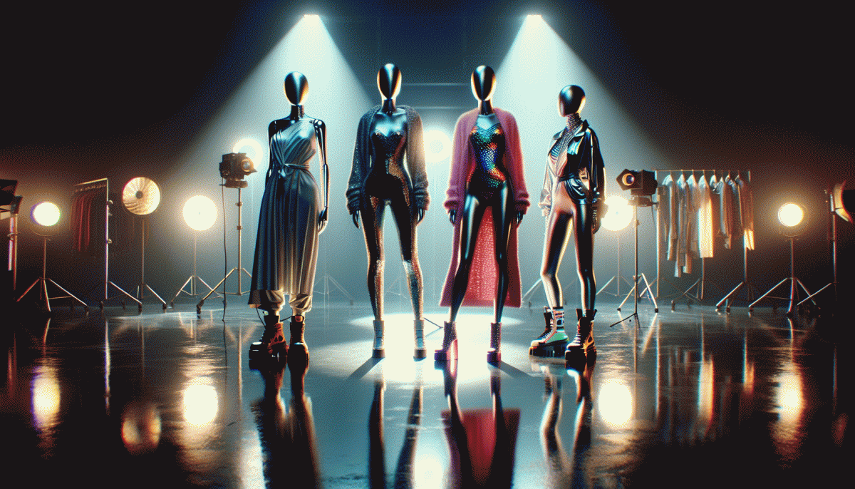
Flashy for the Win: When High-Gloss Creative Actually Converts
Glossy creative wins when attention is scarce and seconds matter. High-gloss visuals and bold motion do more than decorate: they act as signals of value and urgency. A polished hero image or a cinematic six second loop can shortcut consideration and make a scrolling thumb pause, giving your message the one breath it needs to convert.
Pick flash when three boxes are checked: the offer is visual, the audience values aesthetics, and the funnel is short. Products that live in the look and feel world—fashion, gadgets, experiences—benefit from aspirational framing. For lower funnel placements a refined ad often lifts click through rates and lowers cost per acquisition because perception matches price.
Execution matters. Prioritize contrast, a single clear focal point, and a concise message. Use motion for emphasis only, optimize the thumbnail frame, and design mobile first so polish never becomes clutter. Run quick A/Bs on color and CTA timing, and measure both micro conversions and final sales to avoid vanity wins.
If a blockbuster spot is out of reach, do micro productions: styled product shots, tight testimonial clips, and subtle motion graphics. Bold design plus smart measurement beats flash for flashiness alone. Launch a short experiment, watch the metrics, and let performance crown the winner.
Get Weird or Go Home: The Psychology of Delightful Oddities
People do not just tolerate oddities, they celebrate them when those oddities feel playful instead of threatening. That sweet spot sits at the intersection of surprise and safety: a benign violation that jolts attention, triggers curiosity, and lights up reward circuits. Weird elements become memory hooks because they violate mundane expectations in a way that is easy to process and share. Think of them as tiny cognitive fireworks that stick.
Designing delightful oddities is less about random eccentricity and more about calibrated contrast. Use a consistent frame and then break one rule: a color that speaks in a whisper while the copy shouts, a soundtrack that is slightly off-kilter, or a familiar routine interrupted by a tiny absurdity. Favor micro-surprises over chaotic overhaul. Add constraints to channel creativity so the weird is readable, repeatable, and brand-forward rather than confusing.
For creators and small teams, practical moves matter. Test a two-second visual twist halfway through a clip, seed a playful non sequitur into captions, or build a recurring character who behaves one note outside the norm. Measure what feels risky by engagement lifts, not gut feelings. If you want to amplify those micro-surprises with distribution power, try this to get attention fast: boost TT — use paid momentum to see which oddball moments spread organically.
Start tiny, iterate quickly, and keep an empathy filter handy: weird that delights is weird that respects the audience. Track shares, comments, watch time, and repeaters to know what counts as delightful for your crowd. In short, get intentional about your oddities, measure their magic, and let the quirks do the heavy lifting.
The Test Lab: A/B Battles to Pick Your Style Champion
Welcome to the mini war room where design theories meet messy human behavior. We lined up dozens of thumbnails, headlines, and color treatments and pitted them against each other in ruthless A/B clashes. The goal was simple: find the version that grabs attention without sounding like a circus, converts without betraying the brand, and leaves people talking for the right reasons.
Each battle focused on one variable at a time — tone, imagery, and level of oddness — so the winner could be traced to a single tweak. Metrics were chosen like weapons: clickthrough rate for attraction, time on page for engagement, conversion rate for persuasion, and social shares for viral potential. Tests ran long enough to dodge flukes and short enough to keep momentum, with audience segments split by behavior rather than guesswork.
Surprises were plentiful: the most grotesquely clever idea sometimes outperformed polished glamour, while raw authenticity beat manufactured sparkle in niche groups. The takeaway: stop guessing. Start small, test one thing, and let the data do the drumbeat. If you only track vanity numbers, you will pick the prettiest loser.
Ready to build your own lab? Start with a clear KPI, two to three focused variants, and a minimum sample size. Keep notes on qualitative feedback, iterate fast, and celebrate the weird results that teach you more than the safe ones ever will.
Your 7 Day Plan: Mix, Measure, and Crown the Winner
Think like a lab tech, not a gambler: pick one variable per treatment and keep everything else steady. Day 1–2 run three short bursts to sense which flavor gets attention; Day 3–4 iterate on the most promising, changing only the headline or color; Day 5–6 swap creatives between formats to isolate what actually drives action; Day 7 consolidate lessons, craft the final champion, and record how long each post keeps attention and any early comment themes.
- Launch: Test flashy hooks and kinetic visuals to spark fast clicks and shares.
- Baseline: Post raw, authentic drafts to measure genuine retention and comment depth.
- Shock: Drop weird, unexpected twists to see what generates virality beyond paid reach.
Track three simple numbers every day: engagement rate, saves and shares, and click-throughs. Use relative change instead of vanity totals (for example a 20 percent lift is more valuable than 1,000 hollow likes). Also track audience retention on video, and record cost per conversion if using ads. Keep post timing and audience identical so the only change is creative, and log repeat runs for any surprising winners.
When you identify the winner, amplify confidently—give it reach, not hope. If you want a fast, controlled boost to validate results, consider a reliable push like buy Instagram followers to seed social proof and speed up organic signals.
Read also

Raw vs. Flashy vs. Weird: The Showdown Your Brand Didn’t Know It Needed

Raw vs. Flashy vs. Weird: We Ran the Showdown—Guess Which Style Actually Wins?

Raw, Flashy, or Weird? The One Style That Crushes Conversions Might Surprise You

Raw vs Flashy vs Weird: The Creative Cage Match No One Saw Coming

Organic vs Paid vs Boosted: The Follower Growth Showdown — What Actually Works Now
