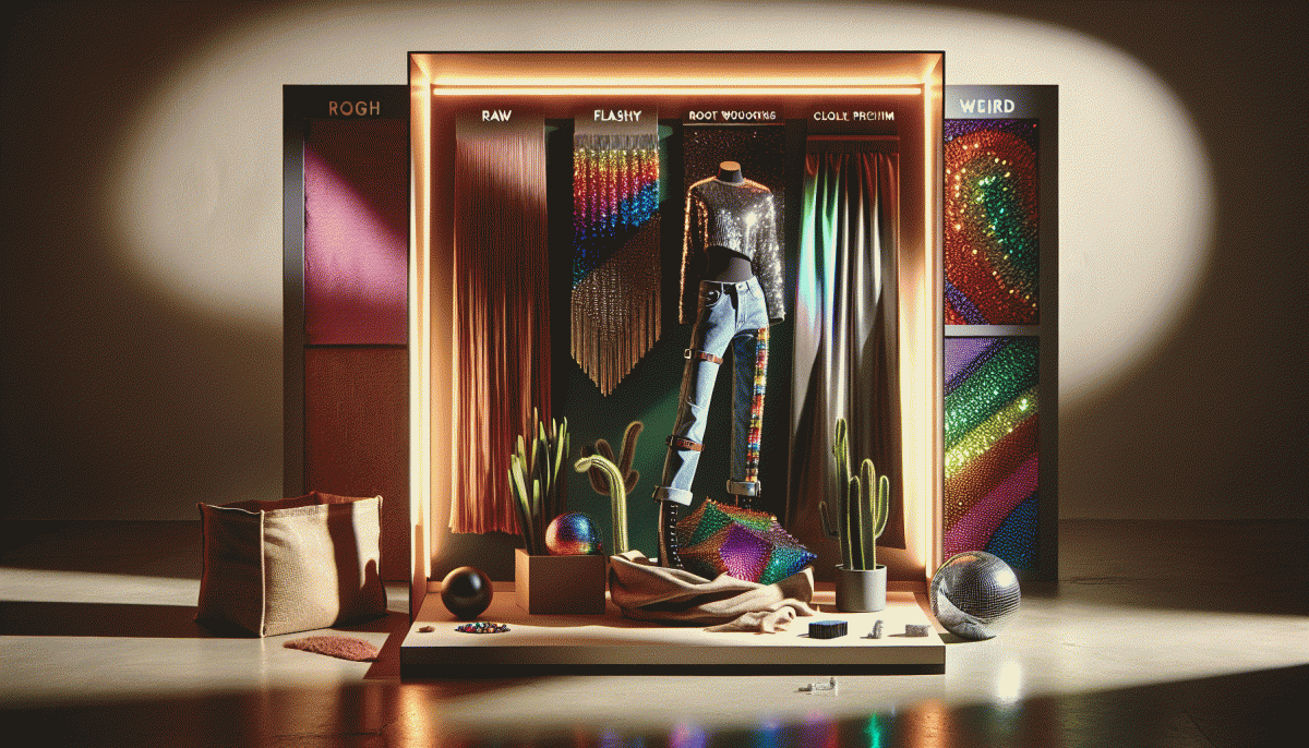
Raw vs Flashy vs Weird: The shock winner that converts like crazy
The 10 second gut test: which style your audience trusts
Give any creative ten seconds and the brain will decide trust or trash. Use that split second to run a quick gut check: did the hero image feel honest, did the headline talk like a human, did design scream cheap or confident, and did any social proof quietly whisper credibility? Treat this as your mini focus group for first impressions.
Here is a fast routine: open the page, mute everything, and scan from top left to center. Notice the headline, then the image, then the smallest trust signals like logos, numbers, or faces. If the message is clear inside ten seconds, you passed. If the brain hesitates, clutter or mismatch is the culprit. Fix the biggest friction first.
Now interpret what passed the test. Raw tends to win with audiences that value honesty and depth, flashy hooks impulse buyers and spectacle lovers, and weird stops scrollers in niche or creative markets. Use that read to pick a dominant style for your campaign. The sweet spot is an honest core with one amplified element that converts like crazy.
Turn this into an experiment plan: pick the hero, swap headline variants, and test three creatives live for a day to capture 10 second metrics like bounce and clicks. If trust is low, default to raw for two weeks. If attention is low, try a weird thumbnail. Repeat quickly and optimize for clarity first.
When raw beats polish: scrappy ideas that sell
Polish is seductive, but sometimes the fastest path to a sale is a video that looks like someone grabbed a camera between emails. Raw feels human — mistakes, flubs, unfiltered emotion — and that's what converts when people crave connection over perfection. The goal isn't to be sloppy; it's to prioritize clarity, urgency, and relatable detail. Ship an honest idea faster than you can hire a designer. When the message is obvious, tidy graphics add zero lift and cost you time. Use that freed-up time to test offers and copy instead of nervously tweaking pixels.
Practical moves: shoot one vertical phone clip showing the product in real use, capture a five-second reaction, and stitch them into a 15–30 second ad. Ask customers to record a quick voice note about their favorite detail; their candid words often outperform scripted testimonials. Run a tiny A/B where 'handheld' versus 'studio' spend splits 80/20 — you'll be surprised how often the handheld wins. Keep the caption direct, benefit-first, and end with a single, obvious action.
Constraints breed creativity. Limit yourself to one location, one prop, and one hook. Create a limited-run offer that excuses imperfection — 'first 48 customers get it for $X' — and watch hesitation melt. In the copy, call out the roughness as proof: 'Made in our garage — tested by real customers.' Track micro-conversions: clicks on the product page, comment replies, and saves; those signals tell you if your scrappy idea resonates before you pour more budget into it.
An easy workflow: 1) Pick one bold promise you can prove in 10 seconds. 2) Produce one raw asset (phone video + one photo) in under an hour. 3) Publish, measure, and iterate daily for a week. Double down on the variants that create action, not the ones that look slick in a portfolio. Embrace the imperfect — when done right, scrappy ideas don't just feel honest, they sell.
Go full glitter: use flashy to stop the scroll without the cringe
Flashy doesn't mean trashy — think polished glitter, not meme vomit. When a feed is a blur, bold color, kinetic text, and a single unexpected prop arrest attention in under a second. The goal is to stop the thumb with style, not shock people into an eye-roll.
Practical recipe: open with a visual hook (big shape or face), follow with a one-line value punch, then land a tiny micro-action — save, tap, swipe. Keep copy scannable, motion deliberate, and assets optimized so that your shiny creative loads fast and converts faster.
- Hook: Use a high-contrast element to stop the scroll within 0.7s.
- Value: State the benefit in one sharp line—no jargon.
- ⭐ CTA: Make the micro-action frictionless and obvious (swipe/save).
Avoid the cringe by limiting effects to one or two layers, keeping faces authentic, and respecting brand cues. If it reads like an ad, it should still feel like an experience — not a loudspeaker. Measure engagement signals, then dial the flash up or down.
Flashy used with intention is a conversion engine: seasoning not the whole meal. Pair bright hooks with raw authenticity or a weird twist to own attention and turn scandalous scroll-stoppers into repeat buyers. Test, iterate, and let data pick the winner.
Weird works: odd hooks that spark comments and shares
Start by treating weirdness like a creative spice: a pinch makes everything memorable, a shovel overwhelms. Odd hooks work because they interrupt autopilot — a tiny violation of expectation that triggers laughter, disbelief, or instant curiosity. Think mismatched pairings, surprising props, or a question that feels like a brain-teaser. The goal isn't nonsense for attention's sake, it's a clear, shareable moment that invites a reaction: comment, tag a friend, or hit share.
Practically, build the hook around a micro-story. Use contrast (a luxury item in a thrift-store setting), scale shift (a giant spoon for tiny cereal), or impossible claims phrased as playful challenges. Lead with a visual or first sentence that begs for context — people will fill the gap with comments. Keep it short, give permission to react (ask a silly yes/no), and avoid forcing shock that feels mean or fake. Test timing and context — the same object in two settings can flip meaning.
Use a quick recipe: hook + tiny reveal + invitation. Test two variants: one straightforward, one weird — measure comments and shares, not just views. Swap the caption tone, change the object, or flip the POV in the first two seconds. Rinse and repeat until a pattern emerges. Remember: weird converts when it's authentic to your brand voice; otherwise it lands as a cheap stunt. Log which comments lead to DMs or signups to link weirdness to revenue.
When you're ready to amplify those viral experiments, pair creativity with reach — boost the odd posts that already sparked emotion. For a fast way to scale engagement on short-form platforms, check out best TT boosting service to get more eyeballs on your strangest, most shareable work and learn which oddball hooks actually convert. Start with organic testing before paid amplification to save ad spend.
Pick your winner fast: a mini playbook and scorecard
Move fast. You have three tonal engines on the runway — the unvarnished and honest, the glossy and showy, and the unabashedly oddball — and one of them will start pulling conversions immediately. The trick is not to philosophize forever. Use a tight playbook that turns instincts into repeatable tests, and you will find which tone maps to revenue without wasting a month of creative budget.
Start by sizing risk, speed, and clarity. Run rapid A/Bs for three elements: lead hook, visual treatment, and CTA. Give each test a simple 0–10 score for attention, comprehension, and friction. Keep cycles short: launch, measure at 48 hours, kill or scale at 7 days. If a style wins attention but kills comprehension, it is a high attention, low convertor. If it loses attention but reduces friction, it might be the sleeper hit when paired with a stronger hook.
Use this micro scorecard to decide in minutes, not weeks:
- Impact: Rate how many people take the desired action after exposure (0–10).
- Clarity: Rate how easily the audience understands the offer (0–10).
- Friction: Rate barriers to conversion like extra steps or confusing language (0–10).
Sum the three scores and apply a simple rule: 20 plus is a scale candidate, 12 to 19 is a tweak and re-test, under 12 is a discard. If the improbable weird option consistently beats the others, lean in and prototype variations to widen appeal. The fastest winners win conversions and mindshare, so pick, test, and double down before your competitor even notices.
Read also

Steal This Zero-Social Funnel That Converts Like Crazy (No Posts, No Problem)

Steal This 3-Step Funnel That Converts Ice-Cold Social Traffic Like Crazy

Steal This Funnel: The Surprising Strategy That Converts Ice-Cold Social Traffic Like Crazy

Build a Killer Funnel That Converts Like Crazy—Zero Social Traffic Needed

We Tested Clickbait vs Value—Here's the Sweet Spot That Converts Like Crazy
