Raw vs Flashy vs Weird: The Creative Style That Actually Converts Might Surprise You
Raw: Confessional vibes, zero polish, maximum trust
Drop the filter and talk like a person — people notice. Raw confessional clips feel like a private note, not an ad: tiny mistakes, laugh-out-loud tangents, and honest 'I had no idea' moments. That kind of vulnerability chips away skepticism faster than glossy polish ever could, creating micro-trust that turns scrollers into commenters and curious lurkers into first-time buyers.
Make it easy to be real. Start with one candid line, keep camera angles imperfect, and let pauses breathe; captions should add context, not correct the voice. Try a three-shot formula: admission, mistake, quick fix — delivered in one breath. Those fragments assemble into a believable narrative that resonates more deeply than perfect production.
Measure what matters. Test short confessions (15–30s) against longer polished pieces and prioritize completion rate, comments, and DMs over vanity views. You'll often see raw content win in engagement and conversions because it prompts replies and conversations — and conversations are the cheapest, stickiest way to sell.
Want to amplify genuine vibes without losing authenticity? Combine human-first content with a controlled reach bump: buy TT followers cheap as a short-term amplifier, then let real reactions fuel organic growth. Keep the confessional cadence and let trust scale your conversions.
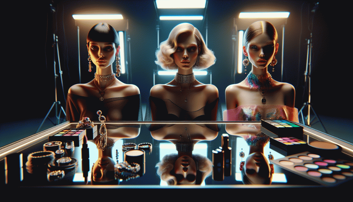
Flashy: High gloss hooks that stop the scroll
Flashy hooks are the digital equivalent of a neon billboard: they catch eyes hard and fast. Think kinetic cuts, oversized text, a single impossible visual, or a sound that makes thumbs stop mid-scroll. The trick isn't noise for noise's sake - it's designing a shock that delivers a clear promise in the first 1-2 seconds so curiosity becomes a click.
Practical moves to get that gloss: use one dominant color plus high-contrast accents, animate a microinteraction (a blink, a slam, a reveal), and cut edits at 0.6-1s to match attention spikes. Lead with benefit copy, not features - a compact value punch wins. Always size and frame creatives for the platform so your masterpiece doesn't get chopped.
Flashy converts best when the decision is simple: low-friction offers, impulse purchases, app installs, or social-proof boosts. It struggles with complex value props or long-consideration buying cycles unless you chain the gloss into a coherent funnel. Pair every shiny spot with a fast-loading landing page and a one-click next step so momentum doesn't evaporate.
Measure like a minimalist: track CTR, watch-through, landing bounce, and your first micro-conversion. A/B test color saturation, opening frames, and whether sound increases or kills performance. If something glitters but doesn't convert, dial back the gloss and keep the promise. In short: make it loud, then make it useful.
Weird: Offbeat ideas that trigger curiosity and shares
Weird works because it interrupts autopilot — a tiny mismatch makes people stop, squint, and share. Instead of polishing every pixel, lean into oddities that spark curiosity: a misapplied prop, an unexpected rhyme, or a rule broken just once. That friction is social oxygen.
Start small and surgical: write a headline that makes people ask "wait, what?", flip the subject of an everyday tutorial, or narrate a mundane task as if it were a thriller. Use sensory details and micro-contradictions; the goal is intrigue, not chaos.
Formats that convert: short absurdist clips, contradicted thumbnails, faux mistakes that reveal a payoff, and impossible-before/after shots that leave room for explanation. Test these in low-risk spaces — stories, reels, or a single pinned post, and add captions that tease a reveal.
Measure the weird: compare share rate, retention, and replies against your usual content. If a strange idea raises curiosity without confusing your audience, scale it. If it bombs, extract the surprising piece and iterate; weird is a series of micro-experiments.
Try one tiny weird move this week and treat the result like data, not drama. Keep copy clear, cadence sharp, and use one oddity per asset. Remember: surprise beats polish when the goal is being noticed and shared — log the metric that matters and iterate fast.
A/B test blueprint: How to pick a winner in 7 days
Think of this as a creative speed-dating experiment: pick the one metric that actually moves the needle for your funnel — clicks if you need attention, conversion rate if you need signups, or add-to-cart if you sell. Lock that KPI in as your north star and refuse to let vanity metrics distract you.
Prepare three crisp variants that only differ in the creative voice: raw (authentic, handheld), flashy (slick, cinematic), and weird (attention-grabbing, oddball). Keep headlines and CTAs consistent, use equal targeting, and split traffic evenly so each style gets the same shot at glory.
Run the test for seven days with daily checkpoints: days 1–2 collect baseline signals, days 3–4 watch for momentum, day 5 consider pruning a laggard, and days 6–7 confirm the leader holds. If you want a shortcut for fast implementation and scaling, try fast and safe social media growth to deploy creatives quickly and funnel results back into the loop.
Decision rules keep you honest. If a variant shows a sustained >=15% lift on your KPI across 48 hours and traffic volume is decent, promote it. If differences are small, extend testing or combine elements (raw headline + flashy visual) and iterate. Don't chase statistical purity at the cost of speed — use practical thresholds and real-world momentum.
Once you pick a winner, scale it confidently (2x–5x), monitor for creative fatigue, and start the next micro-test within two weeks. That cadence turns surprises into repeatable plays and helps you discover whether your audience prefers raw, flashy, or gloriously weird.
Swipe file: Real brand examples that nailed each style
Think of this as a compact swipe file with real fast wins: three short case studies that show how different creative personalities move people to act. Each paragraph below names a brand, the platform where the idea blew up, the conversion win, and a tiny, repeatable play you can steal today.
Example: Dollar Shave Club on YouTube and social — low budget, brutally honest founder video that drove huge first orders.
Why it works: the raw authenticity removed friction and built trust fast. Actionable play: film one short problem-solution clip starring a real team member, end with one clear CTA, and promote it to a lookalike audience.
Example: Gymshark and aspirational fitness creatives across Instagram and YouTube — glossy edits, hero athletes, unmissable motion.
Why it works: high production sells a lifestyle and justifies price. Actionable play: craft a 6–10 second visual hook, layer social proof (customer shots or stats), then retarget viewers with a direct offer.
Example: Squatty Potty on viral video channels — weird, irreverent, unforgettable demonstration that doubled as education and entertainment.
Why it works: memetic oddity increases shares and earned media, which fuels conversion long after launch. Actionable play: pick one oddball truth about your product, dramatize it with absurd visuals, and make the purchase path one click away.
Read also

Raw, Flashy, or Weird? The One Style That Crushes Conversions Might Surprise You

Raw vs. Flashy vs. Weird: We Ran the Showdown—Guess Which Style Actually Wins?

Buying Attention: The No-BS Playbook for Boosting, Influencers, and Paid Leverage That Actually Converts

Stop Scrolling: The Hooks That Actually Work in 2026 (And Why Yours Might Not)

Raw vs Flashy vs Weird: The Creative Cage Match No One Saw Coming
