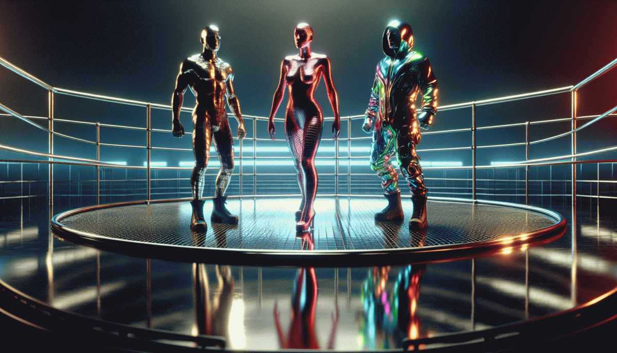
Raw vs Flashy vs Weird: The Creative Cage Match That Will Blow Your Mind
When Scrappy Beats Slick: Why Raw Works When Budgets Do Not
Small budgets make for big personalities. When glossy production is off the table, raw work grabs attention because it feels human — messy edits, grainy light, the off‑script joke. Audiences reward honesty; they sniff polish and skip to something that breathes.
Raw wins on speed and relatability: you can shoot, post, and learn in hours, not weeks. That immediacy creates a conversation loop — comments, duets, saves — that money alone rarely buys. Constraints force contrast, and contrast is a shortcut to memorability.
Try lean moves that scale fast and cost almost nothing:
- Free: Repurpose user clips into a 20‑second story that feels like a friend recommendation.
- Rapid: Run 48‑hour creative experiments to see what triggers reactions, then double down.
- Short: Shoot 10–15s verticals around one surprising moment — easy to consume, easy to share.
Pick one measurable micro‑goal — comments, saves, replies — and optimize each raw asset toward it. Trim intros, add a curious hook, and end with a tiny ask. Publish, watch, tweak, publish again. Budget humility becomes creative advantage when you treat constraints as rules, not punishments.
Flashy That Converts: How High-Gloss Content Hooks Short Attention Spans
High-gloss content is the magician that makes thumbs stop mid-scroll. Think cinematic cuts, neon contrast, and a two-second proof that promises value. The goal is not just to dazzle but to open a tiny window of attention where persuasion can happen. Flashy does the grabbing; your message does the converting.
Start with a thumbnail that reads at a glance, then frontload benefit in the opening frames. Use motion to guide the eye, bold typography for scannability, and micro-interactions to reward taps. Keep copy tight, visuals uncluttered, and place a clear micro-CTA inside the first few seconds to capture intent before it evaporates.
Make the next step obvious: one button, one promise. Remove friction with fewer fields and clearer language, layer quick social proof, and signal scarcity or speed where honest. Tailor polish to the platform; a glossy loop that works on Reels may need a different tempo for a thumbnail-driven feed.
Measure clickthroughs, completion rates, and micro-conversions, then iterate fast. Use templates and swipe files to scale shiny content without burning time. Most important, let flash and authenticity share the stage: polish to hook, realness to keep, and the occasional weird move to surprise and seal the deal.
Get Weird or Go Home: The Science of Memorable Oddities
You know that moment when a weird image or line refuses to leave your head? That's not magic—it's neuroscience. Novelty and surprise hijack attention, boost emotional arousal, and glue a memory in place via the von Restorff effect. Weirdness acts like a cognitive magnet: audiences pause, process, and then tell a friend.
Make one choice deliberately odd. Pick a single element—a sound, a prop, an unexpected visual—and crank the mismatch just enough to surprise without confusing. A good rule: the one-odd-thing wins—keep surrounding context familiar so the oddity pops. Use vivid sensory detail and a tiny narrative twist to give the oddity meaning, not just shock value.
Blend weird with what already works. Raw authenticity builds trust; flashy polish sells; the strange detail makes the combo unforgettable. Start raw to test voice, slip in the odd motif, then dial production value up to match platform norms. On short video, exaggerate pace; on still posts, let the image linger and invite a double-take.
Treat it like an experiment: A/B the odd version against the safe one and track shares, comments, and mentions. If attention spikes, lean in; if it flops, tweak the tension between familiar and strange. Get scrappy, get bold, measure rigorously—and watch memorability turn into momentum.
Match the Mood: Picking the Style for Your Audience and Funnel Stage
Style is not decoration; it is a signal. Picking raw, flashy, or weird should be a conscious act, not a mood board accident. Start by asking two questions: who are they and where are they in the journey? Your answer drives everything from pacing to color choices. Think of mood as pipeline currency: the right tone converts attention into interest.
For top of funnel moments attention is the metric. Middle is trust and comparison. Bottom is friction removal and proof. Read platform cues: short loops on TT and Reels beg for spectacle, long reads on Reddit and Google reward nuance. Then map creative to behavior and measure fast. Run three small variants, watch retention and click rates, and kill what does not work.
A quick map to simplify decision making:
- Awareness: Flashy focus — bold colors, motion, and a one line hook to stop the scroll. Prioritize attention metrics and short loops that invite the first click.
- Consideration: Raw focus — candid demos, honest FAQs, user clips. Show tradeoffs, add social proof, and aim for retention and mid funnel actions.
- Conversion: Weird focus — memorable micro rituals, tiny creative oddities that improve recall and nudge action. Pair with crystal clear CTA and hard proof.
Make it actionable: pick the style that matches stage, run fast A B tests, then scale winners. Keep a two week cadence for new creative and a simple scoring rubric: attention for flashy, retention for raw, and lift for weird. Use empathy as your guardrail and surprise as your accelerator.
Test Like a Pro: Simple Experiments to Crown Your Winner
Pick one clear question and test toward it. Are you chasing clicks, comments, watch time, or conversions? Label your metric up front and stick to it. Run each creative variant against the same audience, same copy, same placement so the only difference is the look and feel. A clean control is the secret weapon of smart experiments.
Keep the design simple: three arms work great — Raw, Flashy, Weird — each with a single, measurable change. Set a minimum exposure floor like 1,000 impressions or 50 conversions before calling a winner. If you want faster signals, focus on early engagement metrics such as CTR and first 3 seconds retention, then validate with downstream conversions.
Make the changes concrete. For Raw strip polish: one-camera framing, honest audio, no overlays. For Flashy dial up production: bold thumbnail, motion, crisp edits, bright palette. For Weird introduce one unexpected element: an odd prop, a surprising cut, or a striking caption twist. Keep copy identical across variants so creative moves the needle, not the wording.
When a winner emerges, do not celebrate forever. Run a confirmatory test and try hybrids: raw voice plus flashy thumbnail, or weird hook with polished production. Watch for novelty decay and audience segments that prefer different styles. Test like a pro and the creative cage match stops being chaos and becomes a fast lane to repeatable ideas.
Read also

Raw vs Flashy vs Weird: The Creative Cage Match No One Saw Coming

Raw, Flashy, or Weird? The One Style That Crushes Conversions Might Surprise You

Raw vs. Flashy vs. Weird: The Showdown Your Brand Didn’t Know It Needed

The One Thing That Drives Clicks on YouTube (Spoiler: It's Not Your Video)
Stop Guessing: The Instagram Posting Times That Explode Your Reach