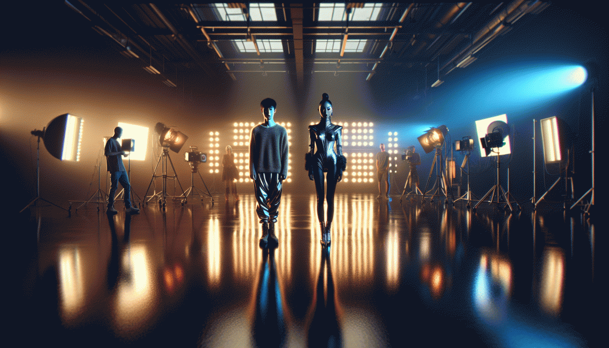
Raw, Flashy, or Weird? The Creative Style Showdown You Never Saw Coming
Why Raw Feels Real—and When It Backfires
There's something magnetic about seeing a creator stumble, laugh, or whisper a half-formed idea into a phone. Raw content trades polish for human texture: jittery frames, imperfect audio, a train-of-thought voice that says this was made by a person, not a committee. That immediacy builds trust fast.
Raw works best when the goal is connection over perfection: testing new product ideas, sharing unfiltered reactions, or pulling back the curtain on process. Keep clips short, lean on honest emotion, and let tiny flaws become personality traits rather than errors to fix.
But left unchecked, raw becomes sloppy. If your message is muddled, details vanish in noise; if you're discussing sensitive topics, rough delivery can read as careless. And audiences will call out fakery fast—pretending to be “organic” is worse than being intentionally polished.
Calibrate by defining one clear purpose for each piece, doing a single clean-up pass (basic audio leveling, crop the worst wobble), and preserving a recognizable brand cue so viewers know it's you. In short: embrace imperfection, but don't excuse laziness.
Before you commit, run a quick test: post a raw version and a tightened take, watch engagement and comments, then iterate. Use the results to decide when raw is an asset and when it needs a splash of shine—your audience will tell you which one feels real.
Flashy: Scroll-Stopping or Just Shiny Noise?
Flashy can feel like a magic trick on a feed: one sharp color, a jolt of motion, and for a beat the thumb stops. That is the promise. The trap is the follow up. If the visual peak is not anchored to a clear idea, people will admire the shine and keep scrolling. Use flash to punctuate one strong message, not to camouflage confusion. Think of it as a neon sign that points to a single door.
Make the shine deliberate. Lead with a Stop-Scroll moment in the first half second, then give the eye a simple path: bold headline, concise benefit, and one visible action. Use motion as a signpost not wallpaper — a subtle loop, an entrance animation, or a color pulse that highlights the offer. Keep typography readable on small screens, choose contrast that survives platform compression, and test one flashy element at a time so you can tell what actually moved the needle.
Treat metrics like a flashlight, not a mirror. High impressions mean people saw the glitter; strong CTR, time on asset, and conversion show that the shine mattered. Run short A/B tests that swap only one variable: color, motion, or headline. If engagement lifts but conversions stall, scale back the spectacle and sharpen the microcopy. If engagement and conversions both climb, you have a repeatable formula worth templating.
Ready to experiment? Start with a one second loop, mute by default, closed captions on, and a single line call to action. Reuse that creative across sizes, then tweak the element that seems to influence behavior most. Flashy is a tool, not a style sentence. Wield it with intent and the shimmer becomes signal, not noise.
Get Weird: The Science of Memorable Oddities
Weirdo moments act like cognitive Velcro: small oddities pull attention and refuse to let go. Neuroscience calls this prediction error — when the brain expects soup and gets glitter on the spoon. That tiny mismatch makes images, phrases, and short scenes linger far longer in memory than perfectly polished content.
Make oddity a tool, not a stunt. Try a tactile mismatch, a wrong-scale prop, or a polite absurdity dropped in the caption to derail autopilot scrolling. For reach testing and practical examples, explore buy TT boosting service to see how micro-oddities travel on fast feeds and invite repeat views.
Design around setup-and-punch: lead viewers toward a pattern, then flip it with a tiny detail that reframes the whole frame. Thumbnails, first frames, and lead sentences are prime real estate for that flip — the subtler the element you break, the bigger the mental ripple.
Pace the weird. Deliver micro-oddities repeatedly but spaced so novelty survives; small repeats build recognition without numbing the audience. Use slight variations and track which surprises trigger shares, rewatches, and comments — those attention metrics are your best memory signals.
Be bold but considerate: avoid cheap shock that alienates. Tie each strange moment back to a clear idea, emotion, or utility so oddity amplifies meaning rather than creating confusion. Weirdness should reward curiosity, not punish it.
Experiment weekly: one weird tweak, one A/B test, one metric to watch. Keep a short log of odd wins, clone what works into new formats, and let deliberate weirdness evolve into a dependable creative advantage.
The A/B Test: How to Measure a Winner in 7 Days
Pick one thing to test, not the kitchen sink. For a seven-day A/B sprint, treat creativity like a combat sport: set two rivals — maybe Raw vs Flashy, or Flashy vs Weird — give each identical audience exposure, and let data declare the knockout.
Day 1: warm up with a small budget to confirm tracking. Days 2–6: split traffic 50/50 and keep all variables constant except the creative. Choose one KPI as arbiter (clickthrough rate, engagement, or conversions), predefine a minimum sample threshold, and aim for at least 1,000 impressions per variant or 50 relevant events so you will reach a usable signal by day seven.
- Clickrate: Fast indicator of attention; use for headlines and thumbnails.
- Engagement: Comments, saves, and watch time show whether a style builds a fandom.
- Conversions: Revenue or signups are the final judge when business outcomes matter.
On day seven, compare results against the KPI and sample rules: if one variant outperforms consistently, promote it and iterate on the loser. If results are tied, tweak a single element and rerun. Document learnings, tag the winning elements (tone, color, pace), and bake those insights into the next creative cycle so Raw, Flashy, or Weird turns into repeatable wins.
Steal These Mix-and-Match Playbooks for Any Budget
Think of these playbooks as a fashion swap: take a raw tee, bedazzle one sleeve, and glue a weird pin on the lapel. Below are budget-friendly recipes you can remix — each one tells you what to shoot, what to skip, and what to amplify.
Low-budget: embrace raw. Use natural light, one reliable shot, and a tight caption that sparks curiosity. Repurpose the same clip across Stories, Shorts, and a pinned post; invite followers to duet or stitch for free UGC. DIY props, bold captions, and a consistent posting cadence beat expensive polish if the idea hooks fast.
Mid-budget: mix flashy and weird. Invest in a single strange prop or a micro-animation to make thumb-stopping assets. Spend on a 1-hour editor who can add punchy cuts, sound design, and one surprising graphic. Run two variants for a week and boost the winner organically — oddness plus quality converts.
High-budget: go cinematic, then amplify. Hire a director-level shoot for hero assets, build a mini-campaign, and use targeted distribution to scale. If you want a quick lift, consider get instant real Instagram views to seed social proof while the campaign finds its audience.
Quick checklist: pick one dominant vibe, add one contrasting element, test two versions, and push the winner. Repeat monthly — creativity compounds when you treat experiments like wardrobe rotations, not one-time drops.
Read also

Raw vs Flashy vs Weird: The Creative Cage Match No One Saw Coming

Raw vs. Flashy vs. Weird: We Ran the Showdown—Guess Which Style Actually Wins?

Raw, Flashy, or Weird? The One Style That Crushes Conversions Might Surprise You

Raw vs. Flashy vs. Weird: The Showdown Your Brand Didn’t Know It Needed
Organic vs Paid vs Boosted: The Follower Growth Showdown — What Actually Works Now